Work

Girls Who Code

Girls Who Code is reinventing the future of technology by building the world’s largest pipeline of women engineers.

Background

Girls Who Code began in 2012 teaching 20 girls in New York City to code and has since grown into a global movement serving 185,000 girls and reaching millions through resources, content, and brand influence. As the organization approached its 10th anniversary, its goal was to mobilize middle- and high-school-aged youth toward the ambitious target of achieving gender parity in technology by 2027.

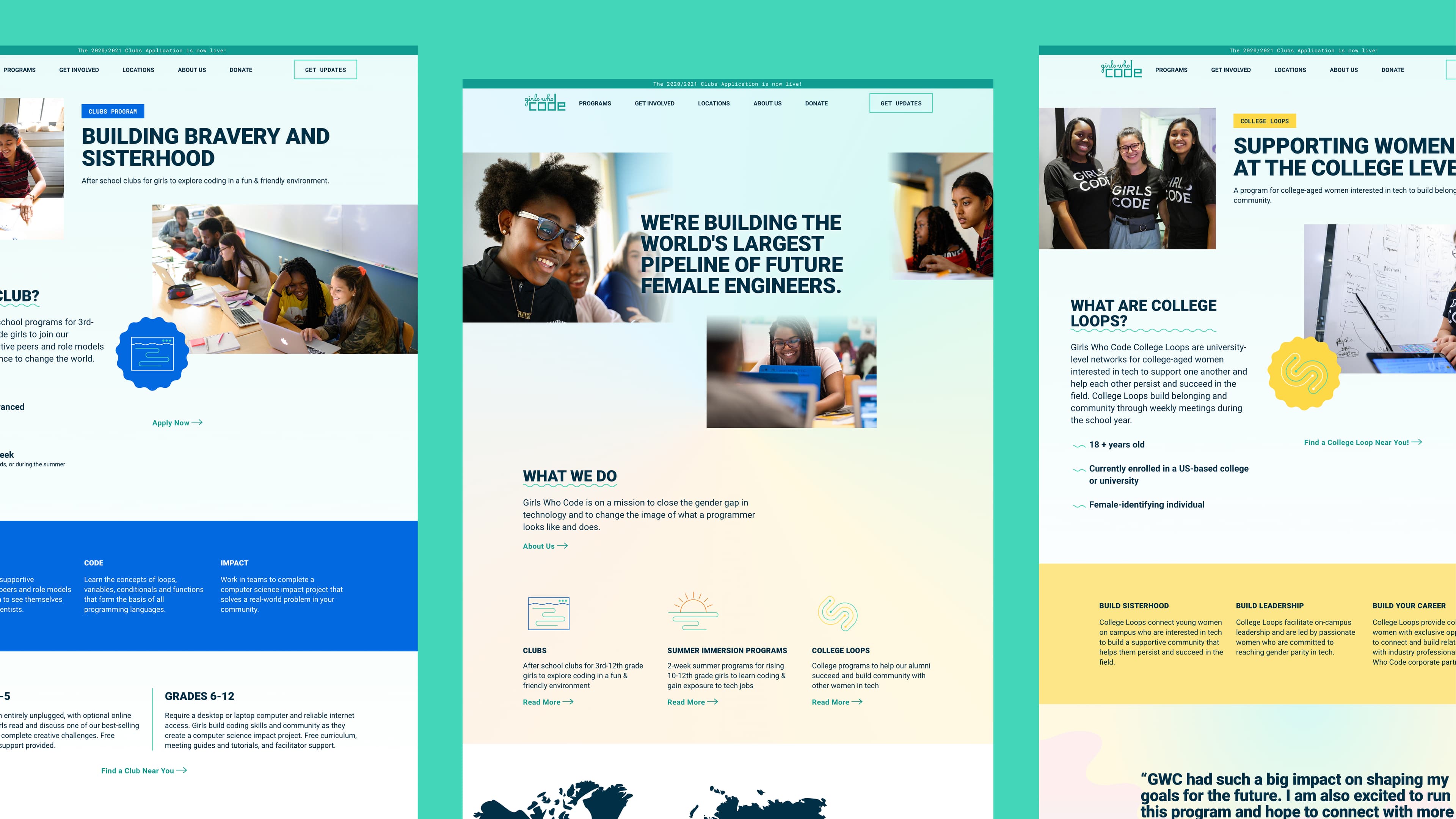
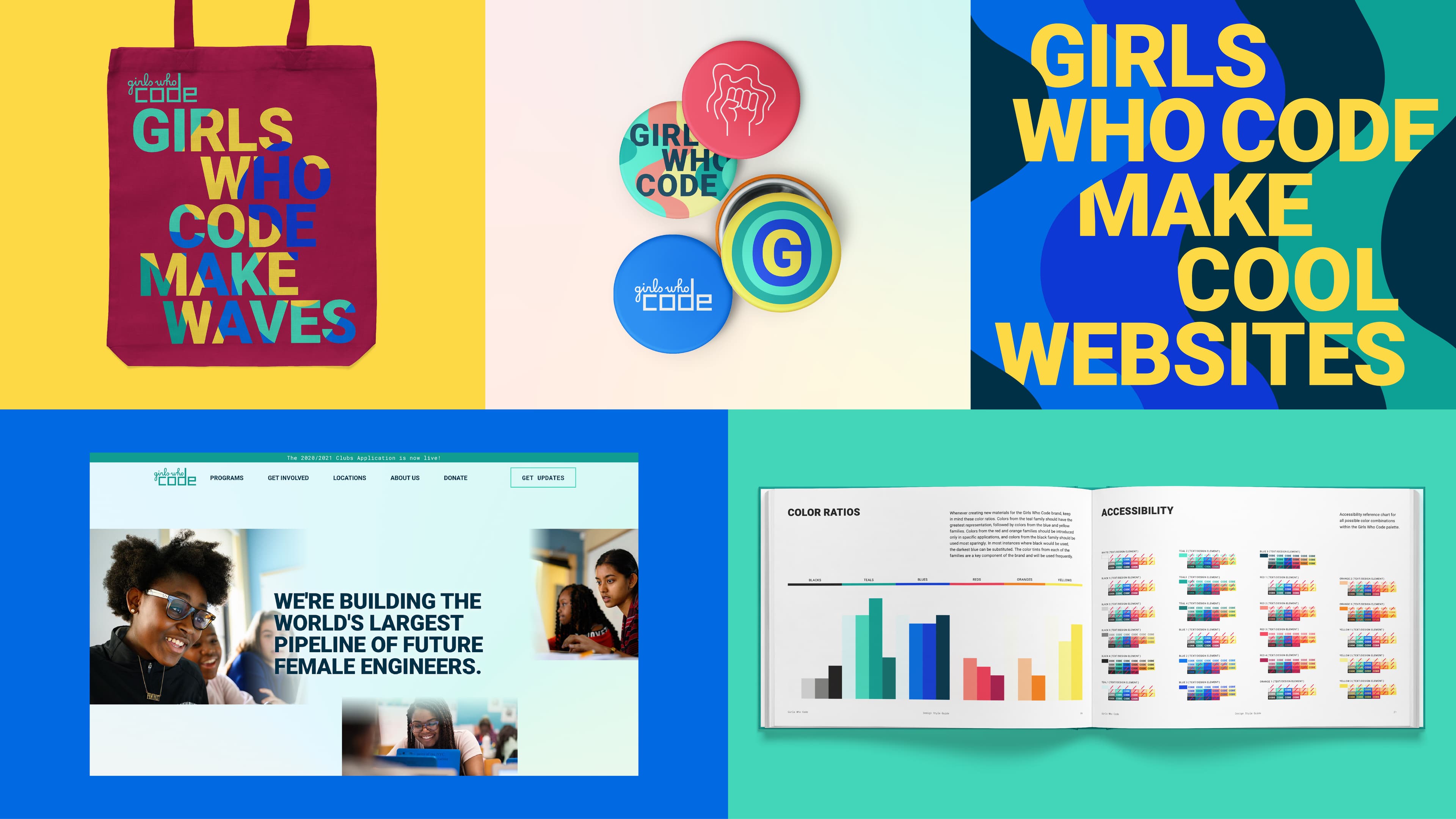
An image collage featuring branded items and promotional content for Girls Who Code. Items include a tote bag, pins, a website screenshot showcasing a statement about building female engineers, and a booklet showing color ratios and accessibility information.

The challenge

With Generation Z highly aware of social justice and using their voices to drive change, Girls Who Code needed a more unified, streamlined brand identity and a digital experience free of noise—one that effectively tells the story of young women driving technological progress.

The opportunity

This moment offered a chance to translate Girls Who Code’s mission into a bold and flexible visual system that balances quirky personality with modern sophistication. Hyperakt refreshed the logo, introduced a superhero-inspired “G” icon, and developed a unified design language. The result is a confident, adaptable brand identity that elevates the organization’s digital presence and strengthens its ability to reach and inspire girls around the world.

The image displays the text "girls who code" with "girls who" in a flowing, cursive style and "code" in a bold, block-style font. The colors used are teal with red and black shadows for a 3D effect. The background is white.

Girls Who Code's dynamic and user-friendly design system is comprised of accessible typography, flexible design elements, and color combinations chosen in careful adherence to visual web standards. It's equipped with tools to modulate its voice for different audiences — Corporate partners & Investors, Parents & Girls, Girls — while maintaining a thread of visual resonance throughout. Its ecosystem of complementary platforms is now brought together through a bigger brand story, connecting users to the GWC mission no matter their entry point.
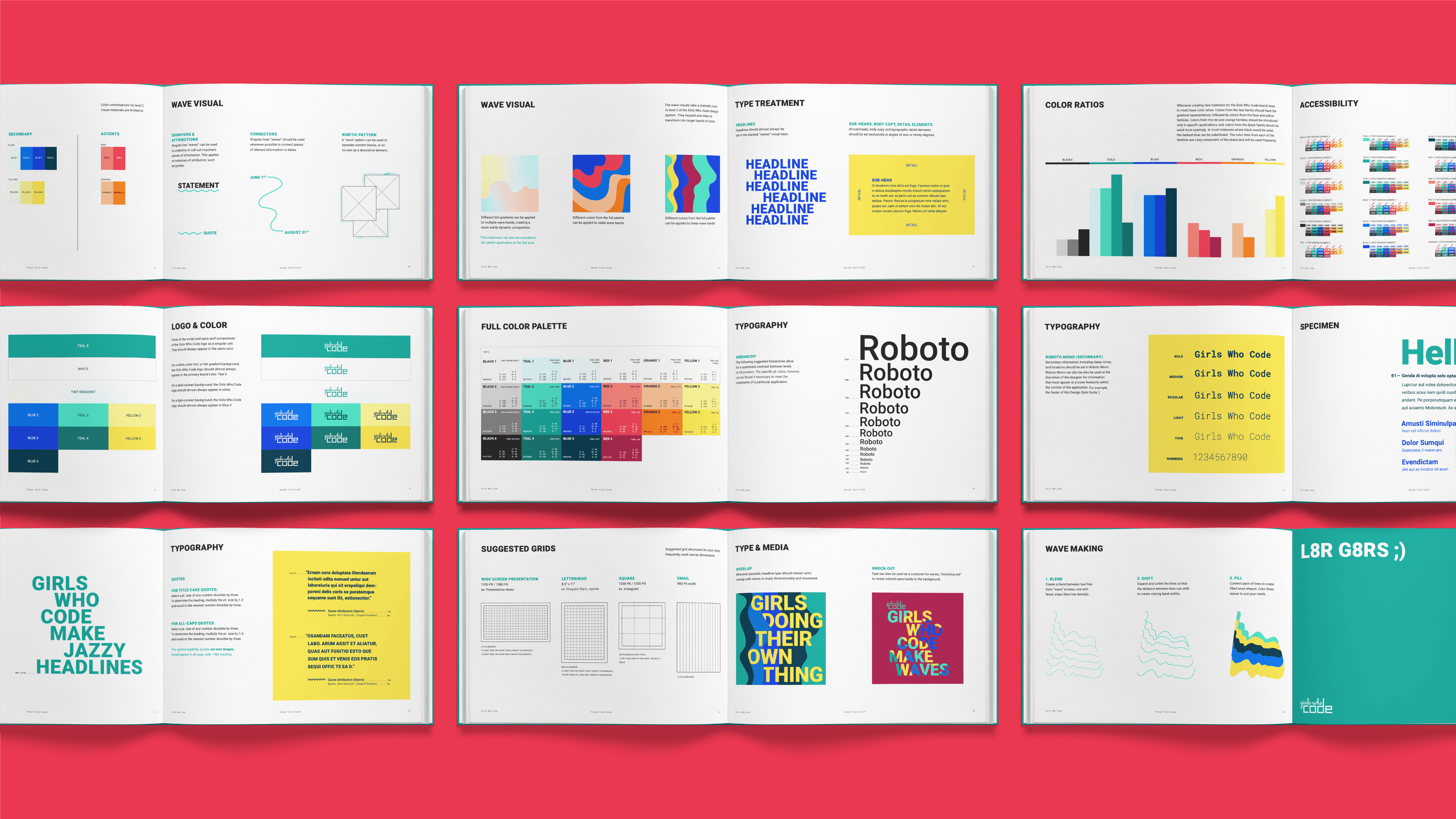
An open book lays flat on a red background, displaying various colorful pages with design elements. Pages include typography guides, color palettes, visual charts, accessibility tips, and sample layouts. The design is clean and modern, with a focus on clarity.
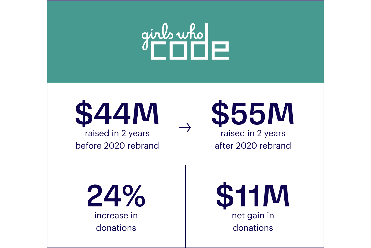
Infographic showing "Girls Who Code" logo and data: $44M raised in 2 years before 2020 rebrand, $55M raised in 2 years after, with a 24% increase and $11M net gain in donations.
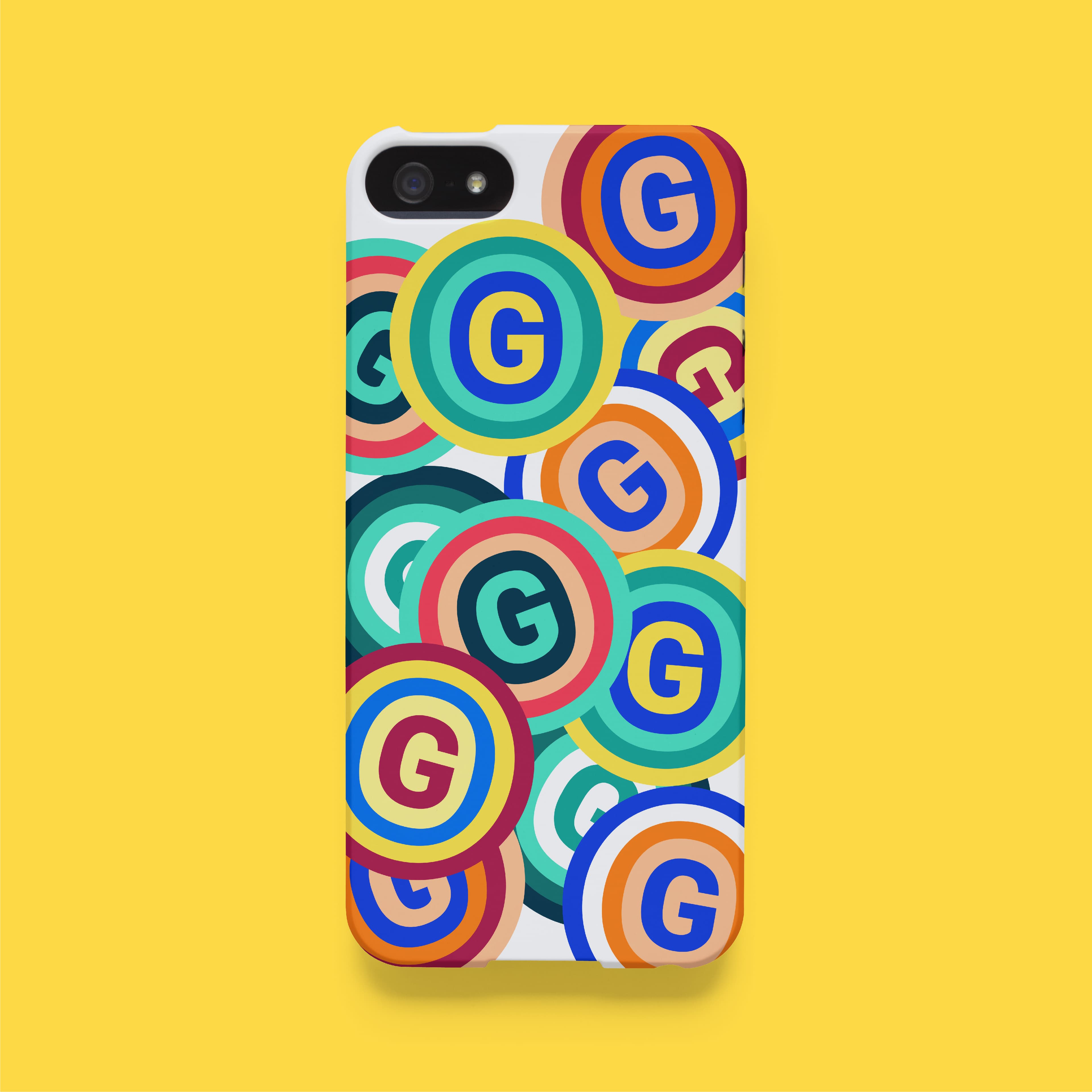
A smartphone with a case featuring a pattern of colorful concentric circles, each with a prominent "G" in the center. The background is yellow, highlighting the vibrant design of the phone case.

Girls make waves

We anchored the visual system in a narrative that speaks to the core goals and values of Girls Who Code: waves of momentum, waves of progress, waves of change. A visual interpretation of the shape of code lines written in a scripting window, it is also a metaphor for the power, strength, and resilience of a new generation of young women and girls coming together to effect positive change in the world.
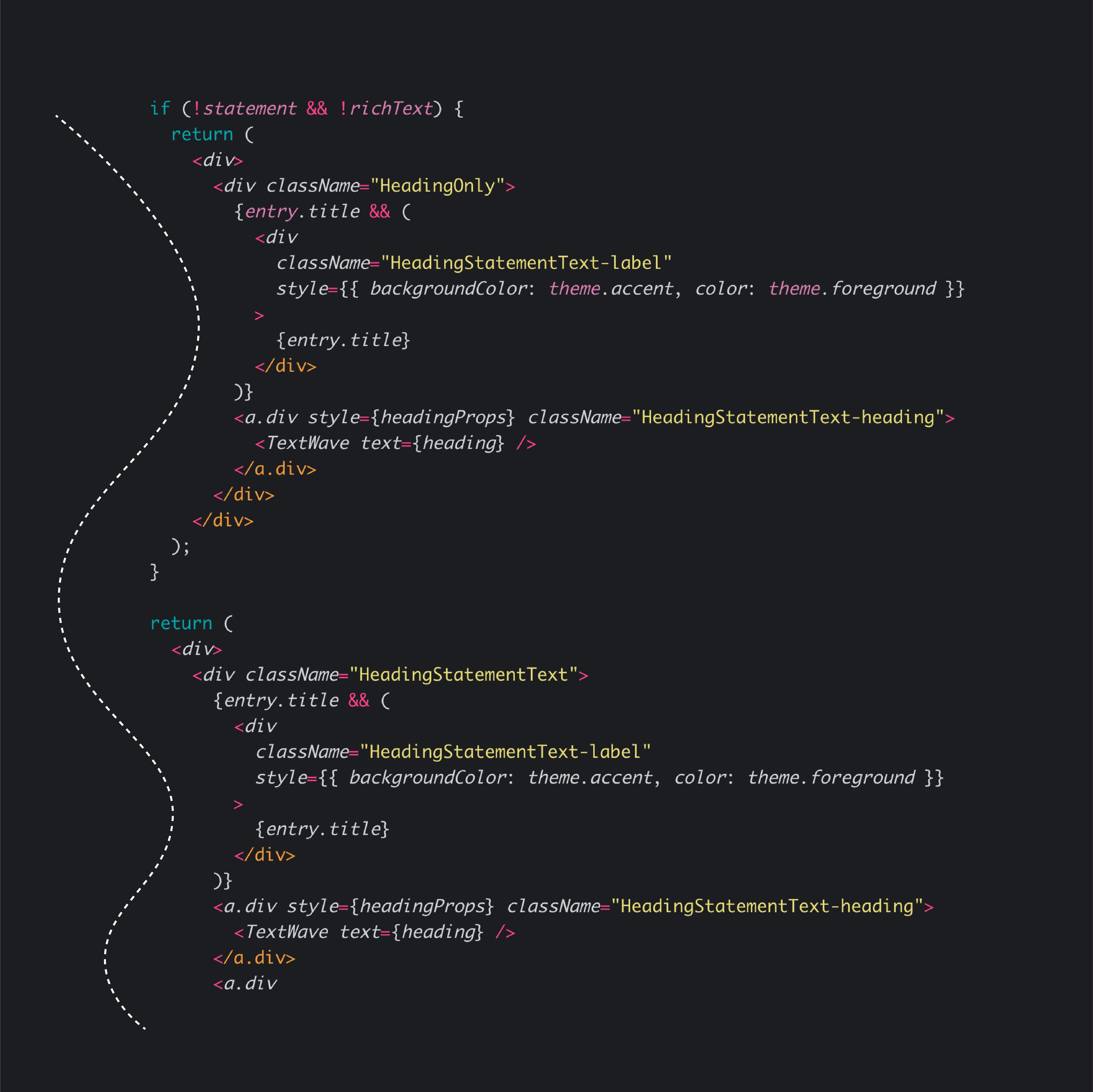
A snippet of JavaScript code using React, which includes conditional rendering. If both `!statement` and `!richText` are true, the code returns a `div` with components for `HeadingOnly`. Otherwise, it returns a `div` with components for a heading statement and possibly text.
I really like the starting point of this and how it was interpreted in not just one single graphic treatment but six different ones, giving the identity a lot of flexibility all while building on a single, core idea.
Armin Vit
Brand New

A quirky website for curious minds

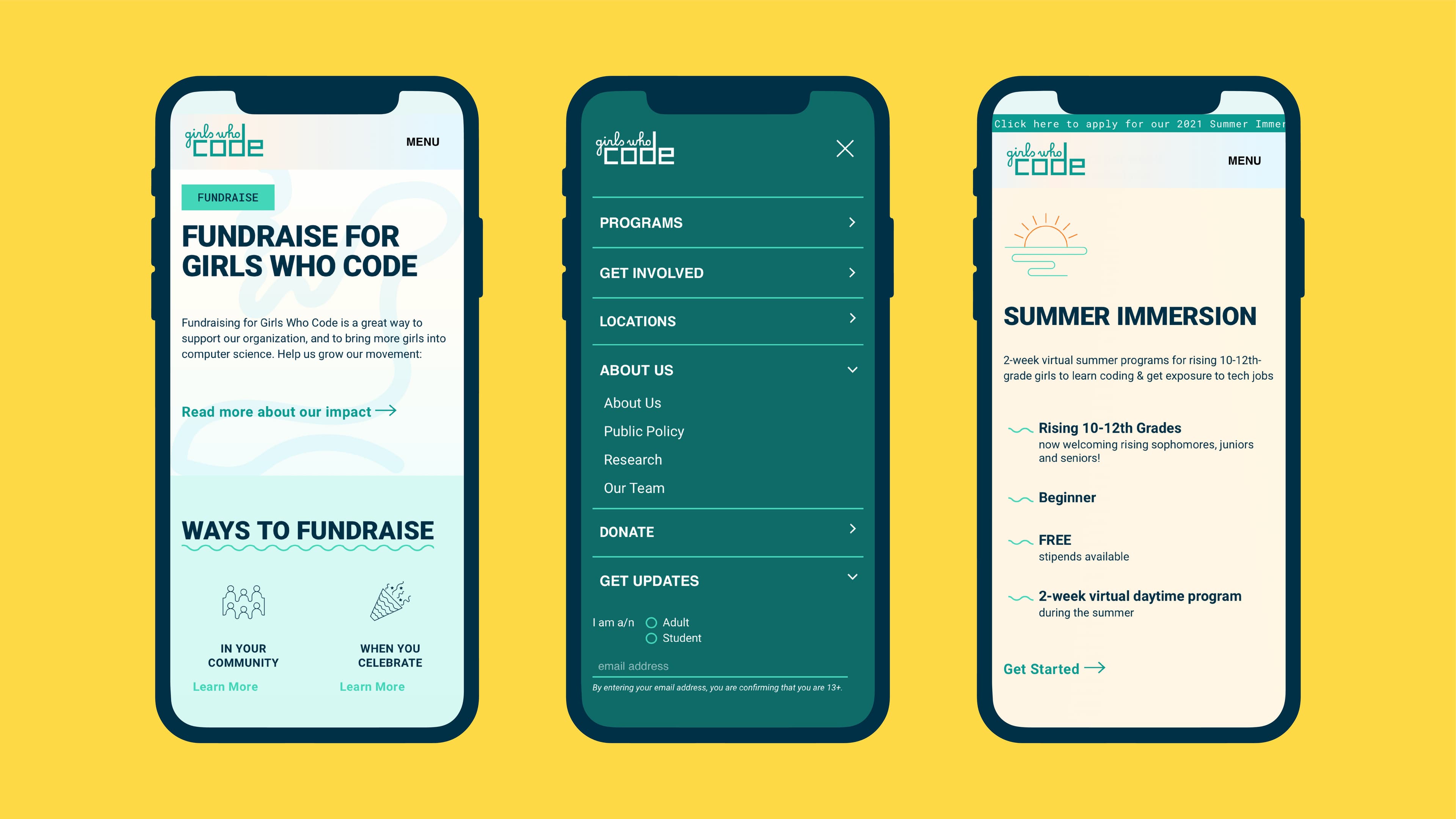
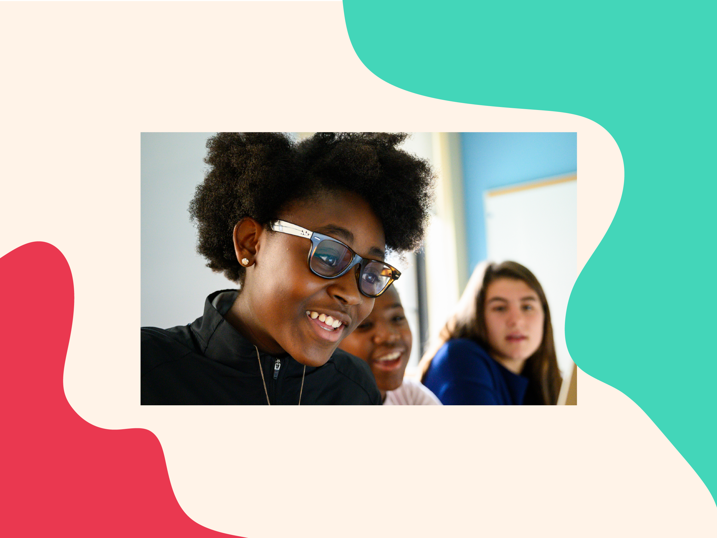
We prioritized the perspectives of GWC’s unique audiences, from corporate stakeholders to young women, in developing a user experience that is exciting, welcoming, and infinitely more navigable. The new action-oriented website is brimming with energizing UI animations and photography that shows girls learning and exploring, with wave motifs creating surprising shapes and gradients throughout. With clearly defined user journeys and conversion-focused narrative structures, the Girls Who Code site now has the muscle to support—and grow— its huge global community.

Three smartphones displaying different screens of the "Girls Who Code" fundraising and program information. The left screen highlights fundraising details, the center screen shows a navigation menu, and the right screen details the summer immersion program for 10th-12th graders.
Three cloud-shaped icons are displayed on a pastel background. The yellow icon contains a circuit design, the blue icon shows a web page, and the orange icon features a sun partially set over a horizon.
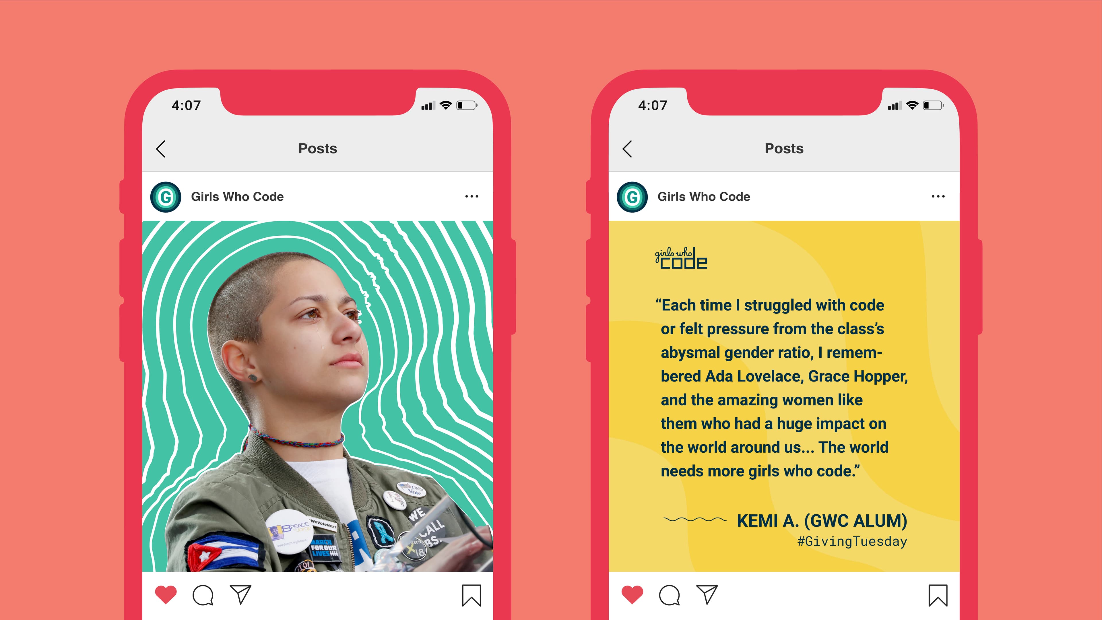
Two smartphone screens display Instagram posts by "Girls Who Code." The left post shows a confident person with short hair and a jacket with many patches. The right post features a quote from Kemi A., a Girls Who Code alum, about the importance of more girls learning to code.

Project Credits

Ready to unlock the potential of your nonprofit's brand?
Reach Out