Nonprofit Brand Score

Created by Hyperakt based on decades of experience working with nonprofits, this is the benchmark confidence in your brand.
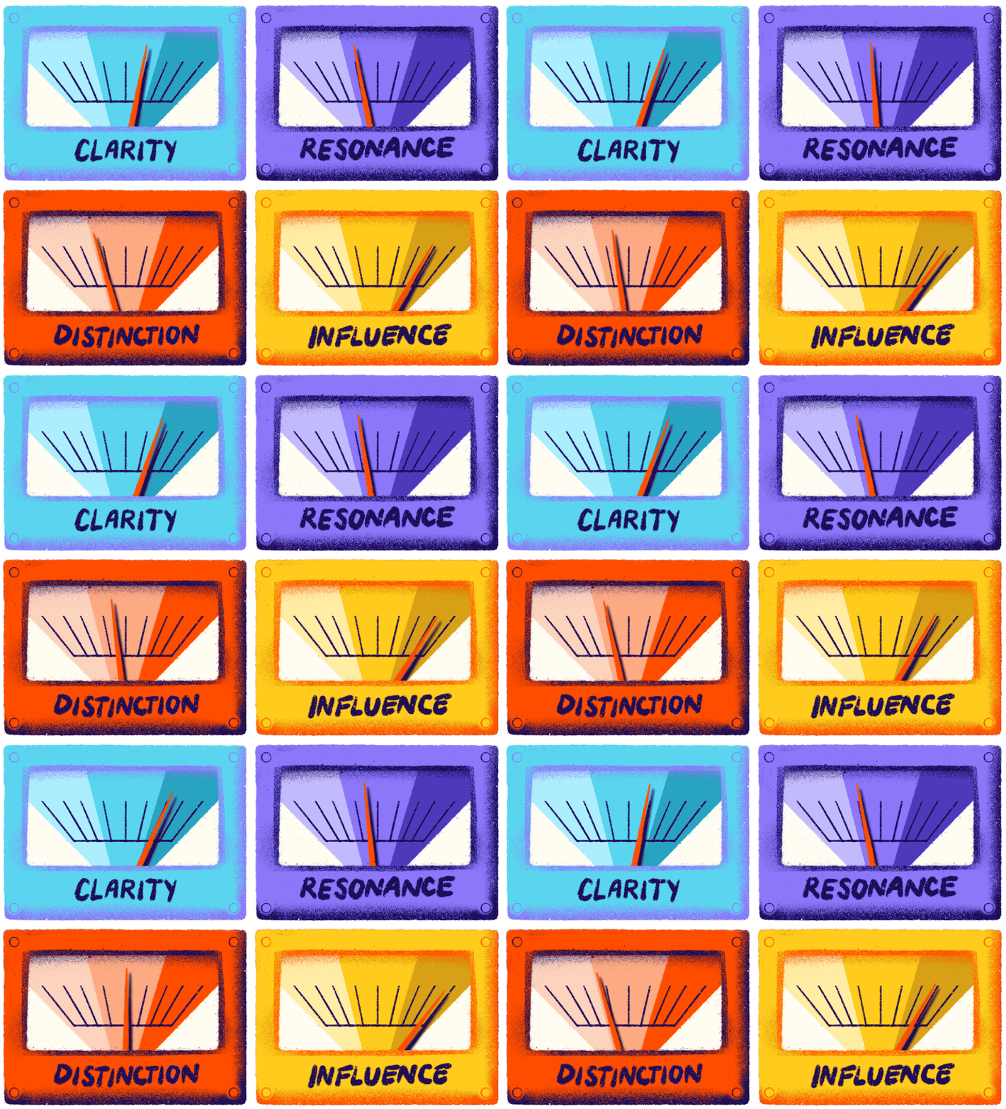
Four colorful gauges labeled "Clarity," "Resonance," "Distinction," and "Influence," each with a needle pointing right, indicating measurement or levels. The gauges are blue, purple, orange, and yellow, respectively.

Uncover weaknesses in Clarity, Resonance, Distinction, and Influence so you can leverage your brand with courage to propel your mission forward. Take 5 minutes to answer the 16 questions below and you’ll get results you can share with colleagues immediately. Learn more about how it works.

An orange square with no other elements or distinguishing features. The entire image is a flat, solid color.Approachability

Our official brand language (mission statement, about us, boilerplate, etc.) is written in plain words, with minimal jargon or technical terms, and is easy for a wide range of audiences to understand.

Completely Disagree
Neutral
Completely Agree

A bold, stylized orange percentage symbol. The diagonal line is thick and slightly rough in texture, and the two round dots at each end are solid and well-defined. The background is clear.Simplicity

It's easy to explain our purpose and work to people outside of our organization like our partners, peers, and community members.

Completely Disagree
Neutral
Completely Agree

Abstract depiction of four orange spray-painted oval shapes arranged in a grid pattern on a black background, with a slight overlap and a gradient effect, creating various textures and shades within each shape.Standardization

I have access to standardized and documented brand language that communicates the basics of who we are, what we do, and what makes us uniquely valuable to our sector.

Completely Disagree
Neutral
Completely Agree

An image consisting entirely of a solid bright orange color with no visible patterns, text, or shapes.Consistency

Our people generally use language consistent with our guidelines when describing our organization.

Completely Disagree
Neutral
Completely Agree

A simple orange arrow on a white background. The arrow starts with a loop before pointing upwards and to the right. The loop and path before the arrowhead create a smooth, curving line.Purpose

Our organization’s purpose (why we exist) & promise (what we deliver) are easy to understand.

Completely Disagree
Neutral
Completely Agree

An orange illustration depicting an abstract orbital pattern with three circular shapes connected by three elliptical orbits, each encompassing the central circular shape.Positioning

Our organization’s positioning is clear. I know what makes us different from others and uniquely valuable to our sector.

Completely Disagree
Neutral
Completely Agree

An orange silhouette of a pointed rocket with two small fins at the base is depicted against a white background. The rocket design is simple and features no additional details or markings.Authenticity

Our brand feels like an authentic and accurate reflection of our people.

Completely Disagree
Neutral
Completely Agree

An abstract design featuring vivid orange paint splatters on a black background. The splatters vary in shape and size, with some elongated and others more rounded. The overall effect is dynamic and striking.Affinity

I believe in our organization and what it stands for.

Completely Disagree
Neutral
Completely Agree

A solid, irregularly shaped bright red-orange oval with rough, jagged edges, and some scattered small spots of varied intensity throughout the shape. The background is white, making the vivid color of the oval stand out prominently.Memorability

Our brand has a unique look and feel when compared to our peers and competitors.

Completely Disagree
Neutral
Completely Agree

An abstract orange design featuring a large solid oval in the upper left, connected by a dotted line to two concentric, uneven rings in the lower right, forming a dynamic and artistic composition on a white background.Relevance

Our brand feels relevant to the conversations and trends in our sector.

Completely Disagree
Neutral
Completely Agree

An abstract digital design featuring bold, irregular orange shapes and splatters on a white background, creating an impression of dynamic movement and fluidity.Adaptability

Our brand feels consistent across communication channels (digital, social, print, etc).

Completely Disagree
Neutral
Completely Agree

An abstract illustration of a half-circle shape in bright orange with black, irregular zigzag patterns inside the lower half of the semicircle. The design is bold with a strong contrast between the orange and black colors.Representation

Our brand’s visuals represent the people at the center of our work with dignity and agency.

Completely Disagree
Neutral
Completely Agree

An abstract image featuring three orange oval shapes stacked vertically, with the largest at the bottom and the smallest at the top. The shapes are solid and slightly irregular, resembling a simplistic depiction of a snowman. The background is white.Trust

Our brand inspires trust from your audiences, stakeholders, and the wider sector.

Completely Disagree
Neutral
Completely Agree

A stylized image of two orange kidney bean shapes. The larger shape is positioned to the top right, while the smaller shape is to the bottom left, creating a dynamic and abstract composition against a plain background.Magnetism

Our brand paints a powerful vision for a future that people want to be a part of.

Completely Disagree
Neutral
Completely Agree

An illustration of two curved orange arrows forming a circle and pointing at each other, indicating a cycle or rotation.Connection

Our brand helps attract partners and catalyze conversations that further the impact of our work.

Completely Disagree
Neutral
Completely Agree

An abstract digital painting featuring large, textured orange brushstrokes stacked vertically, creating a dynamic sense of movement. The brushstrokes taper towards the top and bottom, giving the composition a balanced yet energetic feel.Engagement

Our brand has directly or indirectly improved key metrics such as donations, grant applications, mailing list signups, volunteering, and/or credibility in the halls of power.

Completely Disagree
Neutral
Completely Agree
0% Complete. This will be quick.
Ready to unlock the potential of your nonprofit's brand?
Reach Out