The New York Community Trust
A refreshed brand identity to mark 100 years as a through line improving the lives of New Yorkers.

Background
The New York Community Trust is a grantmaking organization that helps improve quality of life for all New Yorkers. The Trust is the community foundation for New York, serving the eight-county region of New York City, Westchester, and Long Island.


The challenge
As their centennial approached, The New York Community Trust saw the opportunity to re-energize their donors and attract new ones with a refreshed brand identity that celebrates all they’ve accomplished in 100 years.


The opportunity
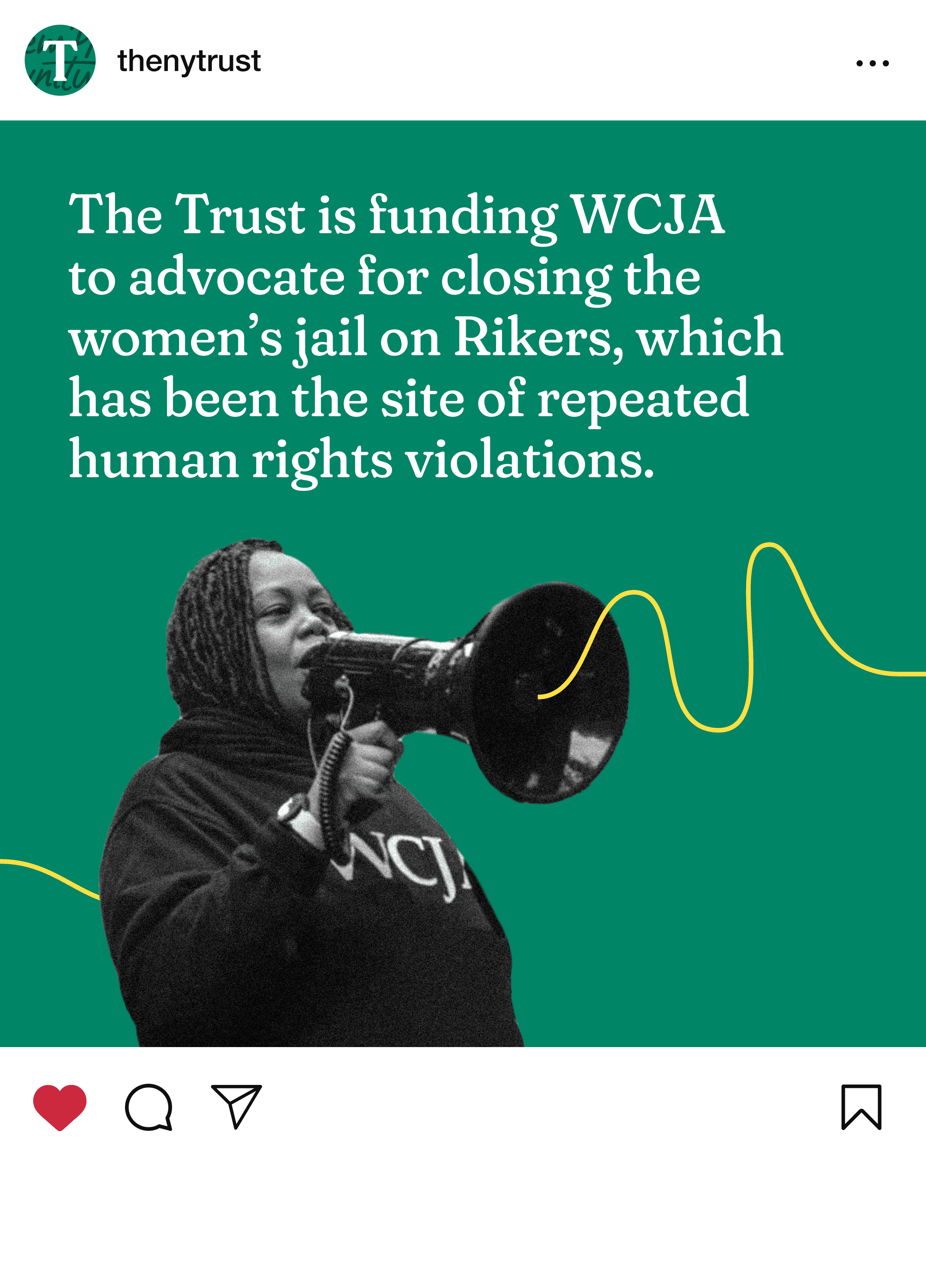
The Trust had the opportunity to embrace a fresher, more modern brand identity. A rebrand could show all New Yorkers that The Trust is here to help build healthy, vibrant, and equitable communities throughout Greater New York today and forever.
A strong brand idea
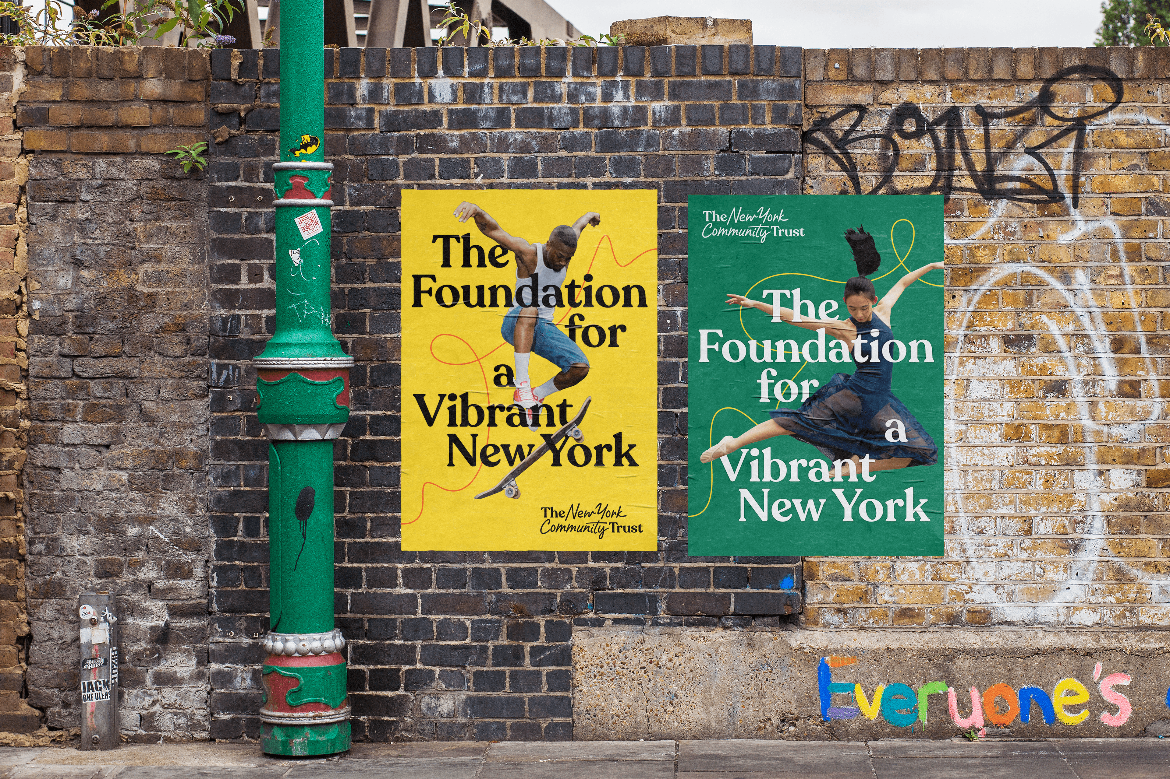
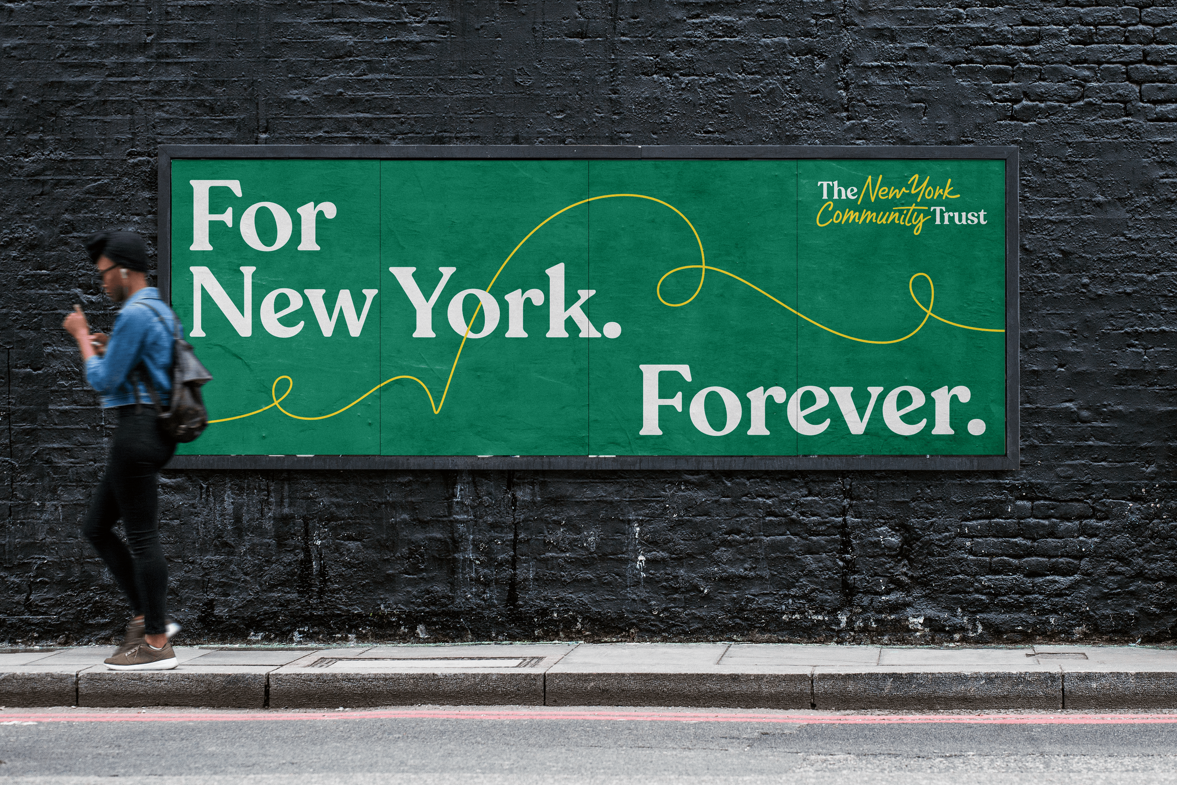
The Trust’s new identity captures the unique role they’ve played for nearly 100 years. Through New York’s greatest triumphs and challenges, The Trust has been there, and will continue to be there; a through-line from past to future, and a beating heart for a beloved region forever.
A sharper verbal identity
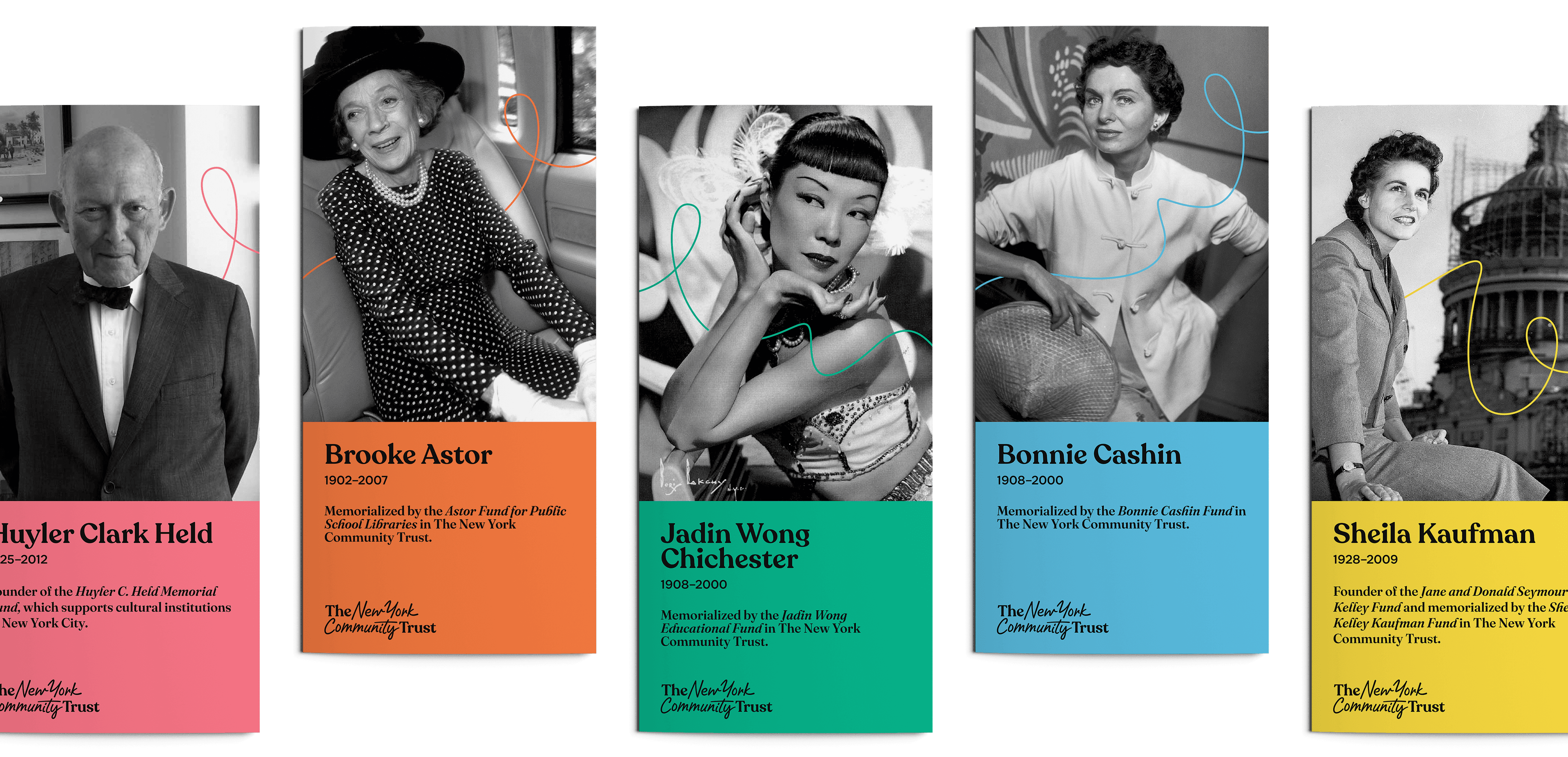
To reflect this sharper brand idea, we refreshed their brand values, mission and vision: creating clearer, more distinct language to tell their story.
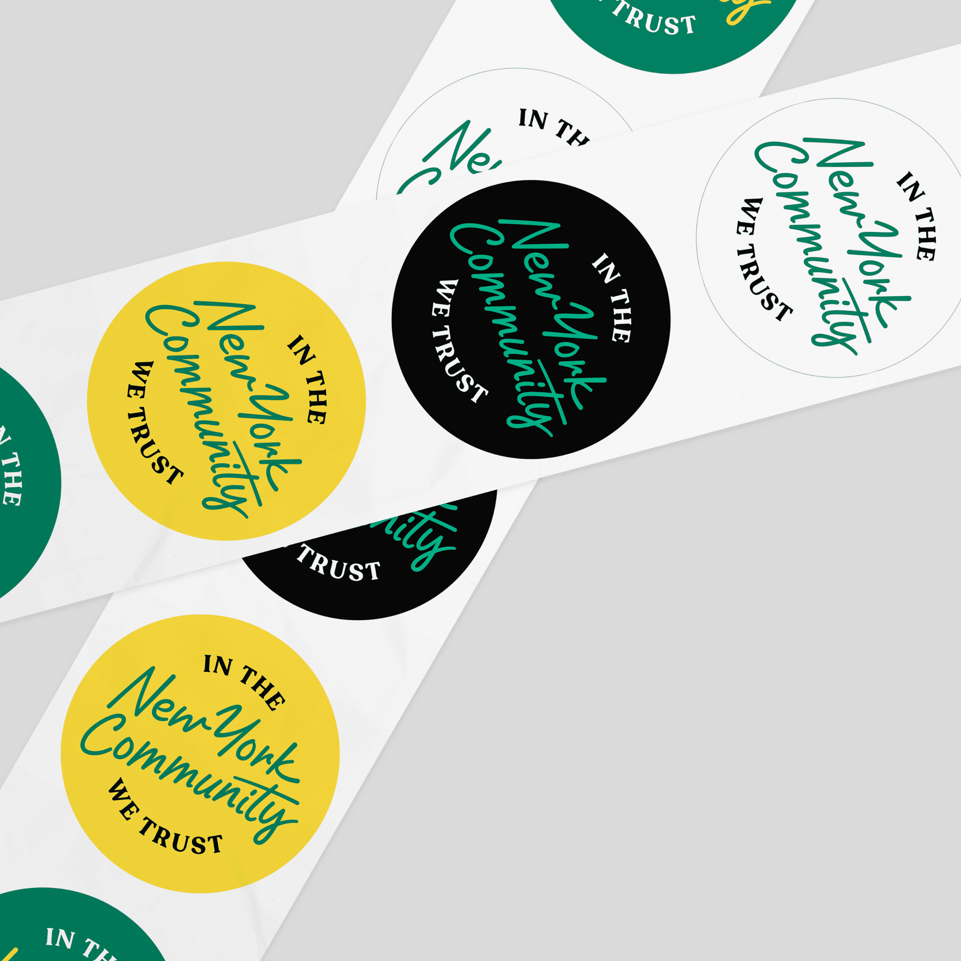
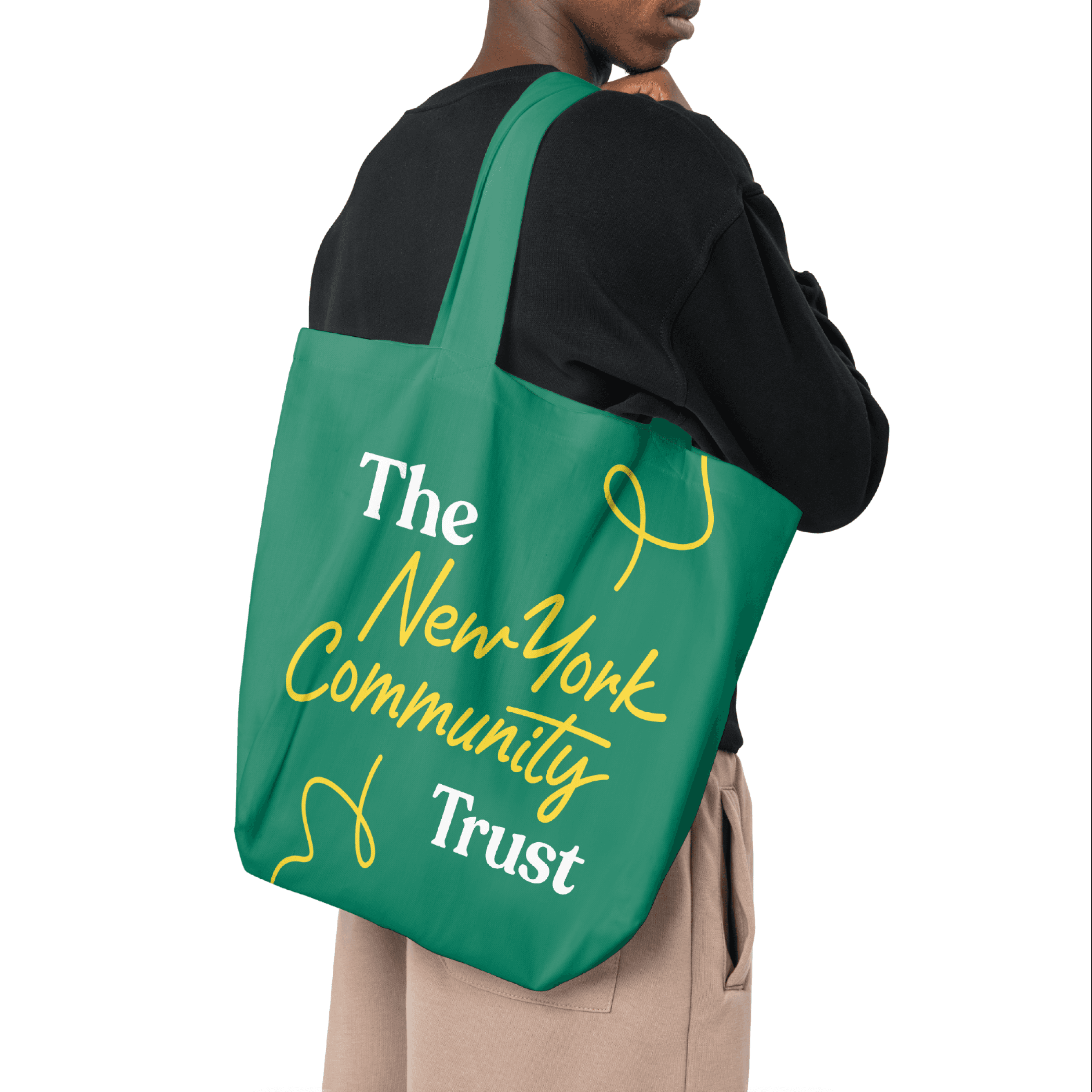
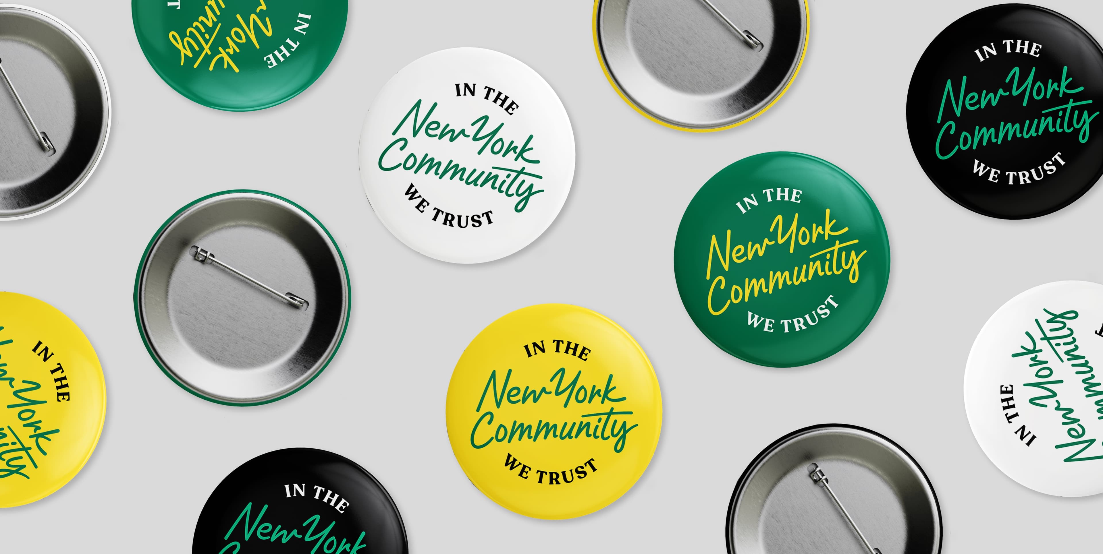
A simpler architecture
With multiple affiliates and various programs in play, The Trust needed a simpler way forward. To create a more flexible logo system, we leveraged a hybrid model with a short-hand: building equity in their shorter-form name, “The Trust,” that was already much-loved by staff and other stakeholders.

An identity with a through line
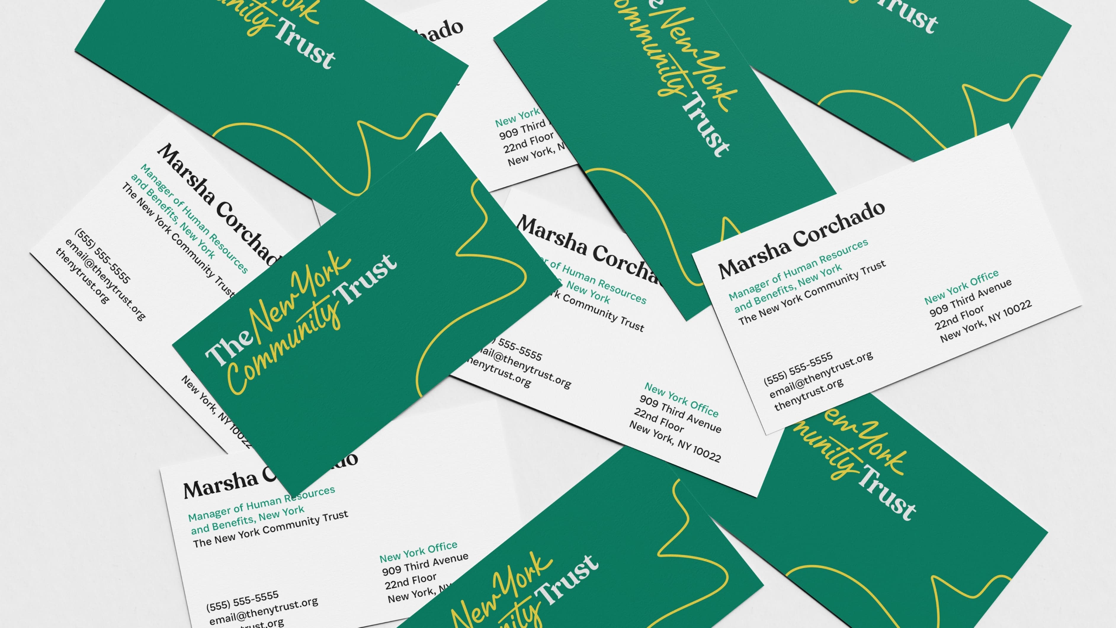
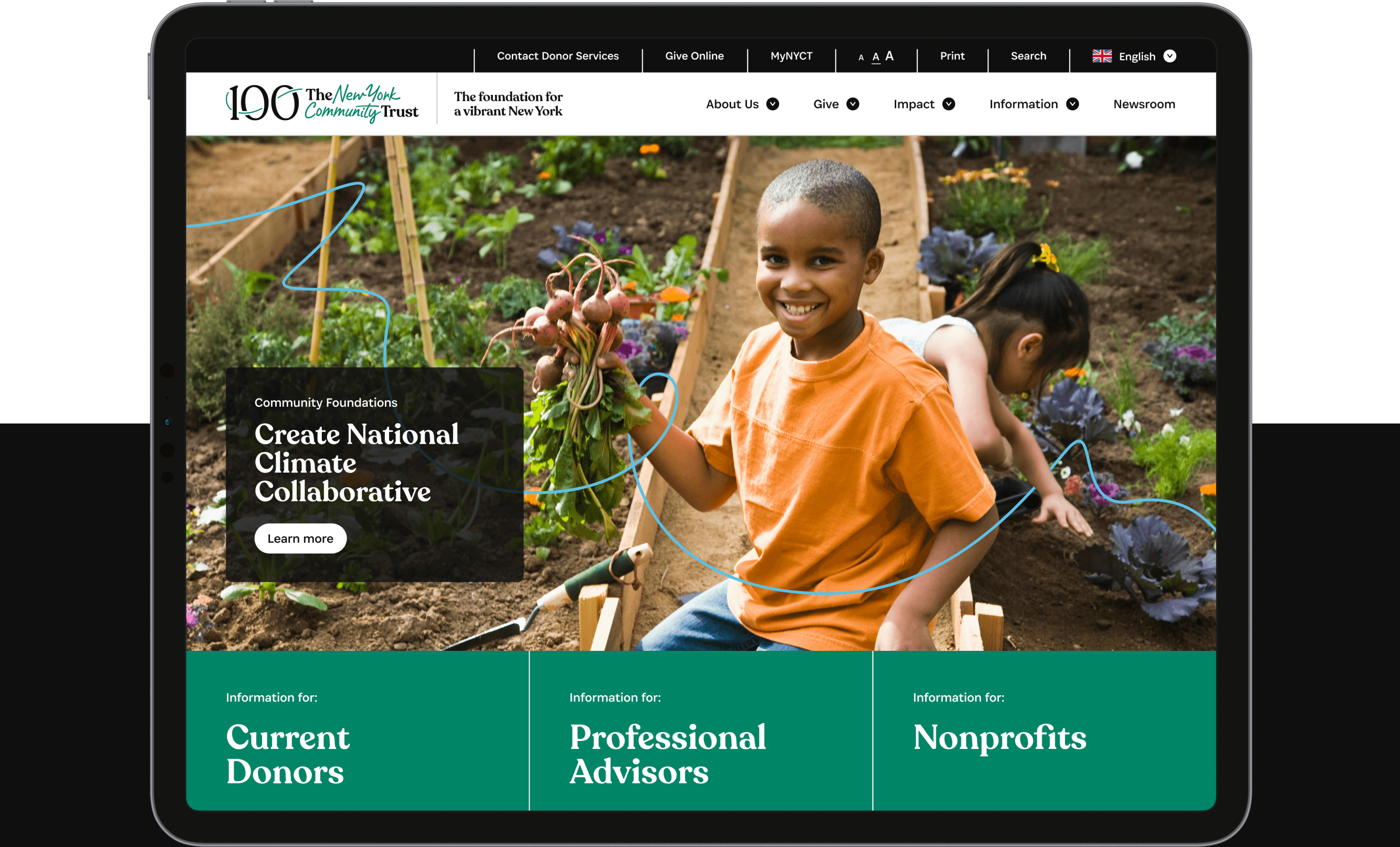
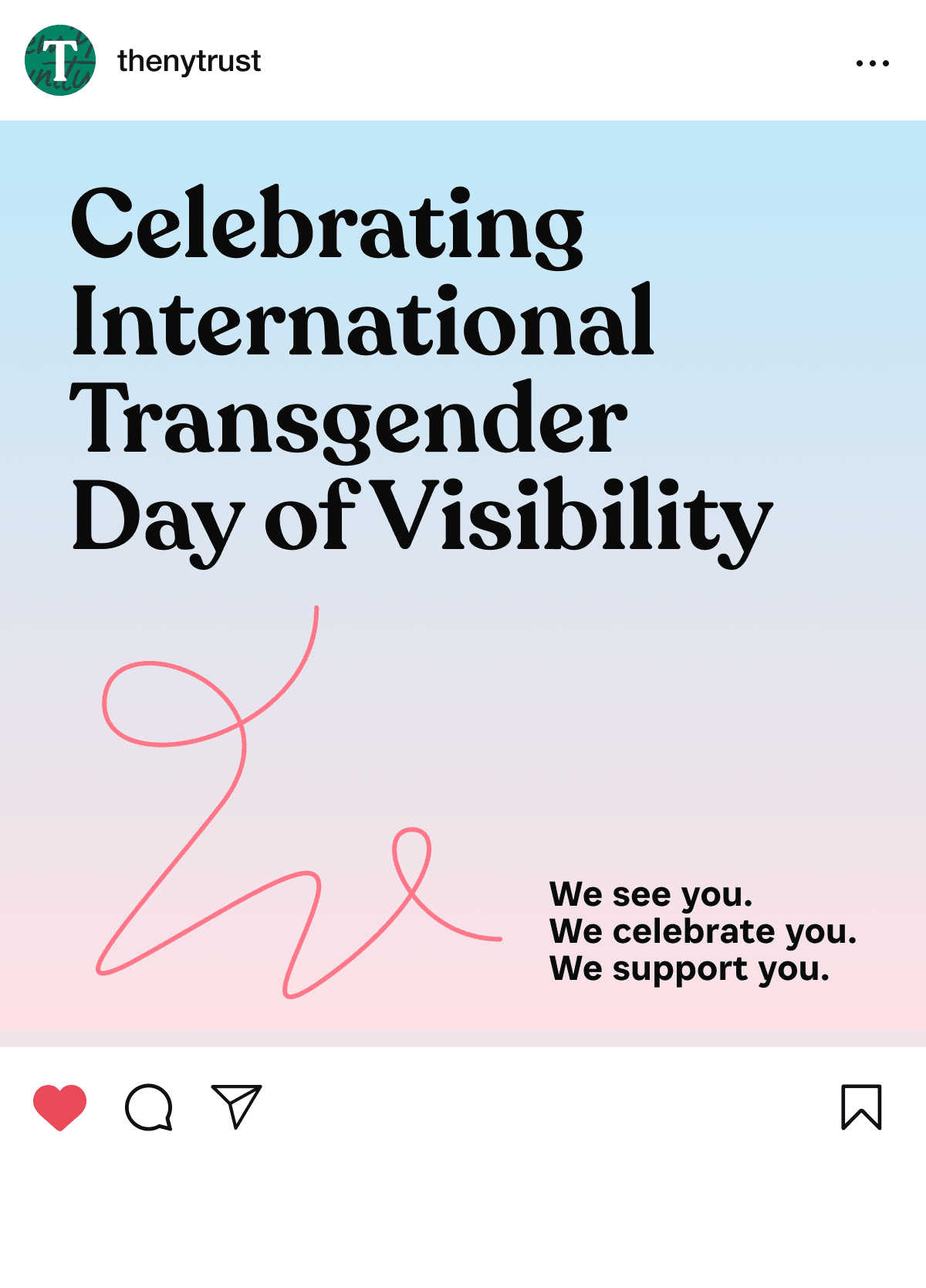
The Trust’s brand represents continuity, resilience, and impact. It symbolizes their enduring commitment to the region and its people with an ever present, continuous line that organically responds to its environment. It is a visual reminder that The Trust exists to shape a better future for New Yorkers.



A dynamic logo
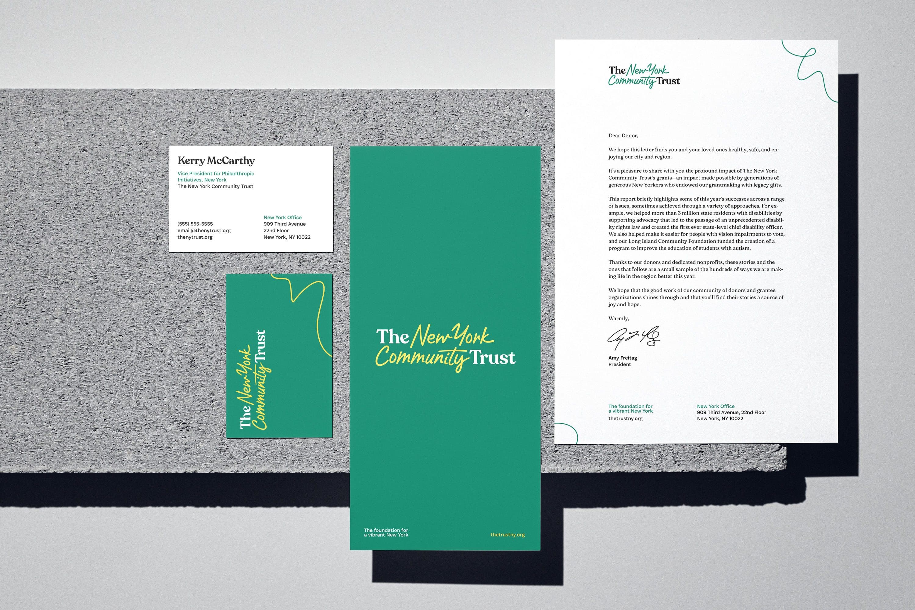
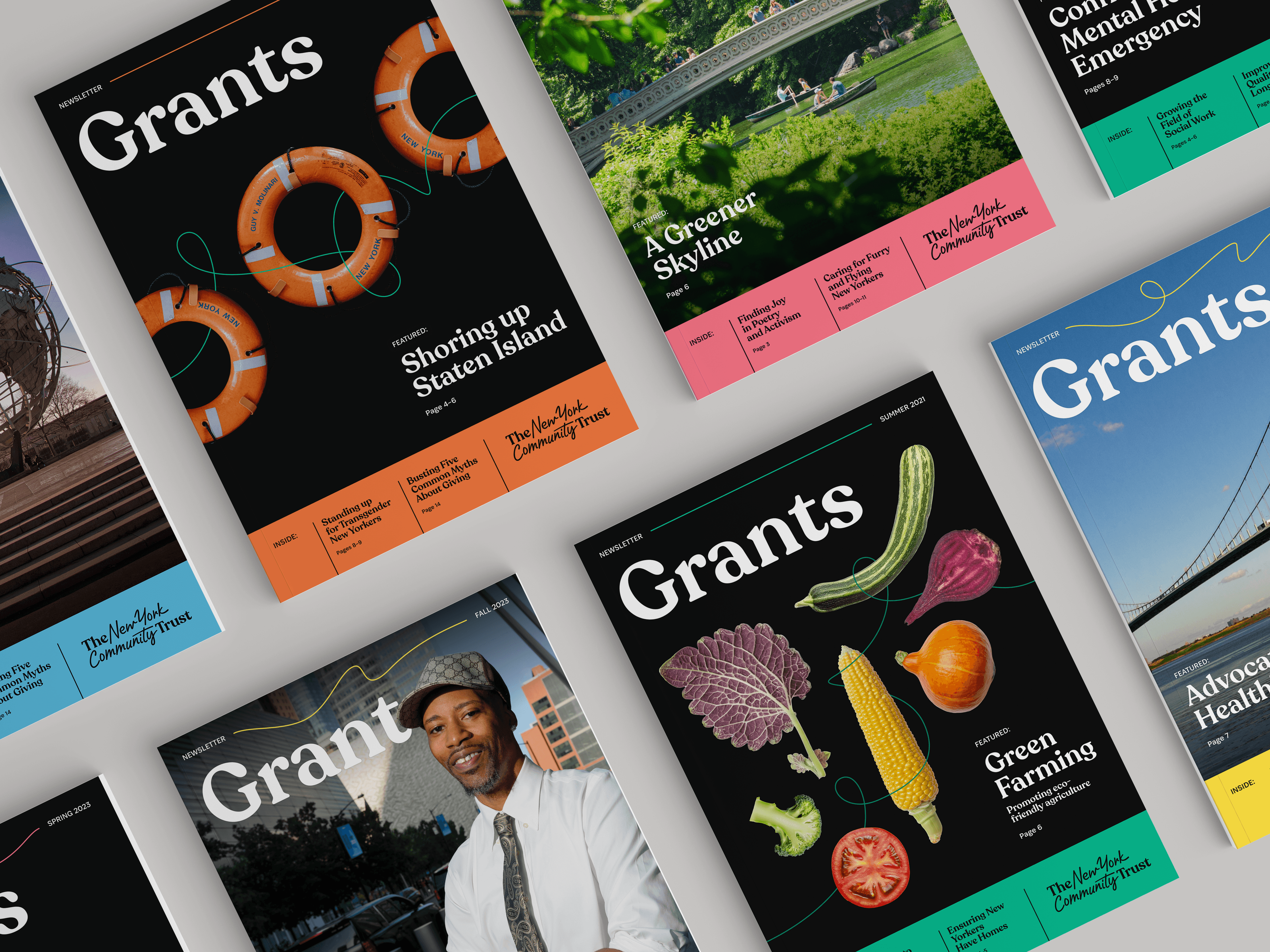
The Trust’s new logo captures this through-line concept: the placement of the serif type acts as “bookends” for the handwritten script which serves as a through-line between them.
A unified brand
The new visual identity resolves the tension of having separately branded branches for the Long Island Community Foundation and the Westchester Community Foundation. Our brand strategy process revealed there was more strength in bringing everything together under one unified brand.
A 100 year celebration
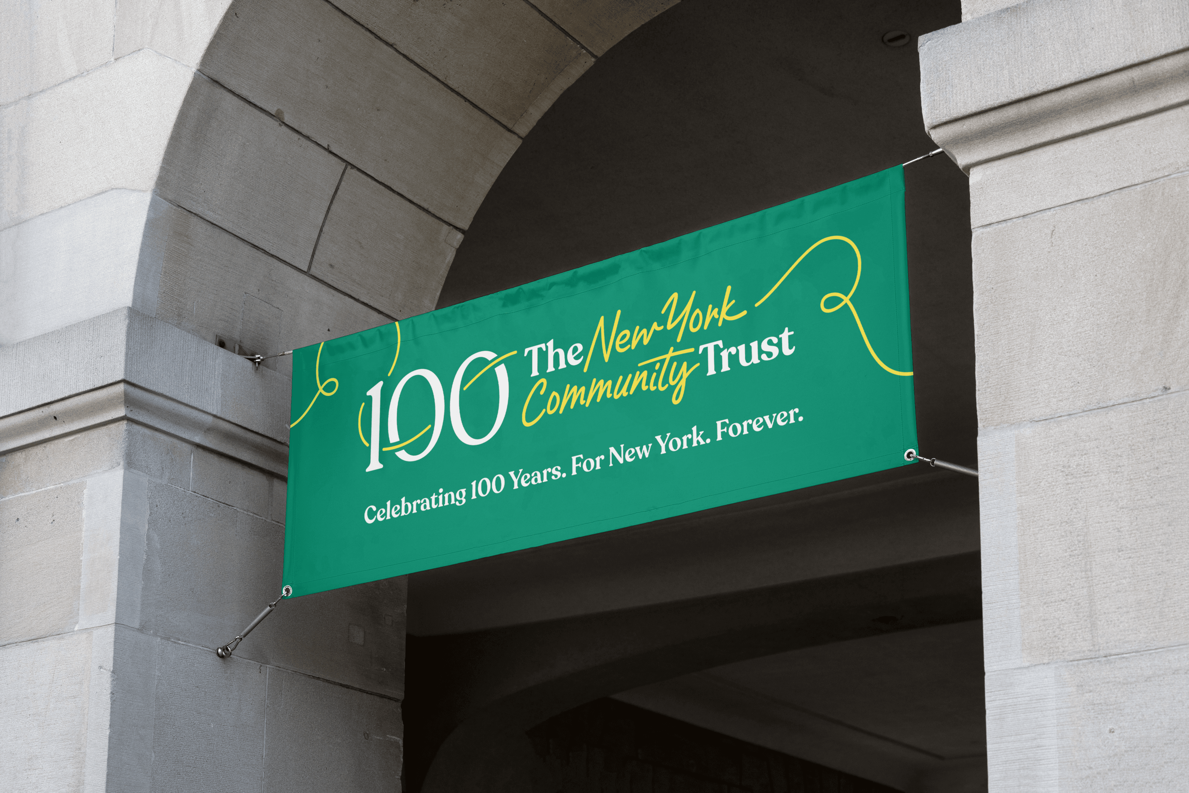
To properly mark The Trust’s centennial, we created celebration assets, including a celebratory logo – reflecting how they have been a throughline for New York for 100 years.


Iconography
The through line concept is embedded in the suite of dozens of icons we developed for The Trust in order to codify the various ways people can give.
News & Recognition
- Hyperakt Wins Bronze at the 2024 Transform Awards for Rebranding the Ford Foundation and The New York Community TrustRead More
- The New York Community Trust's New Brand is Featured in Print MagazinePRINT Magazine
- The New York Community Trust's New Brand, Designed by Hyperakt, Featured in BrandNewBrandNew
Project Credits
- Delaney Weber
- Deroy Peraza
- Sana Masud
- Pauline Shin
- Julia Zeltser
- Domenica Ceballos
