Work

The New York Community Trust

A refreshed brand identity to mark 100 years as a through line improving the lives of New Yorkers.

The New York Community trust wordmark

Background

The New York Community Trust is a grantmaking organization that helps improve quality of life for all New Yorkers. The Trust is the community foundation for New York, serving the eight-county region of New York City, Westchester, and Long Island.

A collage with six images: group of people with rainbow flags, a musician playing the saxophone, people in kitchen uniforms preparing food, a person writing on paper with children, a person wearing a flowing outfit standing on a rooftop, and a person in a blue shirt and jeans.
A horizontally tiled image showing a snow-covered basketball court, a snowy road flanked by trees, the Statue of Liberty, a yellow taxi on a city street, autumn trees with colorful leaves, a calm river at sunset, and a lighthouse by the sea.

The challenge

As their centennial approached, The New York Community Trust saw the opportunity to re-energize their donors and attract new ones with a refreshed brand identity that celebrates all they’ve accomplished in 100 years.

A person wearing a hooded sweatshirt and sneakers is dancing against an orange background. Large text on the left reads "$3 Million," and smaller text on the right states, "In grants to 300 U.S. Performing artists impacted by Covid-19." The Instagram handle "thenytrust" is at the top.
An Instagram post by @thenytrust featuring a woman holding a megaphone. The text reads: "The Trust is funding WCJA to advocate for closing the women’s jail on Rikers, which has been the site of repeated human rights violations.
A woman in a hijab sings into a microphone while wearing headphones. Text on the image reads "Strengthen The Arts." The Instagram post is from the account "@thenytrust" and has a bright pink background with a red squiggly line connecting the microphone and headphones.

The opportunity

The Trust had the opportunity to embrace a fresher, more modern brand identity. A rebrand could show all New Yorkers that The Trust is here to help build healthy, vibrant, and equitable communities throughout Greater New York today and forever.

A strong brand idea

The Trust’s new identity captures the unique role they’ve played for nearly 100 years. Through New York’s greatest triumphs and challenges, The Trust has been there, and will continue to be there; a through-line from past to future, and a beating heart for a beloved region forever.

A series of four banners each features a black and white portrait of an individual with a colorful block of text below them. The banners include names and brief descriptions of Huyler Clark Held, Brooke Astor, Jadin Wong Chichester, Bonnie Cashin, and Sheila Kaufman.
Scattered business cards for Marsha Corchado, Manager of Fund Administration at The New York Community Trust. Cards feature contact information and a green backdrop with the organization's name in yellow.
A set of branded stationary including a business card, brochure, letterhead, and envelope for "The New York Community Trust". The color scheme consists of green and white with yellow accents and elegant typography.

A sharper verbal identity

To reflect this sharper brand idea, we refreshed their brand values, mission and vision: creating clearer, more distinct language to tell their story.

A set of round stickers with the phrases "In the New York Community We Trust" in various colors and fonts. The stickers feature black, white, yellow, and shades of green backgrounds and are arranged in a crisscross pattern on a light gray surface.
A person in a black shirt and beige pants carries a green tote bag with "The New York Community Trust" written in white and yellow text. The tote bag features a simple, stylish design with yellow cursive lines.
Several circular pins are spread out on a light gray surface. The pins feature texts in different colors and fonts, stating "IN THE New York Community WE TRUST." The pins come in various colors, including yellow, black, green, and white.

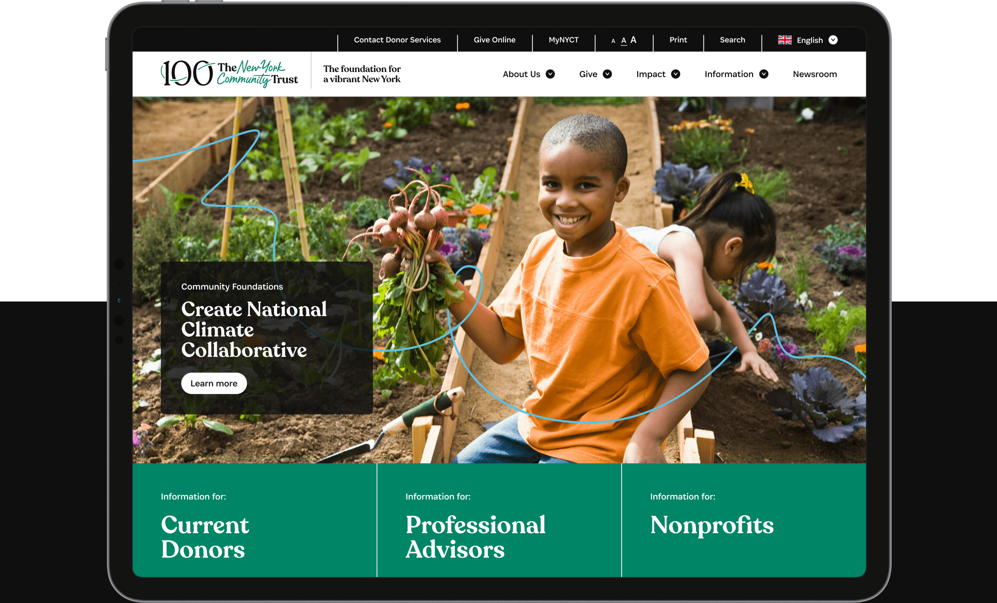
A simpler architecture

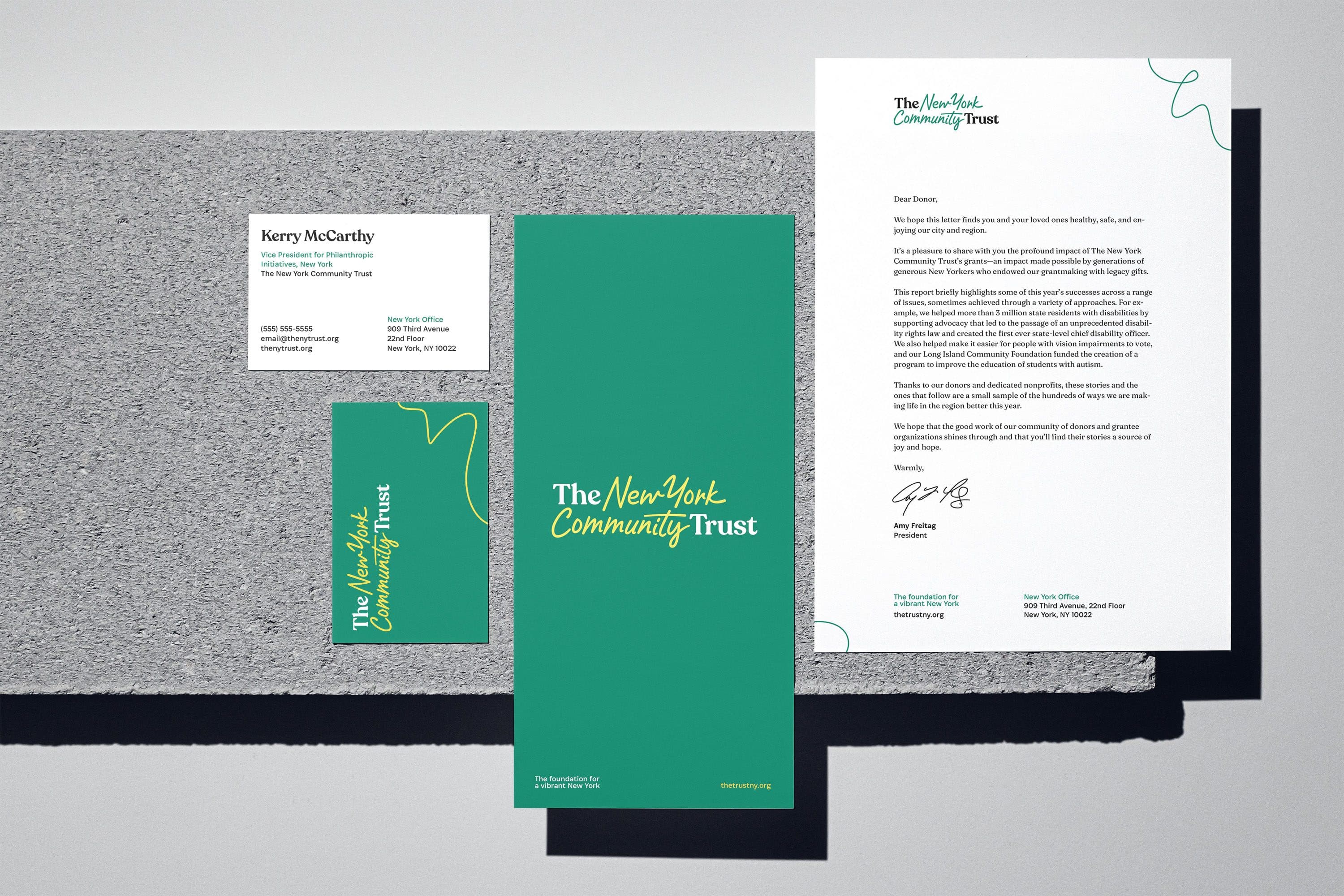
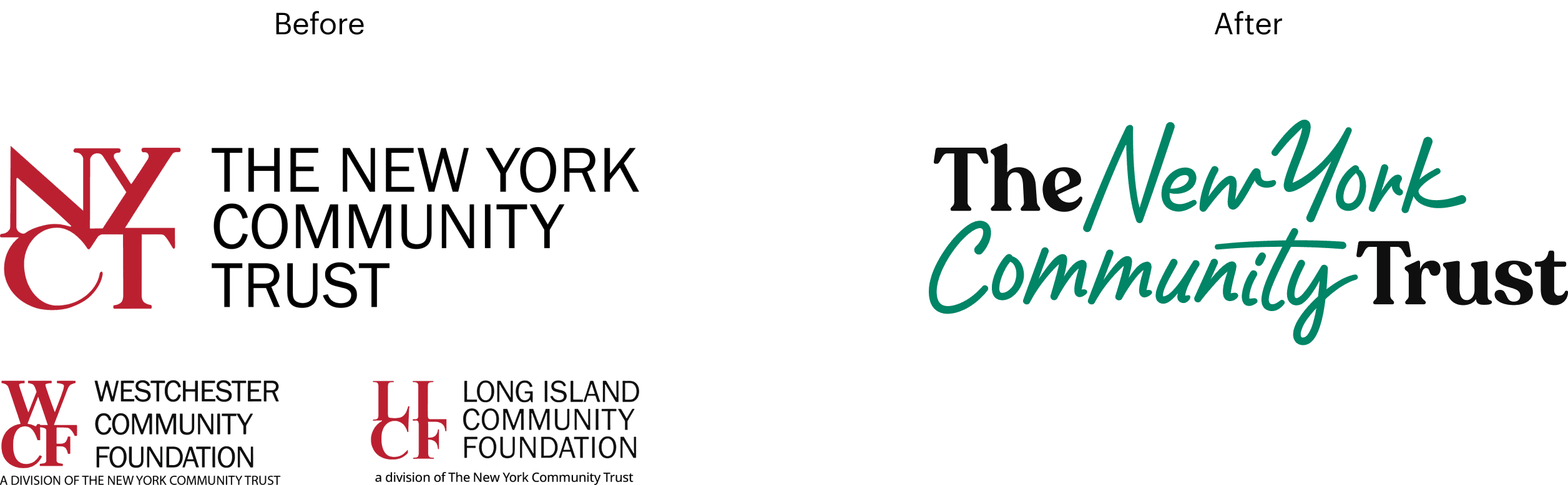
With multiple affiliates and various programs in play, The Trust needed a simpler way forward. To create a more flexible logo system, we leveraged a hybrid model with a short-hand: building equity in their shorter-form name, “The Trust,” that was already much-loved by staff and other stakeholders.

An identity with a through line

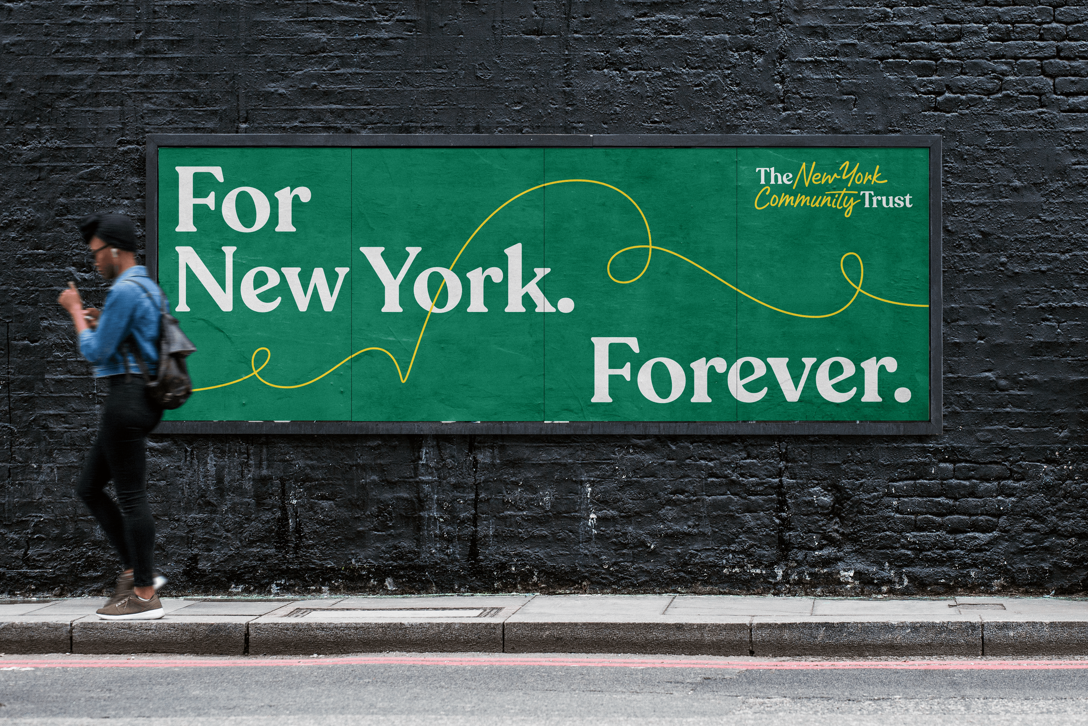
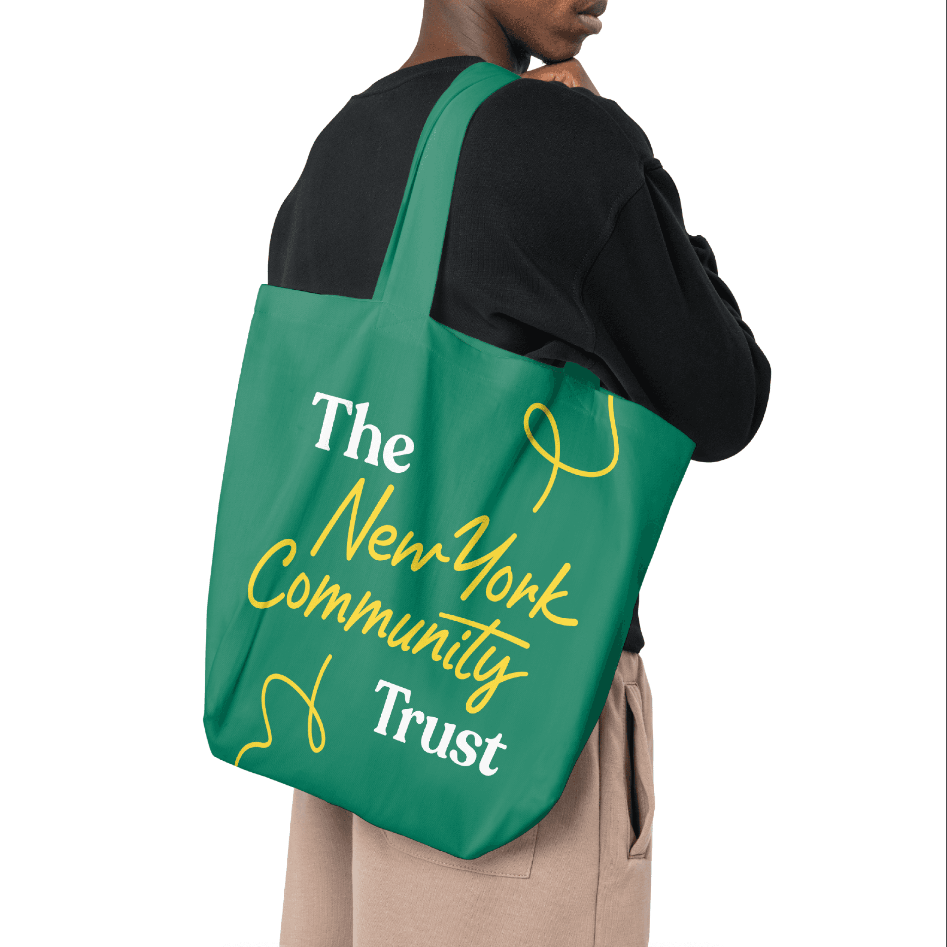
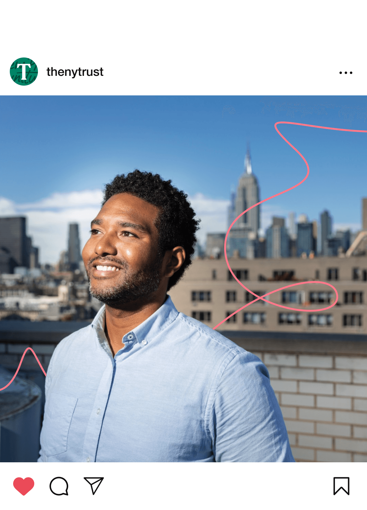
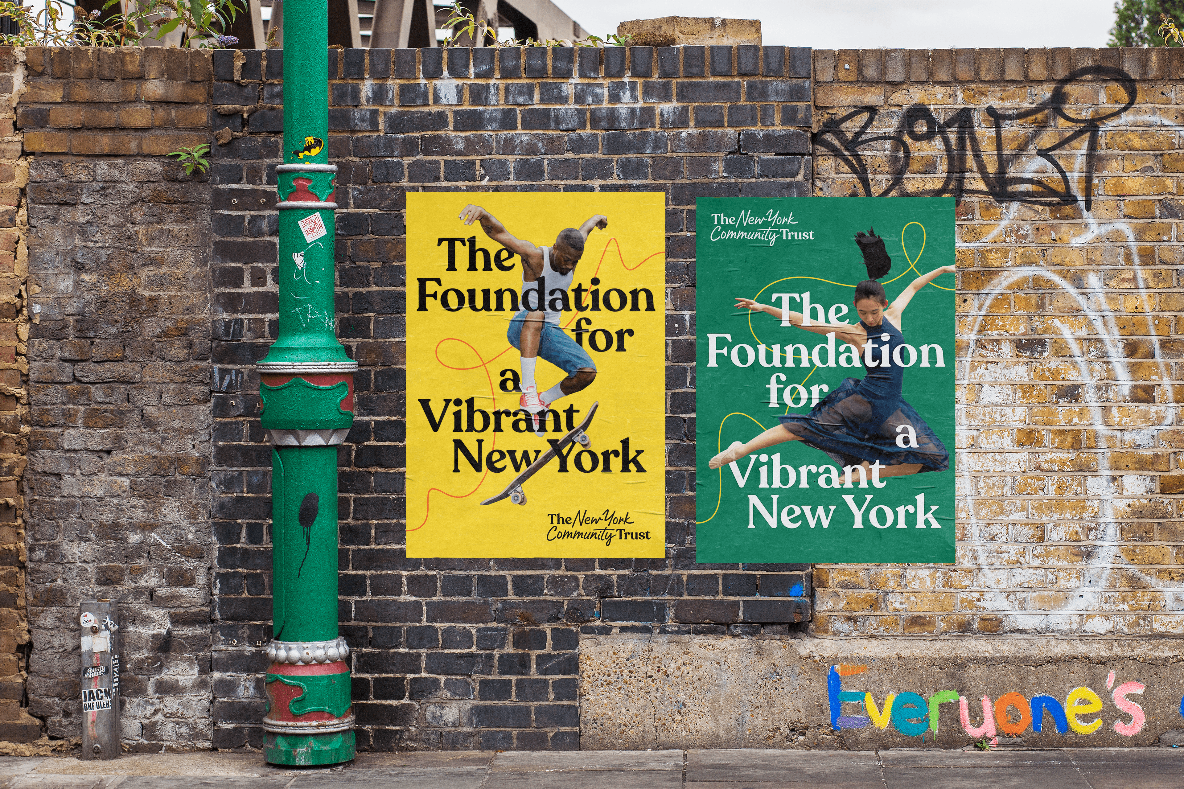
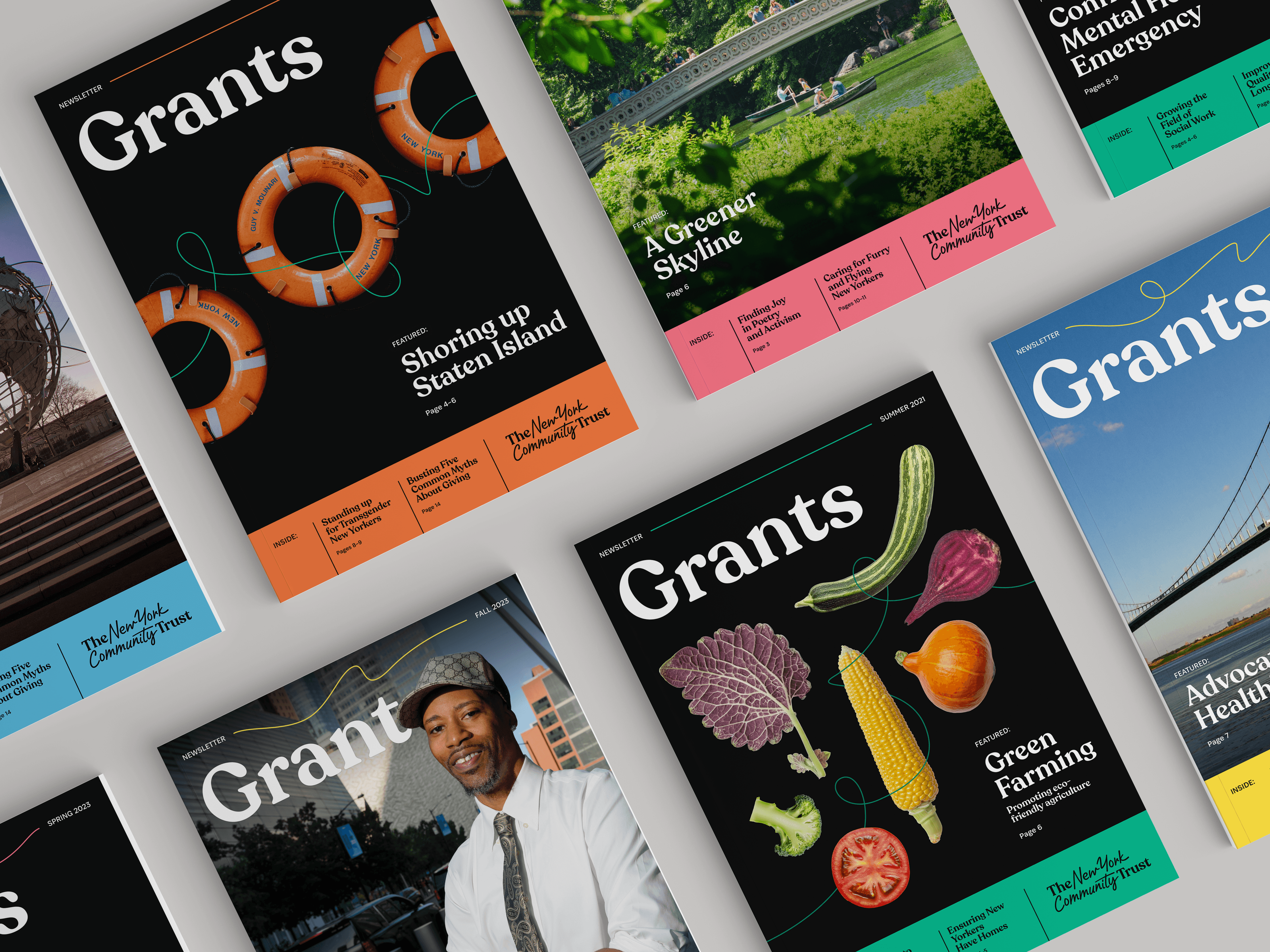
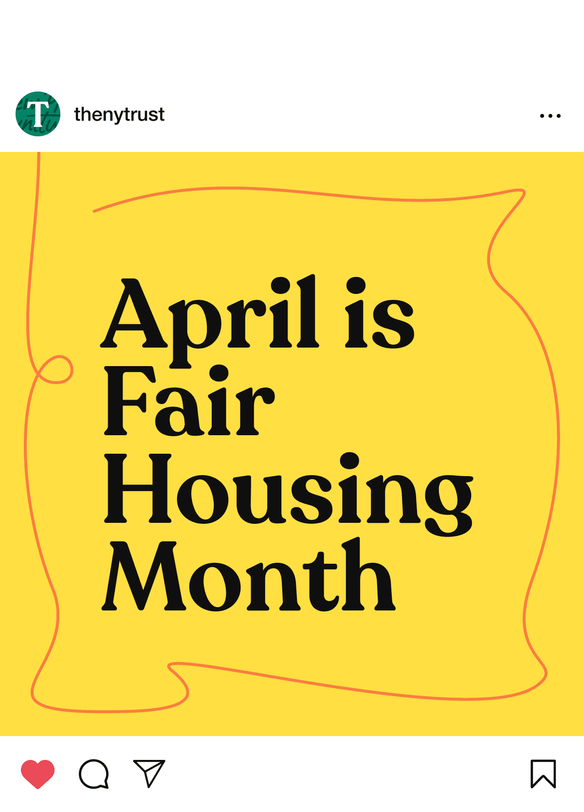
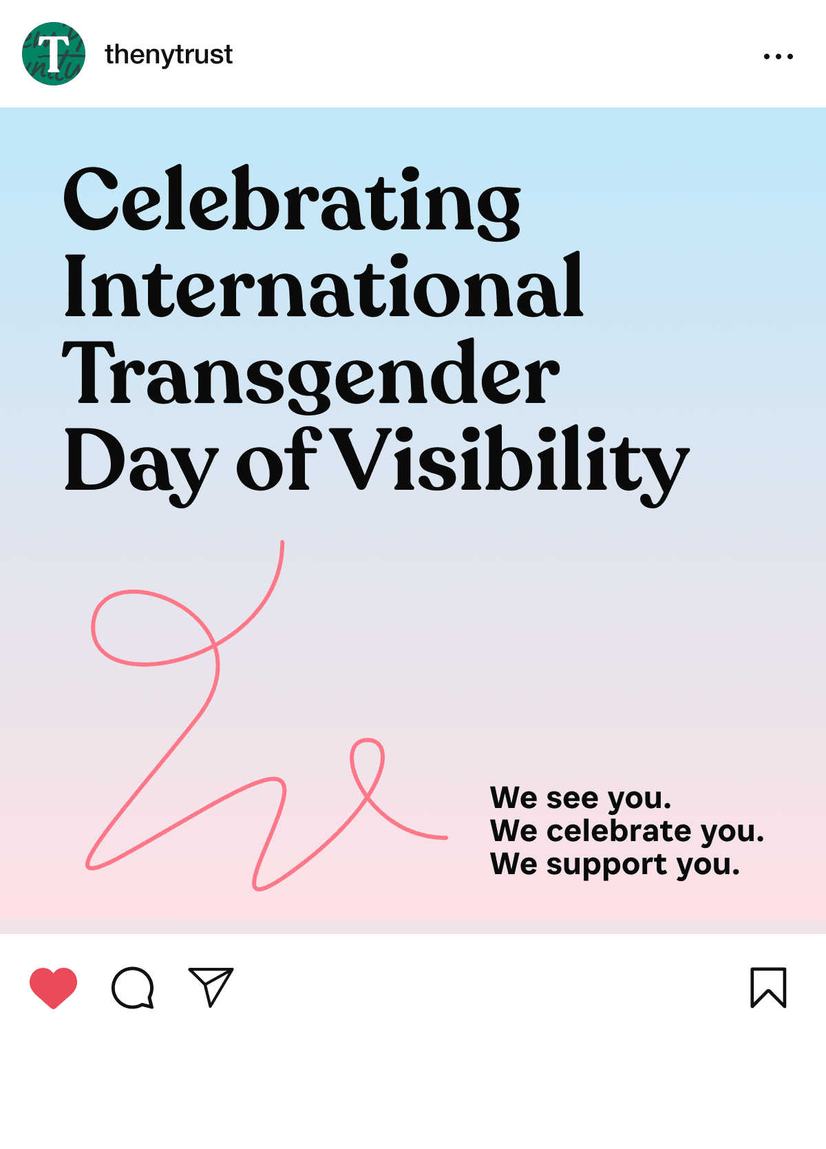
The Trust’s brand represents continuity, resilience, and impact. It symbolizes their enduring commitment to the region and its people with an ever present, continuous line that organically responds to its environment. It is a visual reminder that The Trust exists to shape a better future for New Yorkers.
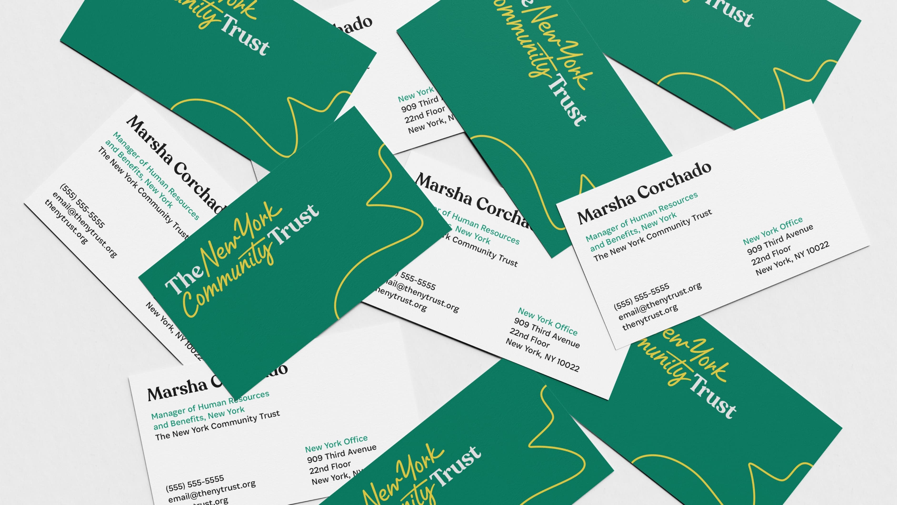
A lively group of diverse adults is gathered in a room, smiling and laughing. Two women in the front are playfully entangled in yellow string, creating a joyful and lighthearted atmosphere. Some people are seated, while others engage with the activity in the background.
A man with short curly hair and a beard smiles while standing on a rooftop with a city skyline, including the Empire State Building, in the background. He is wearing a light blue button-up shirt. The sky is clear, and a red squiggly line is drawn on the image.
New York Community trust posters mocked up on a graffiti filled brick wall.
We are thrilled to share this refreshed brand that infuses new energy into the organization and makes The Trust accessible to every New Yorker.
Amy Freitag
President, The New York Community Trust

A dynamic logo

The Trust’s new logo captures this through-line concept: the placement of the serif type acts as “bookends” for the handwritten script which serves as a through-line between them.

A unified brand

The new visual identity resolves the tension of having separately branded branches for the Long Island Community Foundation and the Westchester Community Foundation. Our brand strategy process revealed there was more strength in bringing everything together under one unified brand.

Logos of The New York Community Trust, Westchester Community Foundation, and Long Island Community Foundation. NYCT logo is red and black, WCF and LICF logos are in red, and The New York Community Trust text is in black and green.

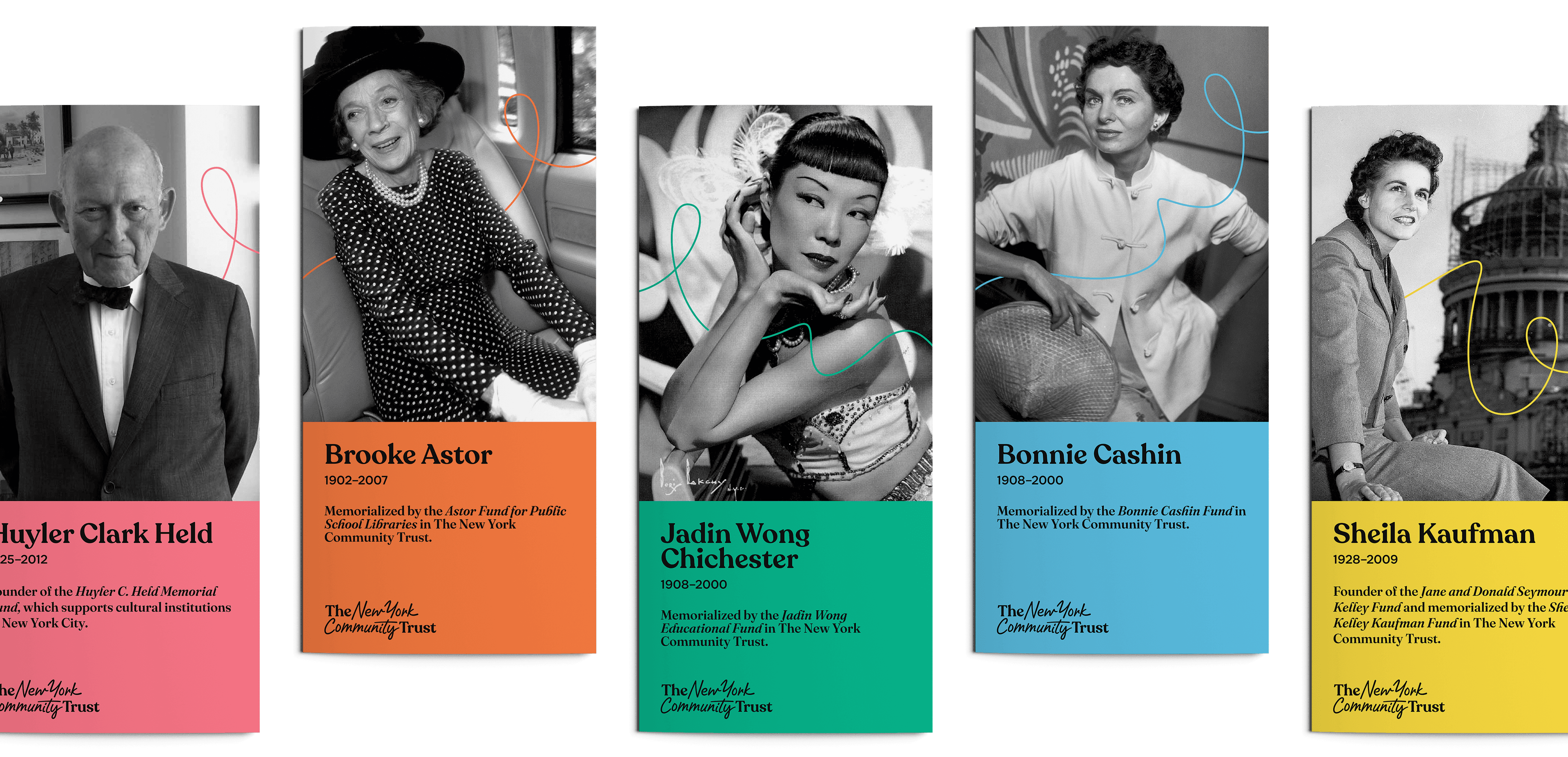
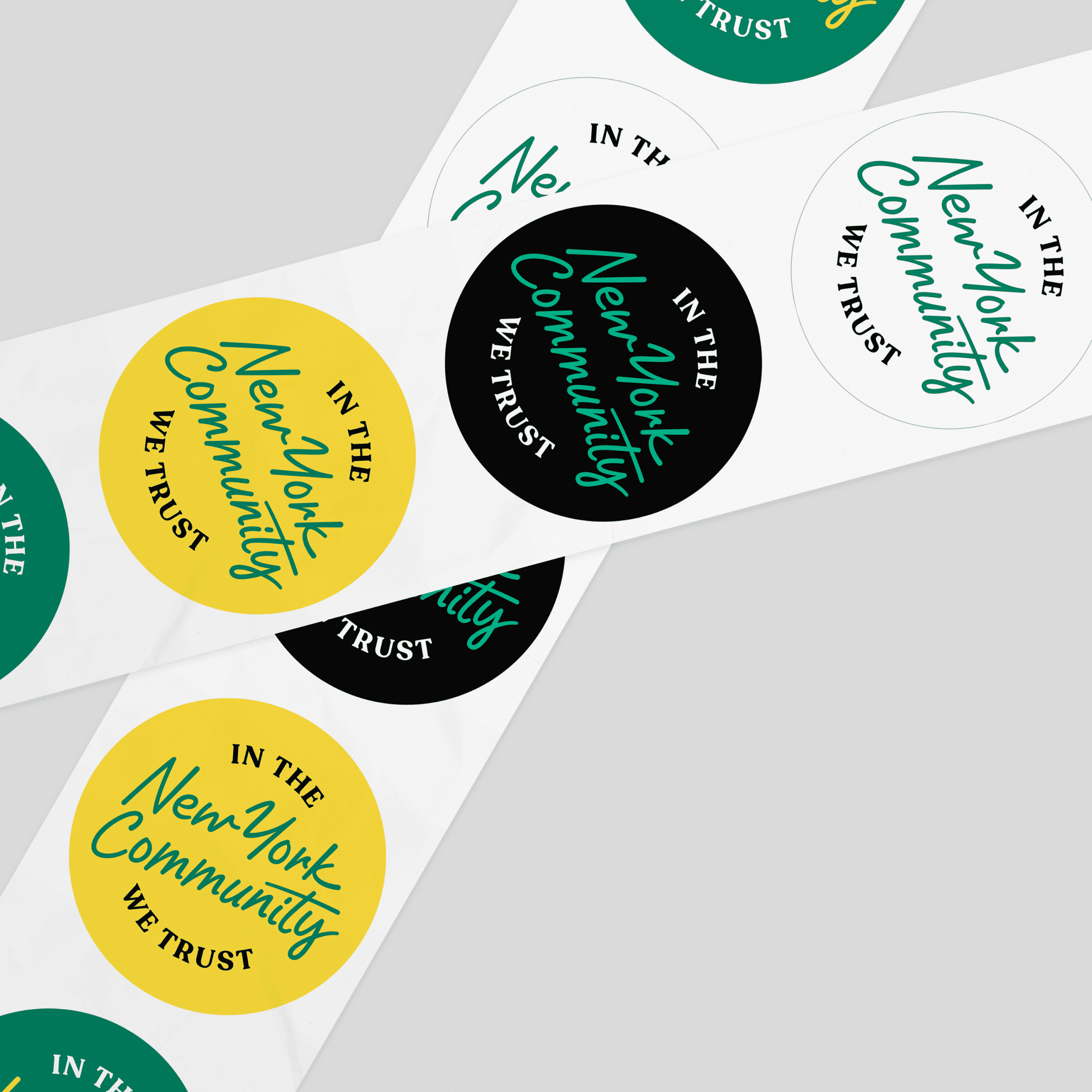
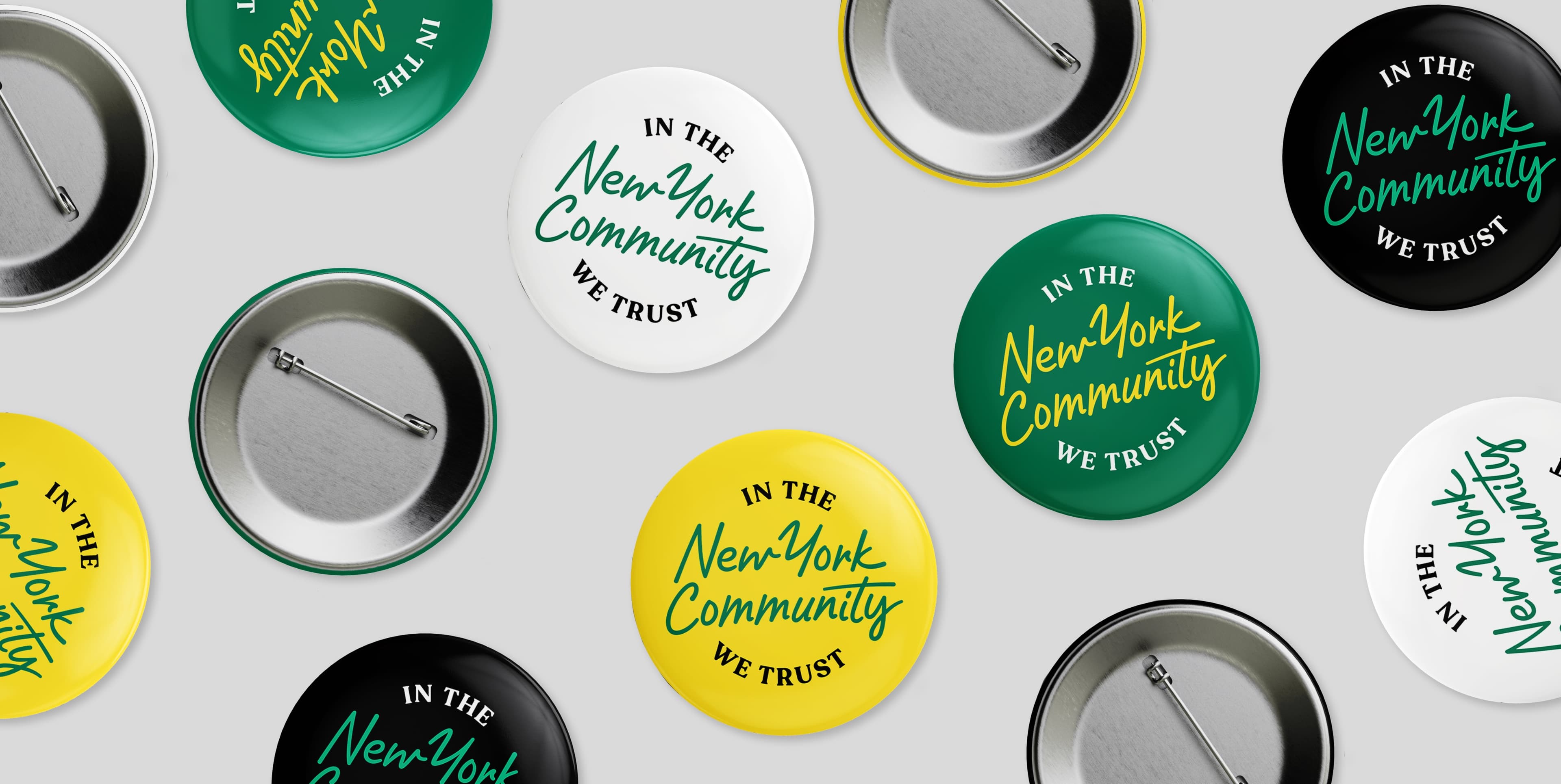
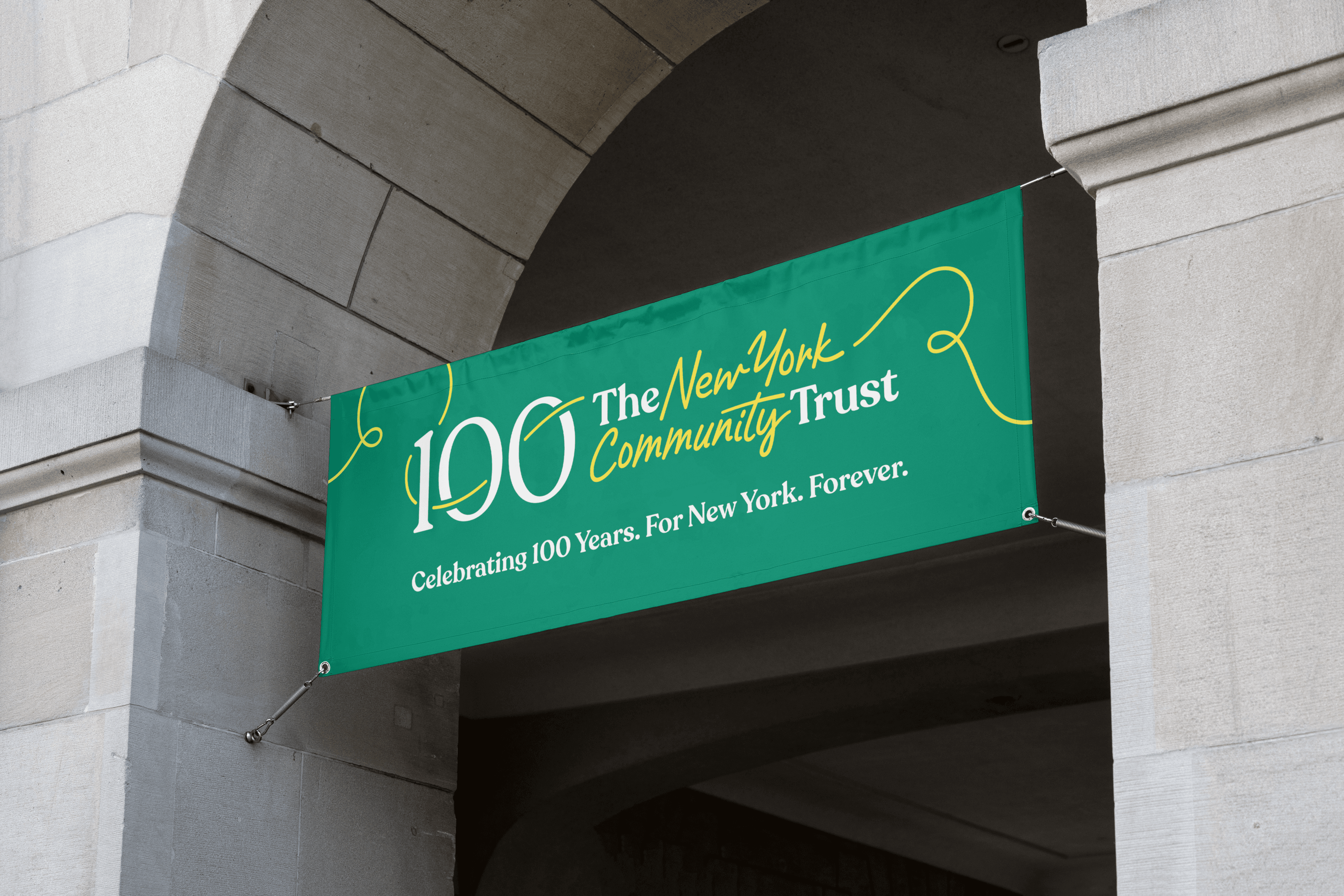
A 100 year celebration

To properly mark The Trust’s centennial, we created celebration assets, including a celebratory logo – reflecting how they have been a throughline for New York for 100 years.

A screenshot of The New York Community Trust website showcasing children gardening. The screen features a header with the foundation's name and menu options. The main content highlights an initiative called "Create National Climate Collaborative" with buttons for more information.
Instagram post by thenytrust with a yellow background and red outline. The text reads "April is Fair Housing Month" in bold black letters.
An Instagram post by @thenytrust features text reading "Celebrating International Transgender Day of Visibility" on a gradient background of blue to pink. Below, there's a heart drawing with the message, "We see you. We celebrate you. We support you.
An Instagram post by The NY Trust announces $8.8 million in funding to 42 nonprofits. The text is written in bold black font on an orange background with a yellow, hand-drawn outline.

Iconography

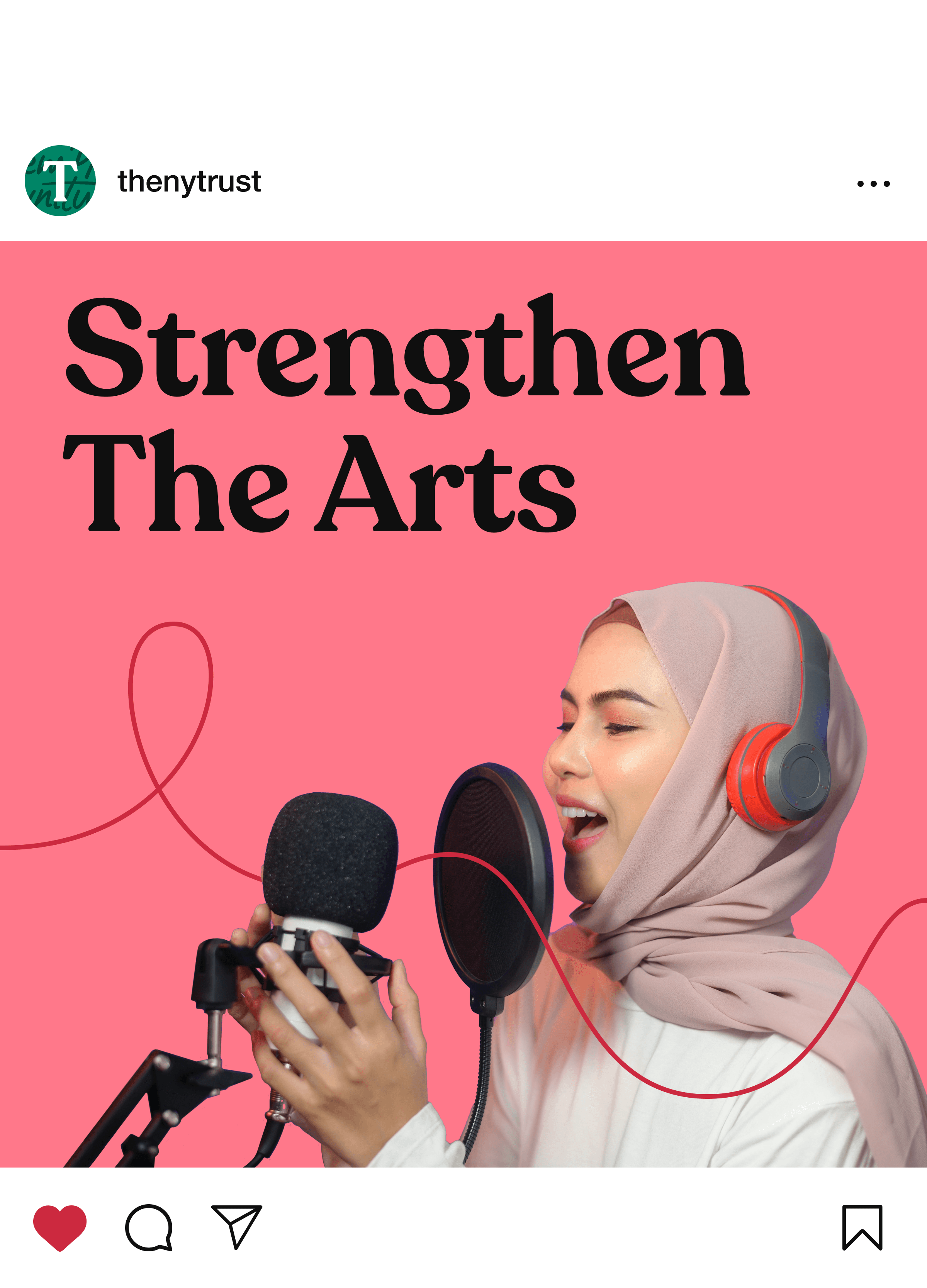
The through line concept is embedded in the suite of dozens of icons we developed for The Trust in order to codify the various ways people can give.

Project Credits

Ready to unlock the potential of your nonprofit's brand?
Reach Out