North Country School & Camp Treetops
Naming and branding their new strategic plan equipped them to enter their next era of growth with confidence.

Background
Tucked away in the Adirondack Mountains, North Country School & Camp Treetops, has provided a one-of-a-kind experience for thousands of children: the space and time to embrace childhood, unplugged, immersed in nature, and fully engaged in their imaginations.
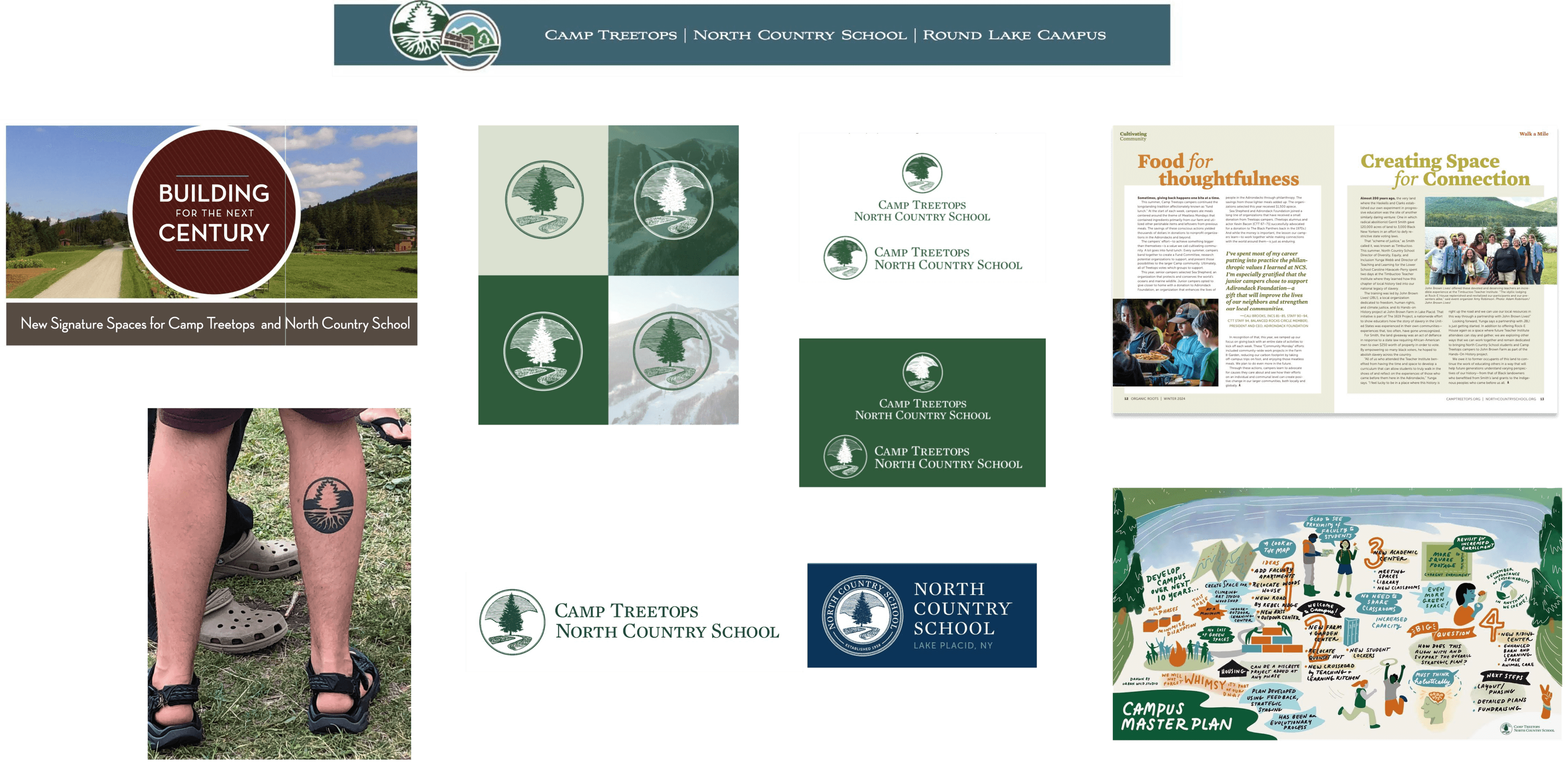
Existing brand assets
The challenge
The organization approached Hyperakt to create a name and visual identity for their new strategic plan.

The opportunity
The new brand was an opportunity to reinforce the organization’s unique philosophy of child-centered education in nature and re-inspire families, donors, and the wider community to support the organization’s commitment to raising rugged, resourceful, and resilient kids.

A name that inspires growth and possibility
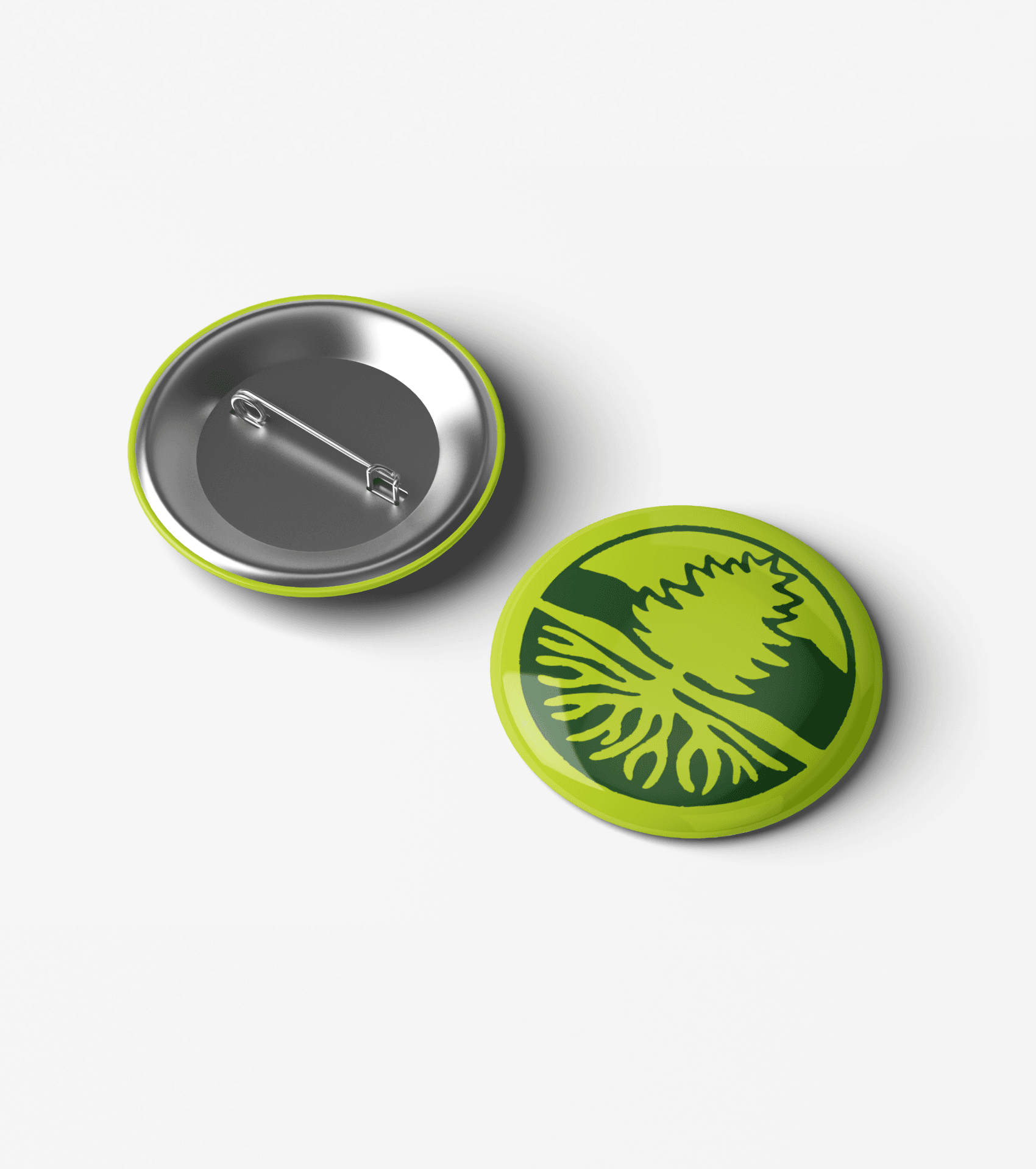
The new name, Growing Evergreen, conveyed a bold plan to expand their impact, calling on community support to bring it to life. It captured the essence of North Country School & Camp Treetops—doing hard things, growing stronger, and embracing wonder. To honor their legacy, we paired their iconic original tree emblem with modern typography to seamlessly integrate the campaign name.

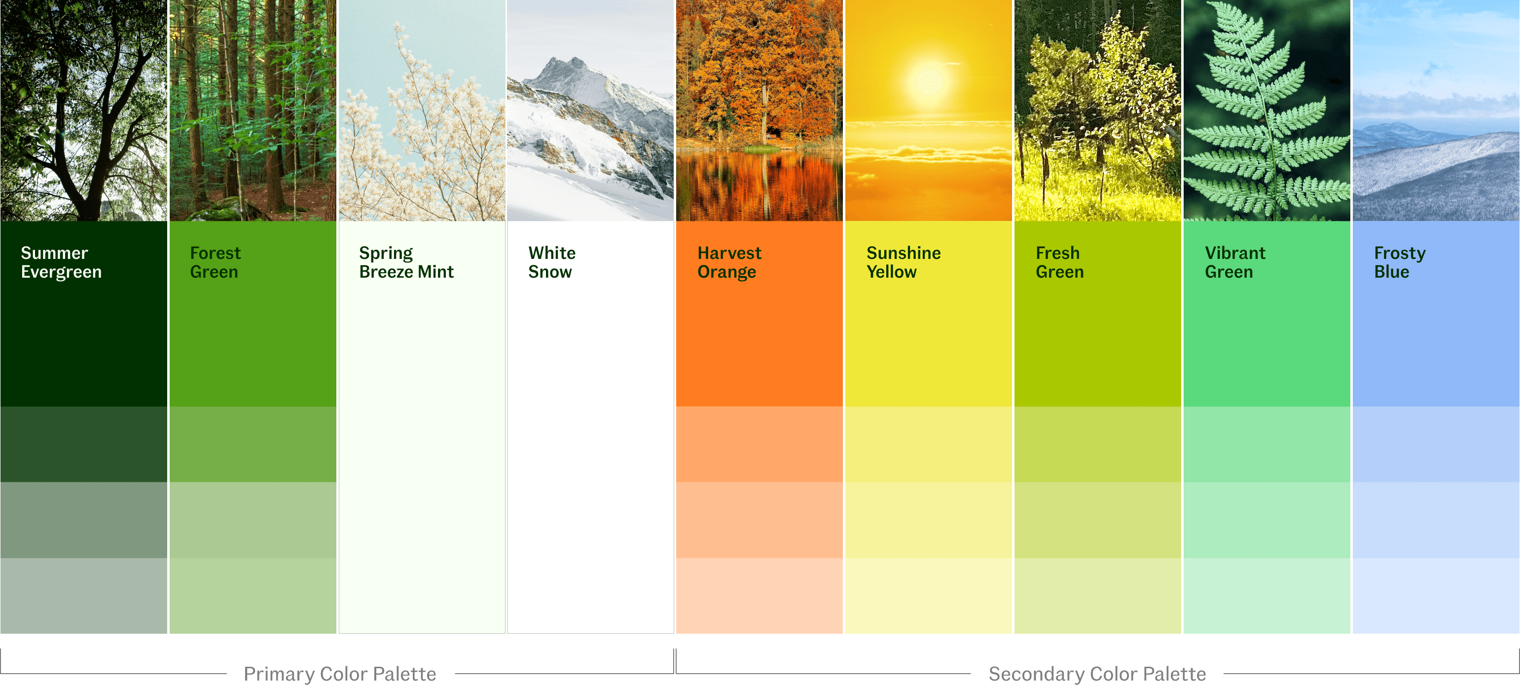
A palette rooted in nature’s cycles
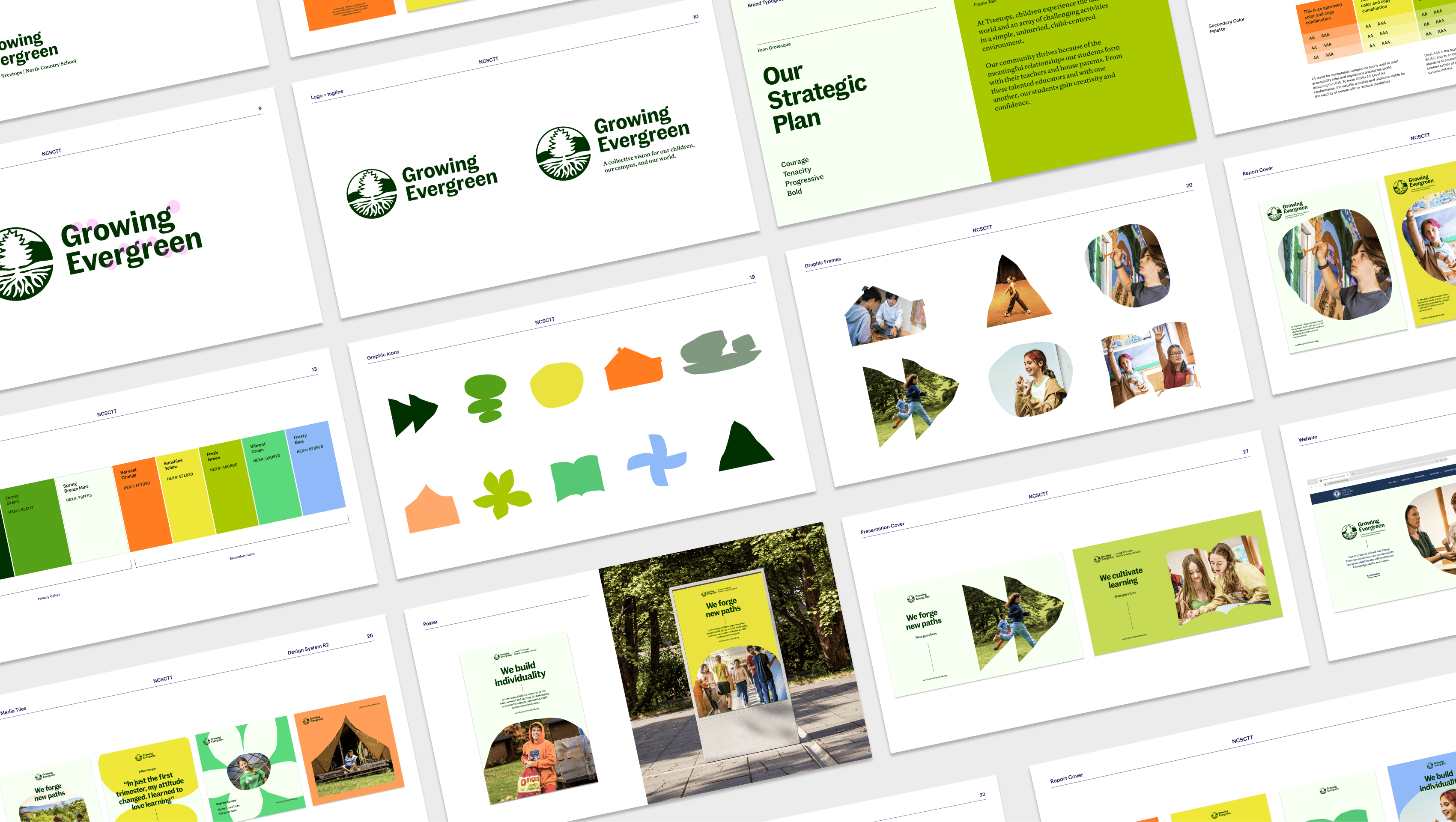
The color palette draws from the Adirondack seasons, evoking summer meadows, autumn leaves, and winter skies. These hues reflect the natural rhythms of life on campus, grounding the brand in vibrancy and connection to the land.
Icons that tell a story
The icons we developed for the brand distill the spirit of North Country School & Camp Treetops into clear, meaningful symbols. Representing everything from outdoor exploration to creative pursuits, they bring the organization’s values to life. Their handcrafted feel adds warmth and a sense of individuality to the brand’s visual identity. The icons were designed to be used either as background elements or frames for photography.

A vibrant, flexible design system
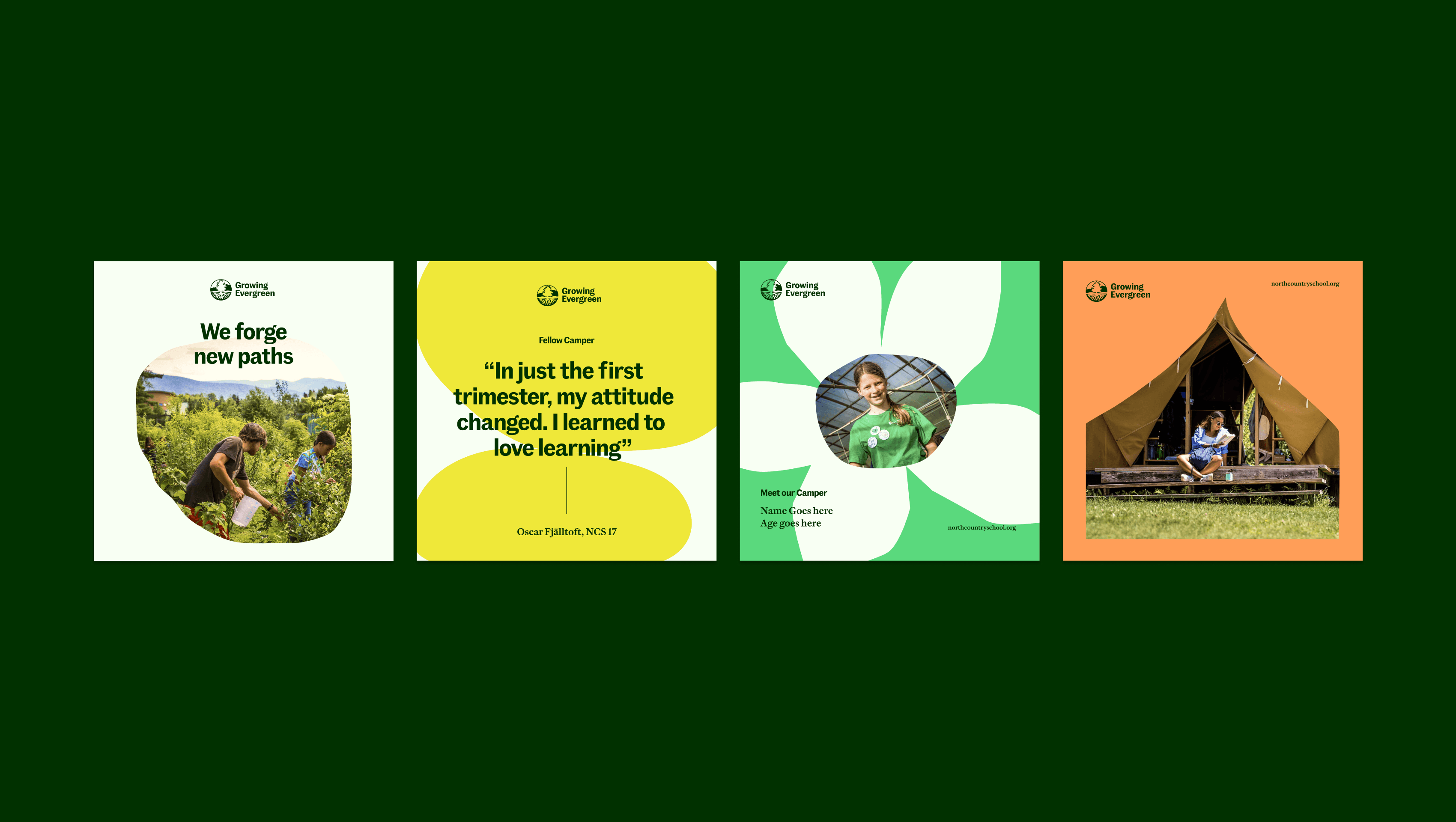
The design system balances structure with creativity, combining clean layouts, vibrant colors, expressive typography, and handcrafted iconography.
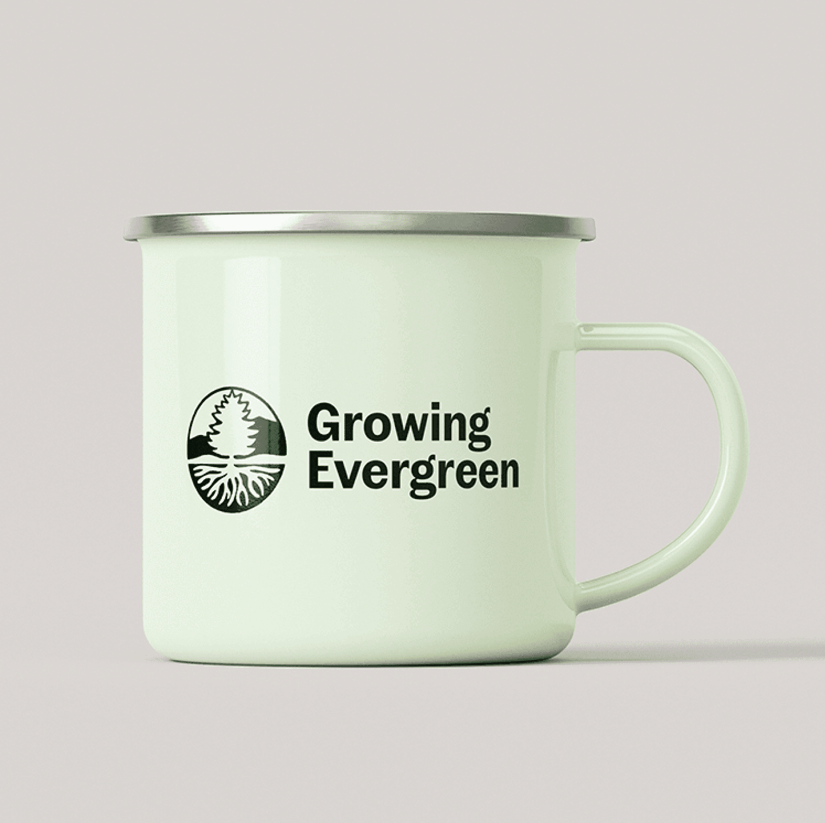
Rooted in nature
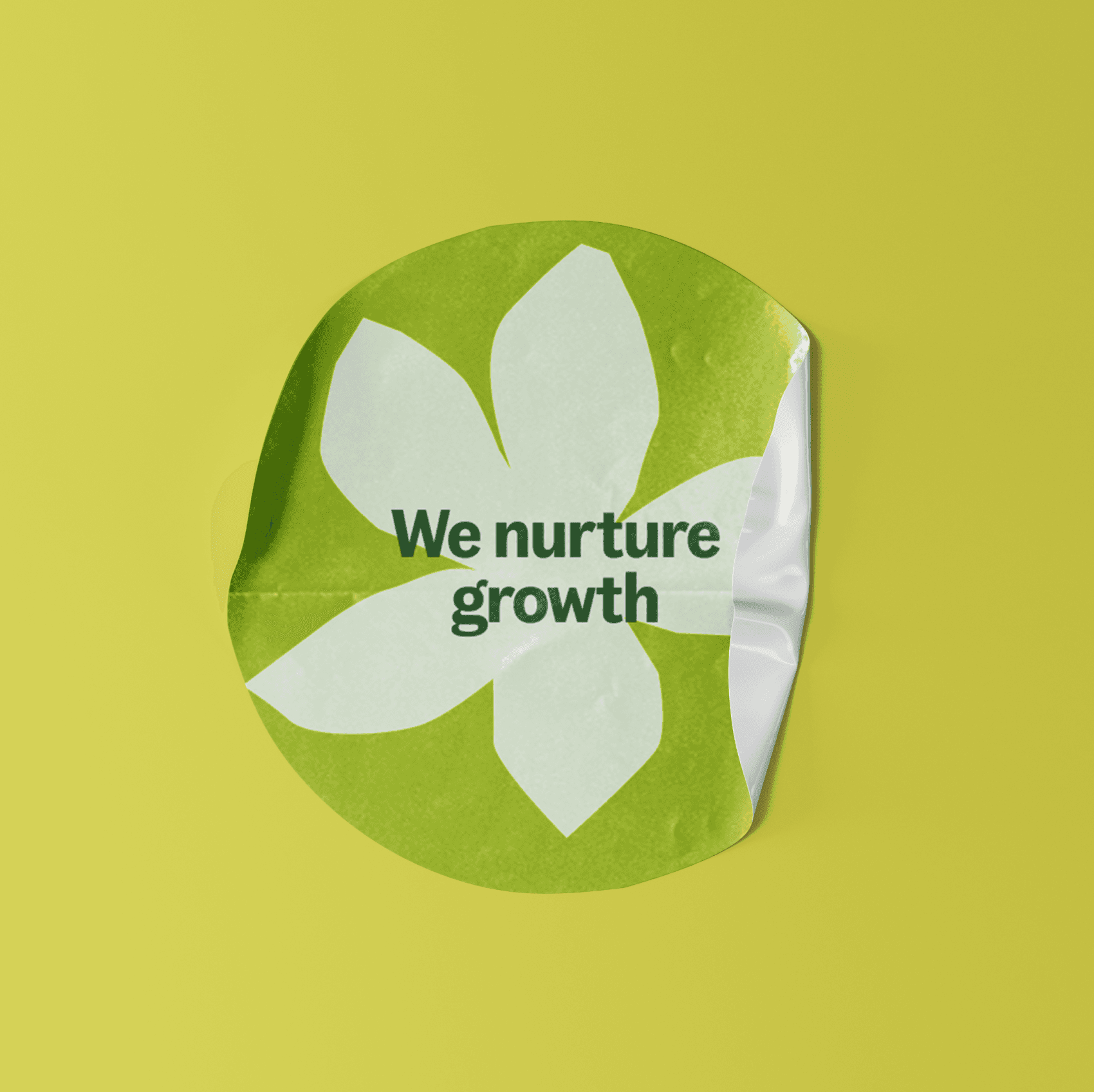
The result is a modern brand rooted in nature without feeling too granola, adapting seamlessly across platforms to ensure every touchpoint feels unified and engaging.
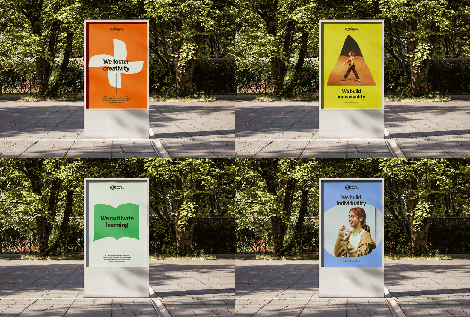
Dynamic and organic layouts
The combination of colors, typography, and bold icons creates dynamic and organic layouts that exude courage, wonder, and optimism.
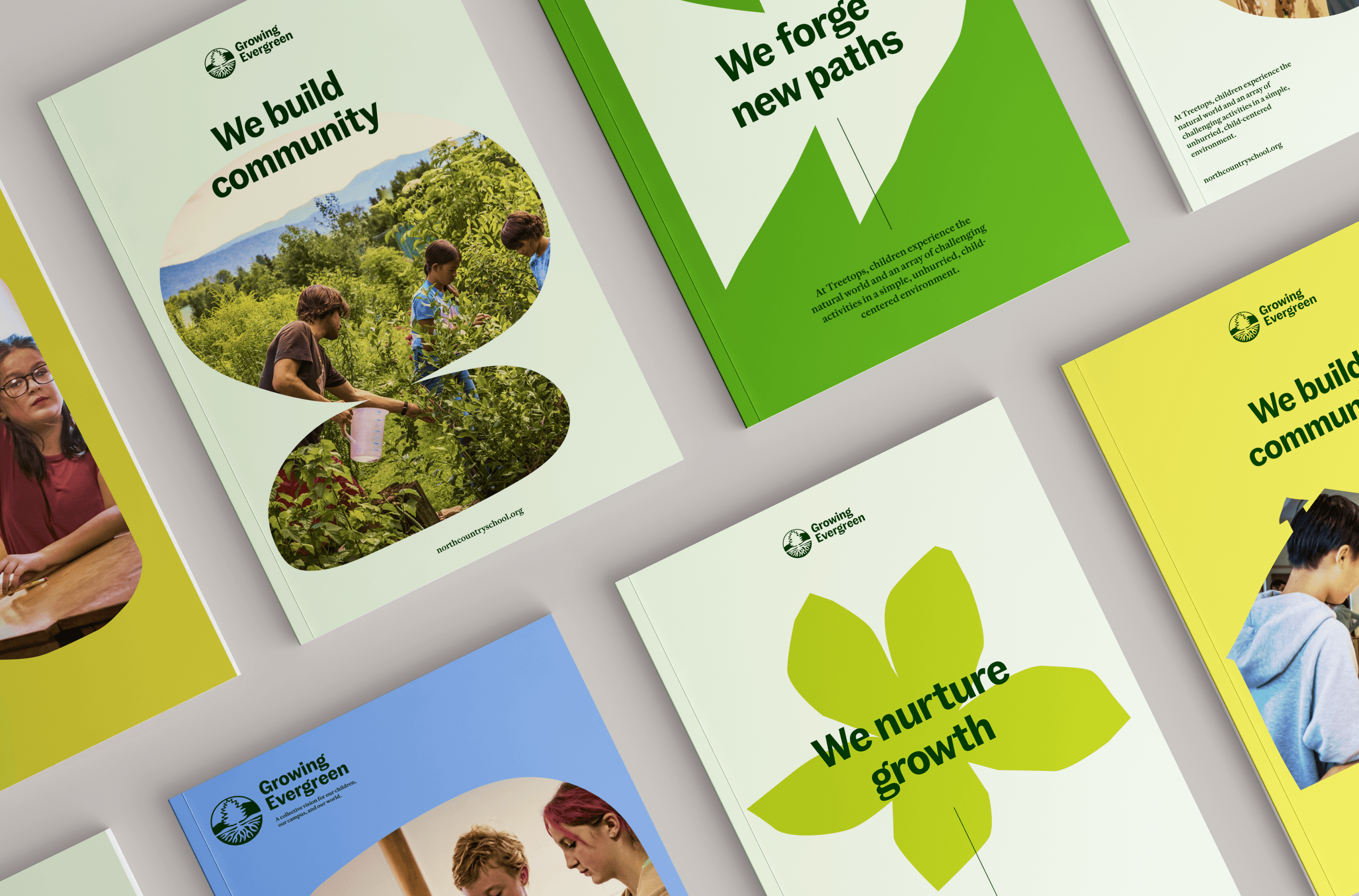
Project Credits
- Kade Burns
- Pauline Shin
- Deroy Peraza
- Sana Masud
- Julia Zeltser
