Margaret A. Cargill Philanthropies
Founded by a visionary ahead of her time, the organization was ready for a bold visual identity that fully expressed its clarity, confidence, and purpose.
Background
Founded by the late Margaret A. Cargill, MACP partners with organizations to make a lasting difference for individuals and communities, with particular attention to overlooked causes. Based in Eden Prairie, Minnesota, just outside Minneapolis, MACP’s grantmaking spans seven primary domains—environment, disaster relief & recovery, arts & culture, animal welfare, legacy & opportunity, quality of life, and teachers & students. Since its inception in 1995, the philanthropy has contributed over $3 billion in cumulative grantmaking both across the globe and closer to home in the Upper Midwest Region.
The challenge
As with many organizations in this space, what the team knew to be true about the unique spirit of the organization was not captured in the visual identity, which had not changed significantly in the years since its founding.

The opportunity
Building on a logo and color palette that represented the essence of the founder herself, we had the opportunity to extend the visual language to bring unique and distinguishing qualities of the philanthropy to the forefront: a commitment to funding overlooked issues, a passion for building deep and lasting relationships with grantees, and a team culture that centered a love for nature and artistic expression.

Refining the logo
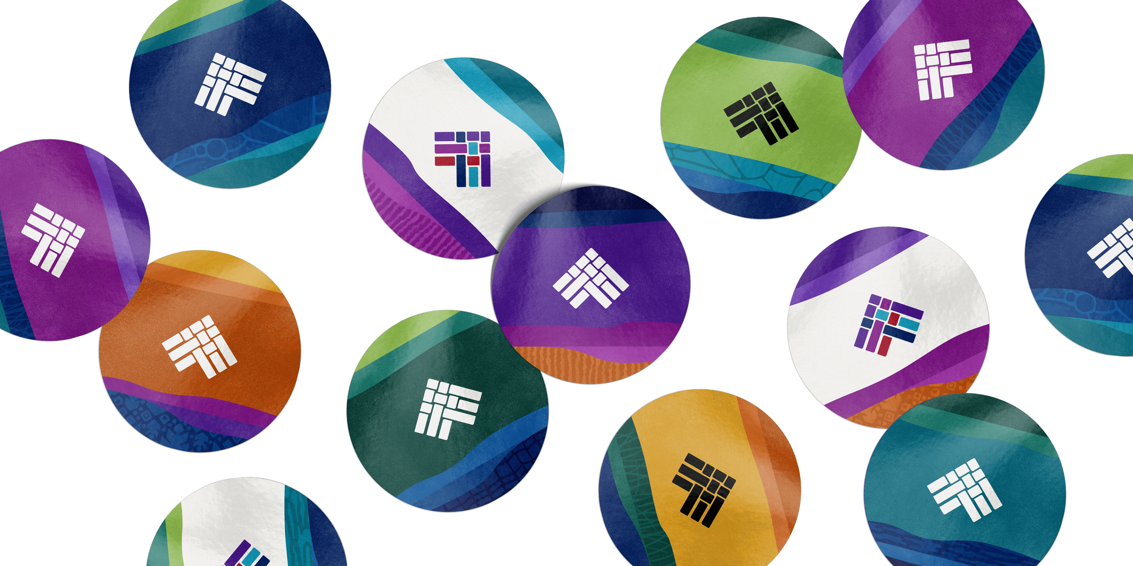
Hyperakt took the original logo, designed to reflect Margaret Cargill's character and life, and subtly modified elements to increase its scalability and legibility. We standardized the weight and rounding of the woven shapes within the icon, as well as the negative spaces between them.
Keeping the logo typography intact, we increased the width of the “philanthropies” byline, improving its readability at smaller scales.
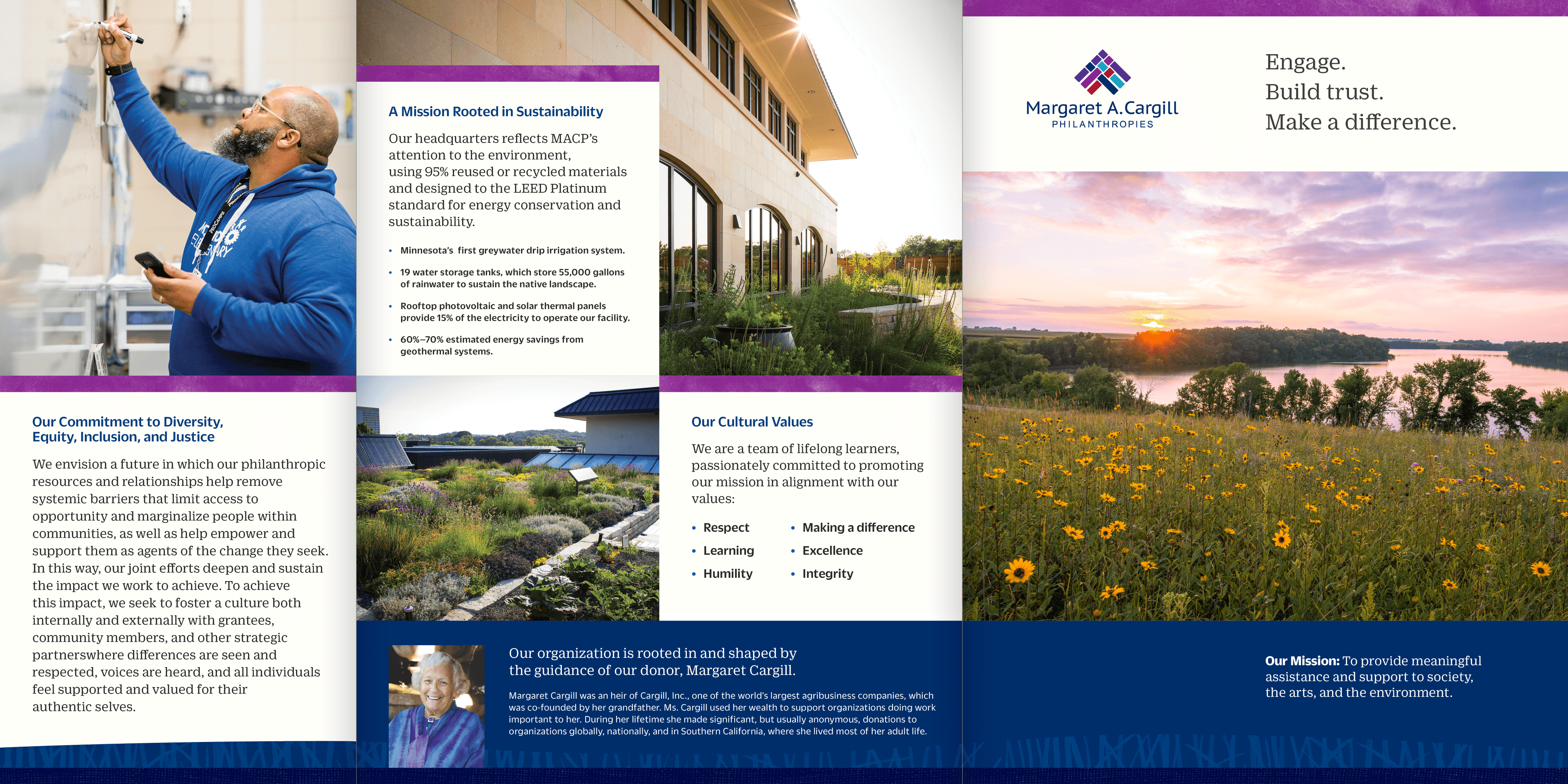
Colors rooted in the Foundation’s Founder
We took the original palette, inspired by Margaret A. Cargill's favorite colors, and expanded it to include additional hues and tints. The comprehensive color system was designed to allow neighboring hues and tints to be layered next to/on top of one another—mirroring the subtle color gradations found in weaving and atmospheric landscapes.
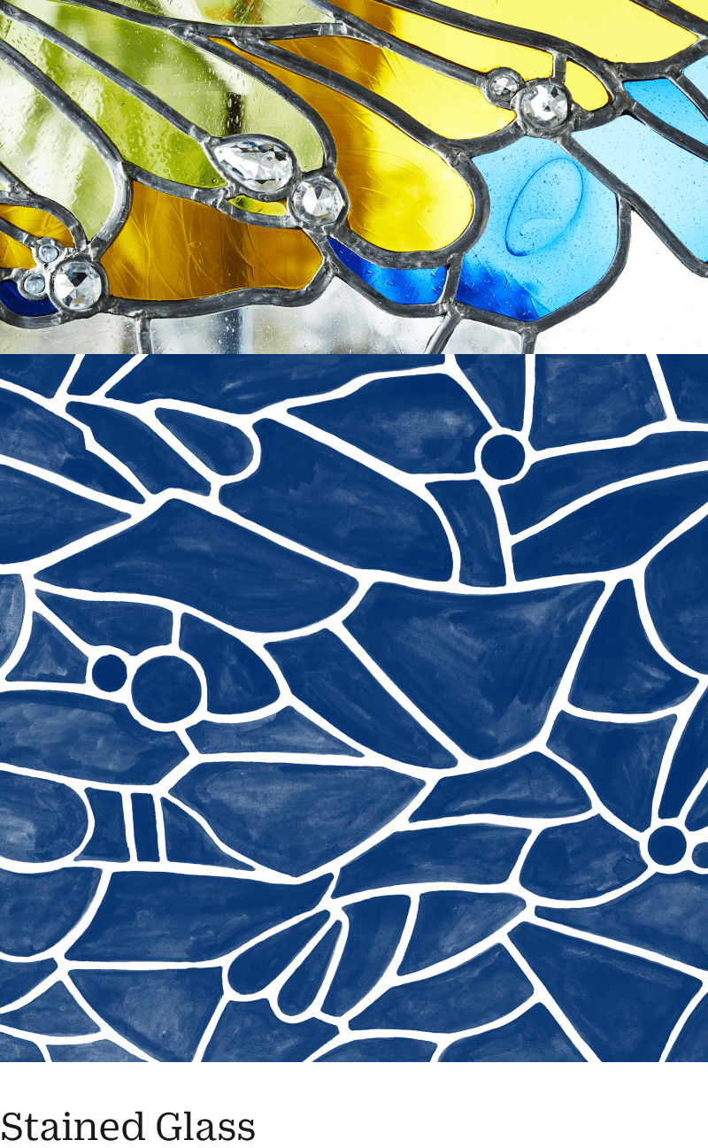
An exciting new medium for storytelling
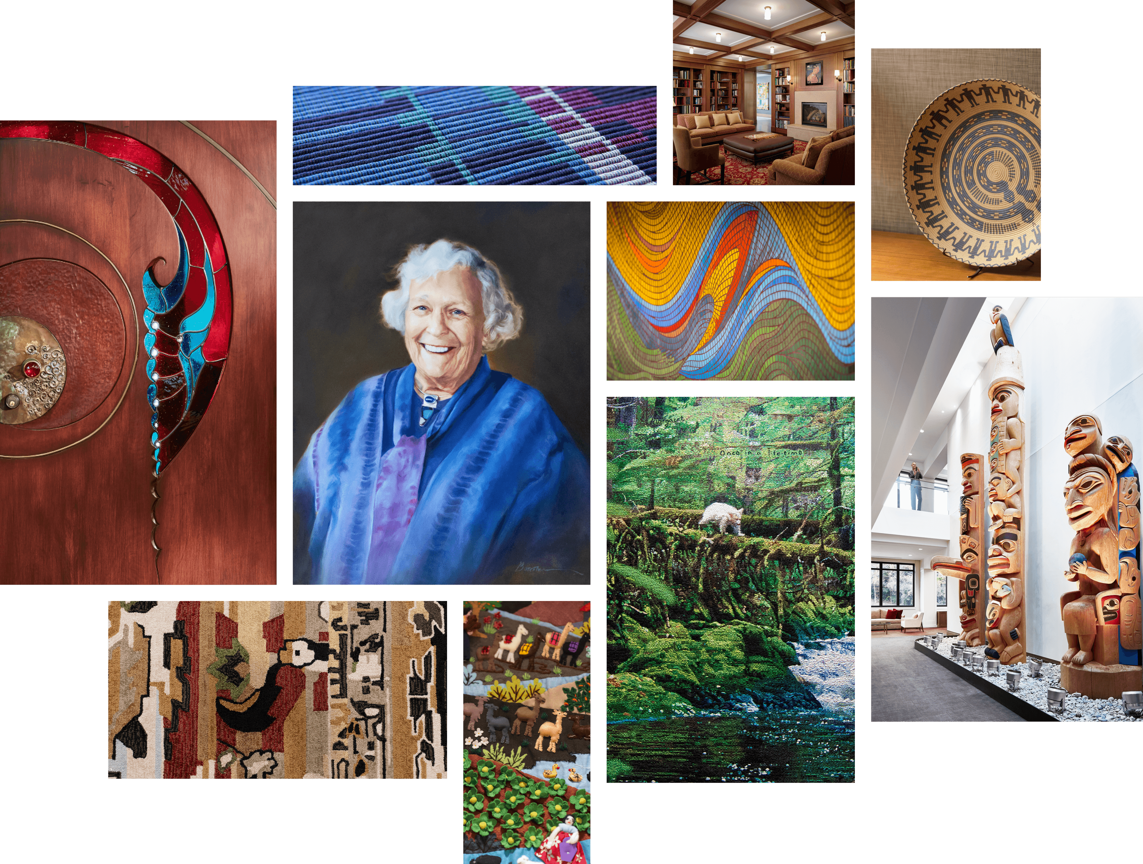
Margaret Cargill was both an artist and an art lover. She appreciated and collected stained glass, woven rugs and tapestries, and Native American art, many of which are now housed in the MACP offices, and these artifacts served as the inspiration for the extended visual language.
The brand idea
The extended visual language was built on the idea of layers, a metaphor that represents the compounding impact of MACP’s partnerships with grantees. Layers represent depth, the passage of time, and steadfastness—all qualities that are central to MACP’s work and approach.


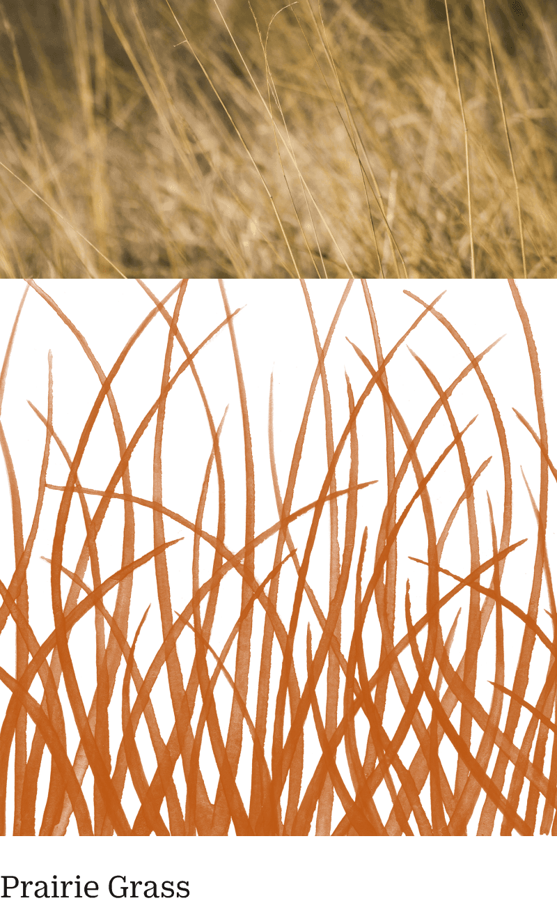
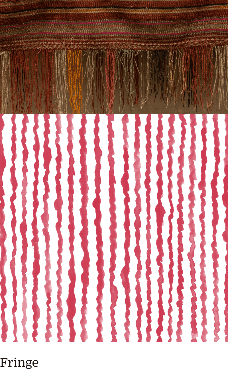
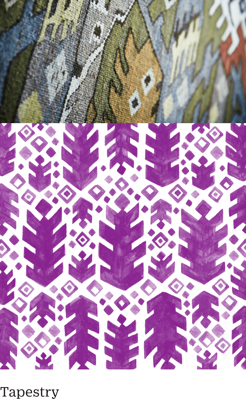
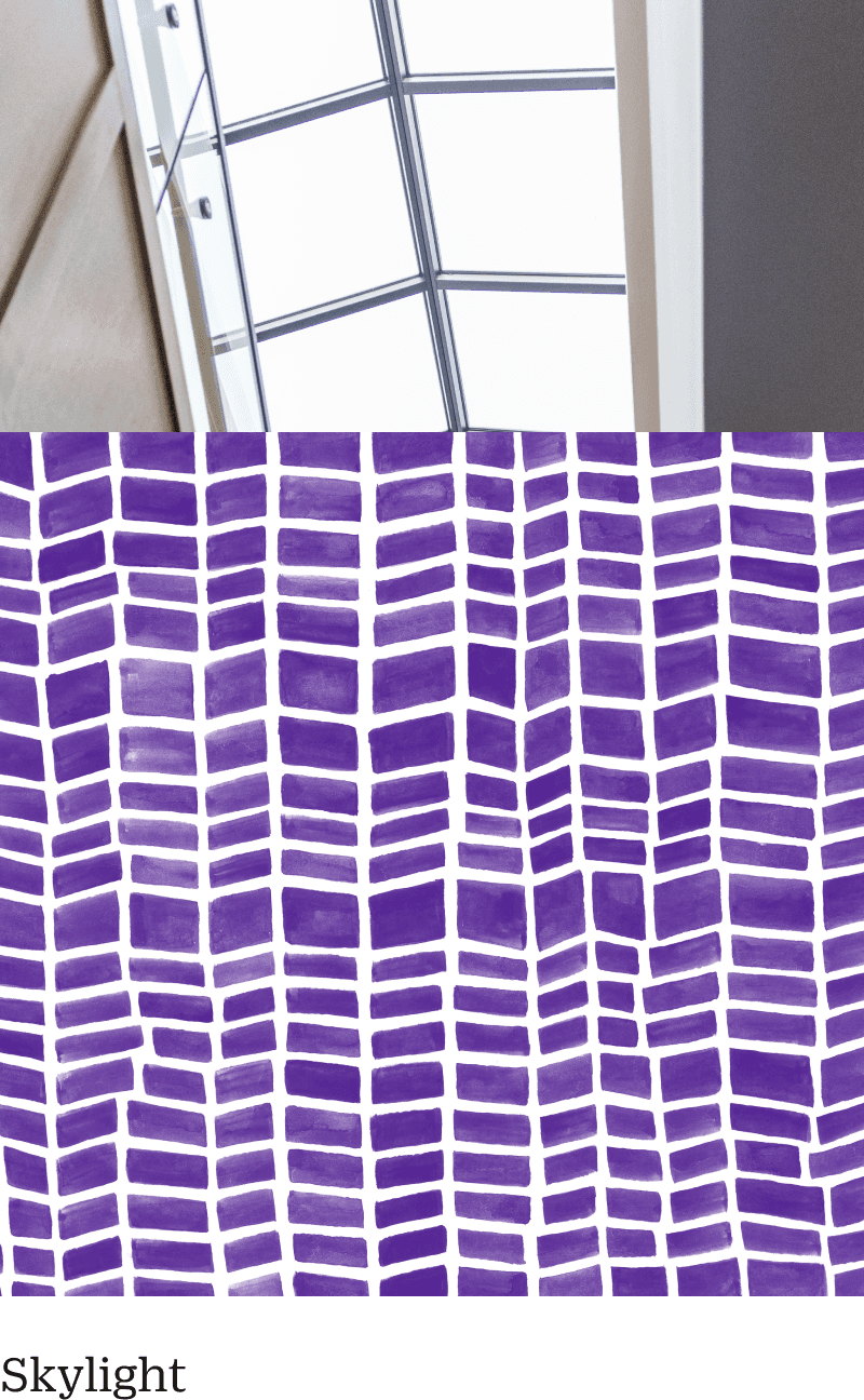
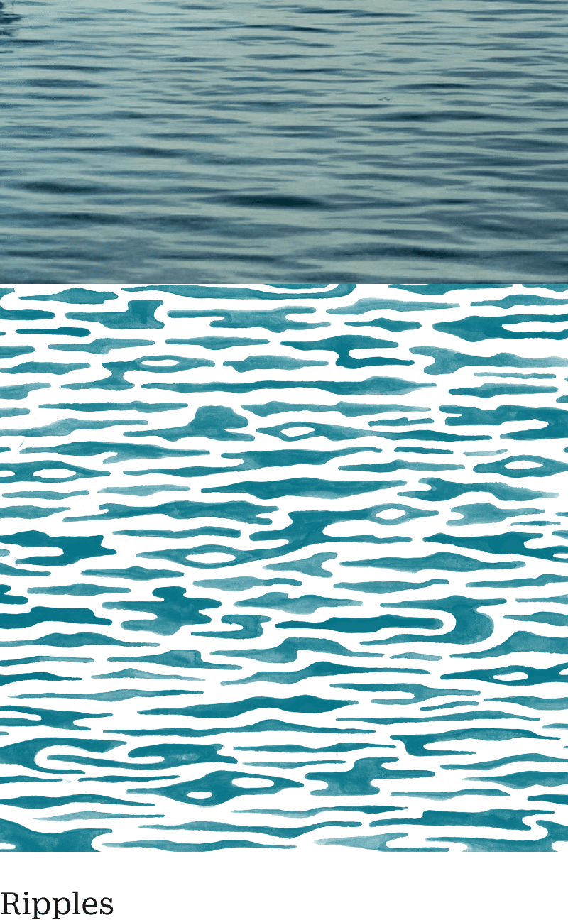
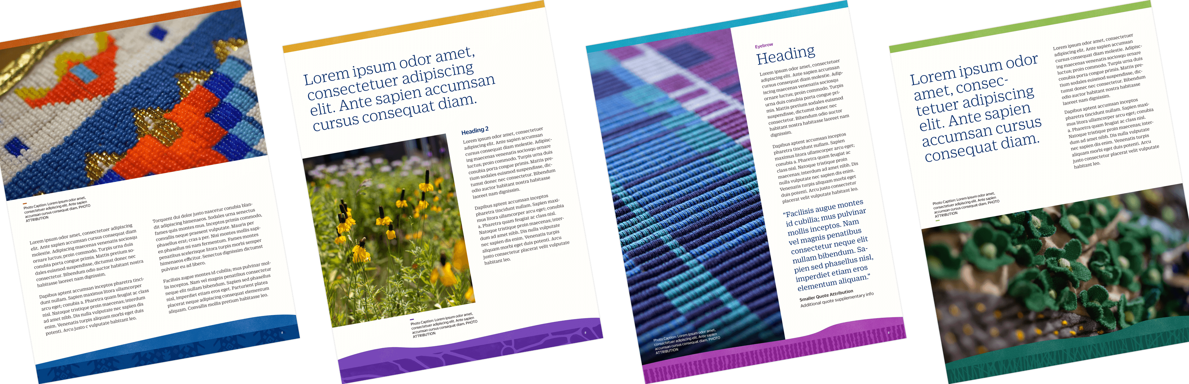
Hand-painted textures and patterns
Hyperakt painted a series of six patterns to be used as ornamentation within the vertical layers of the design system. Each pattern was inspired by a material or object found not only within the MACP office grounds, but also in the natural environments where the foundation’s grantees and their communities do their work—grasslands, rivers, and other meaningful landscapes. The design and quality of the patterns are intended to reflect the handmade sensibility of many of the artworks found within Margaret Cargill’s collection, while also honoring the deep connection between place, people, and purpose at the heart of MACP’s mission.
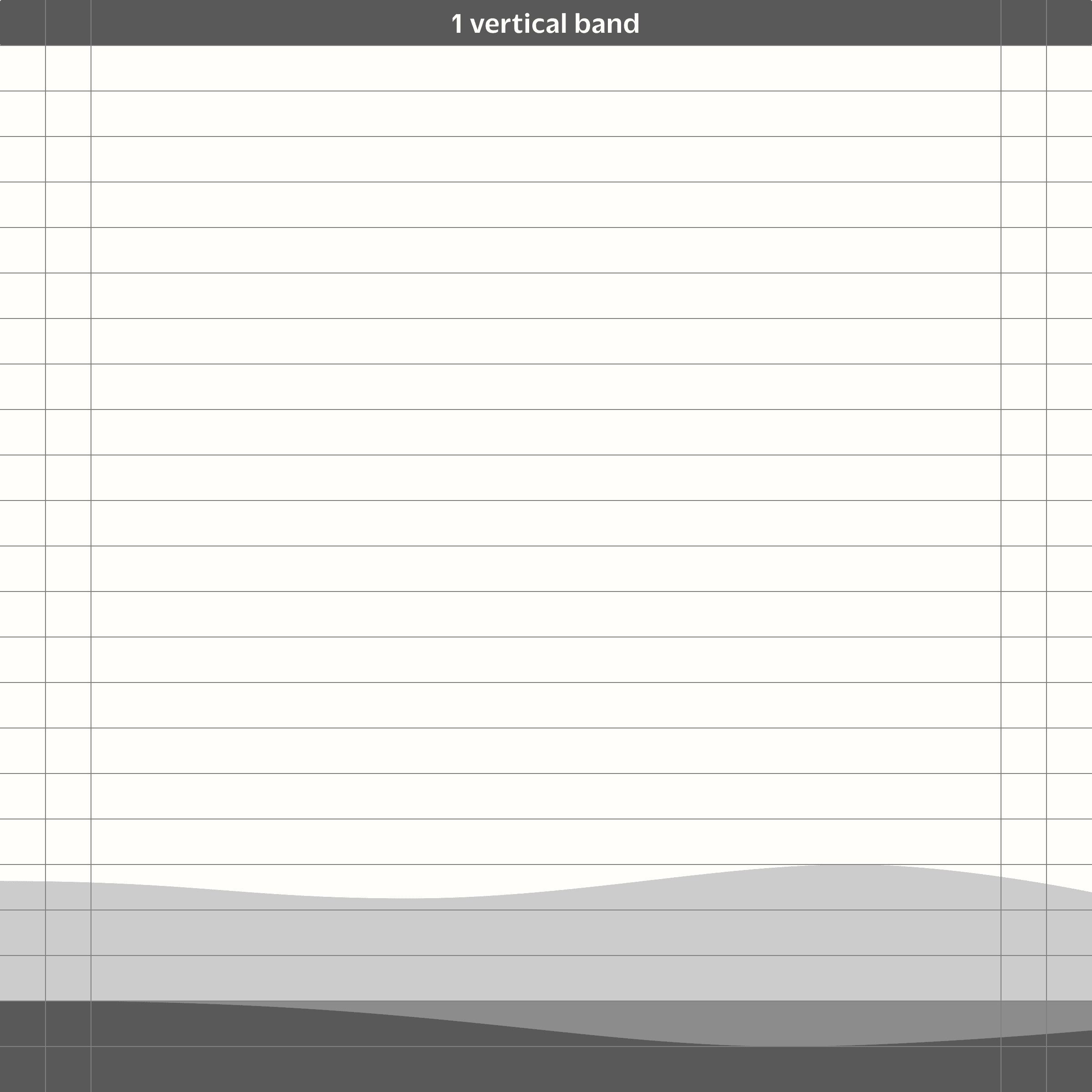
A structured, organic design system
Hyperakt designed a simple and scalable grid system consisting of vertical bands that would dictate the placement and height of the patterned and textured layers.


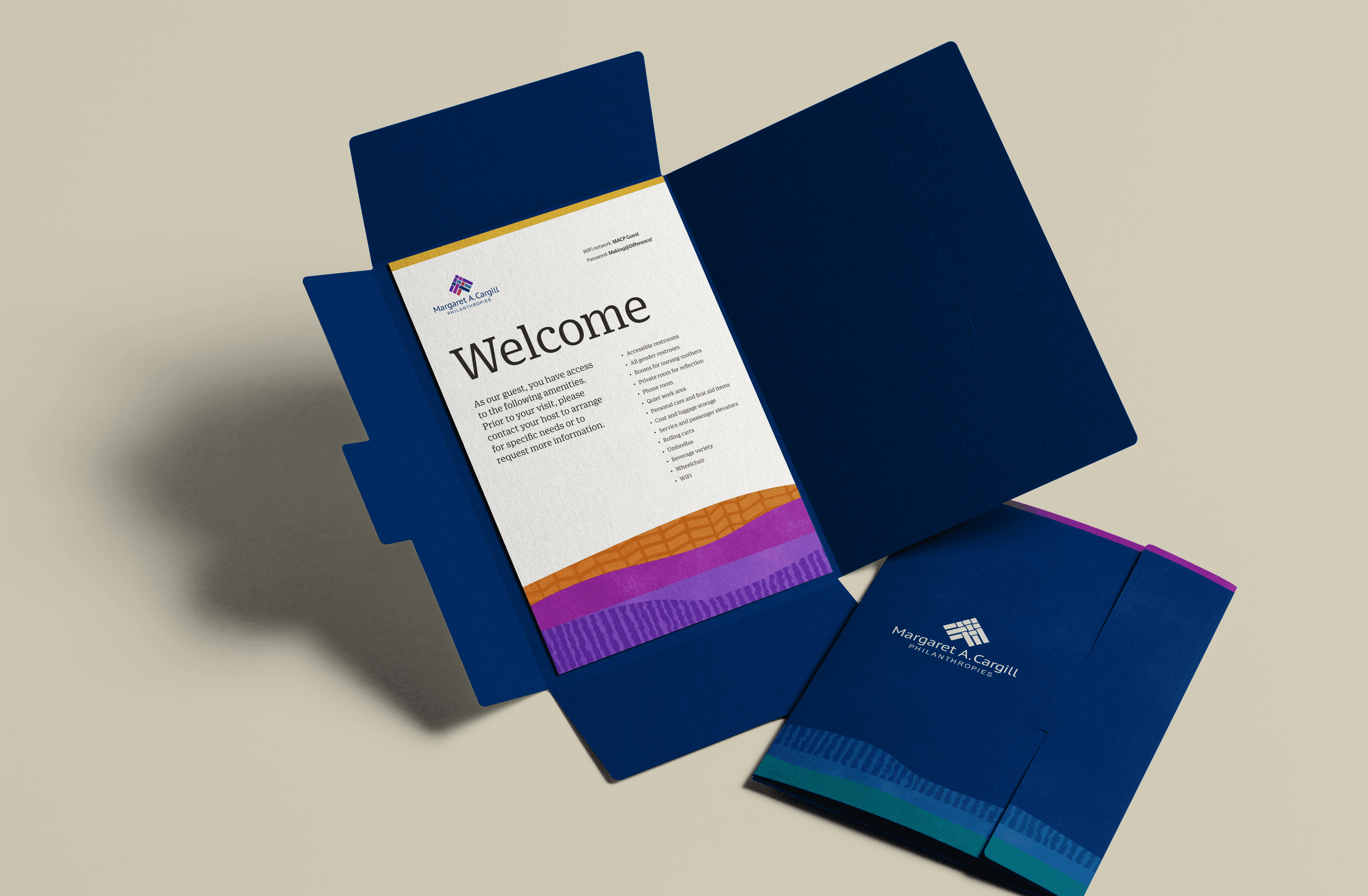
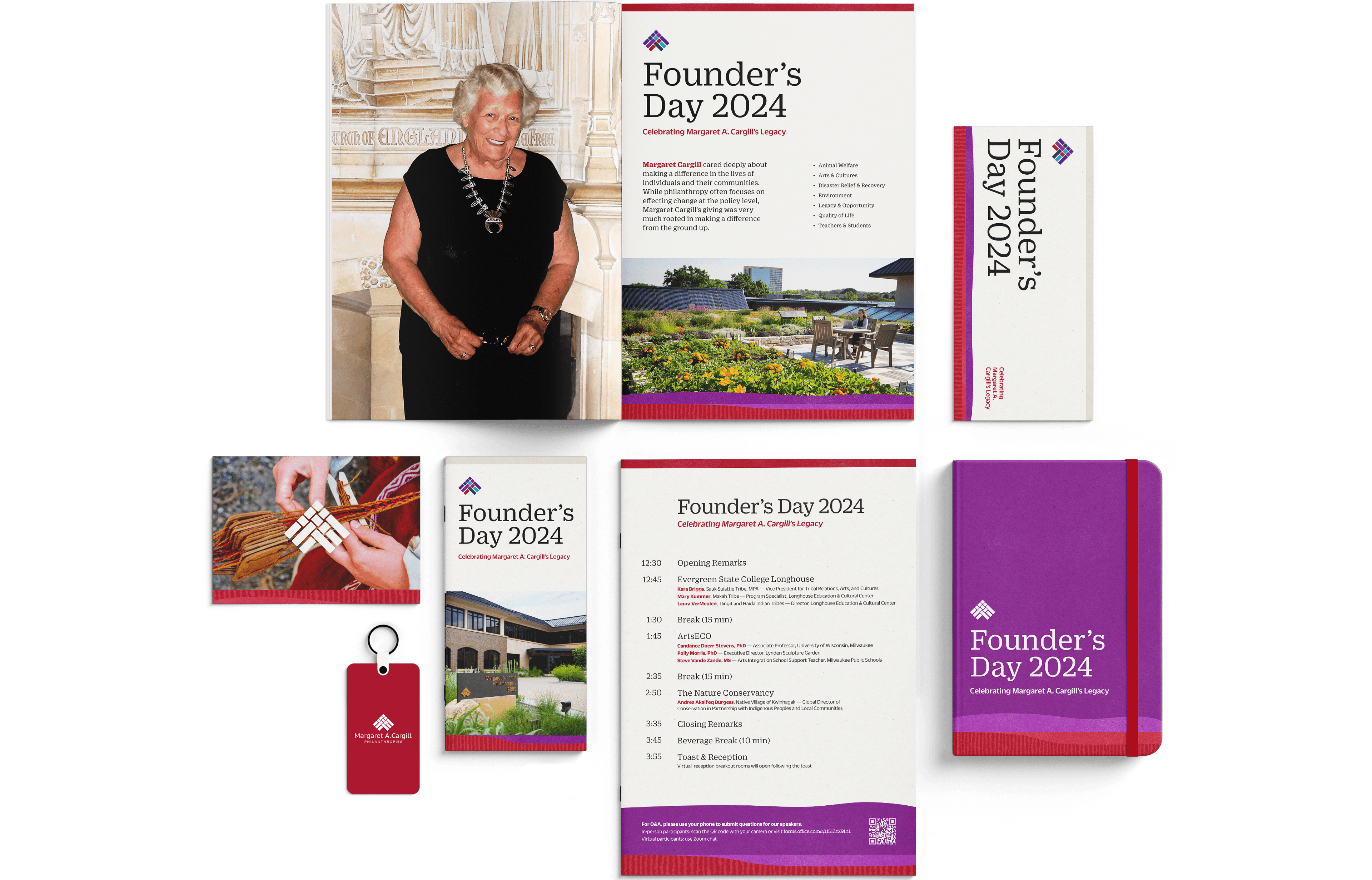
Workhorse templates
We designed a series of Powerpoint and print templates to be used by MACP for both internal and external communications.

Margaret red
Margaret's favorite color, red, was reserved for use on materials related to her life and legacy.
Project Credits
- Delaney Weber
- Sruthi Sadhujan
- Lauren Jones
- Sana Masud
- Deroy Peraza