Vera Institute of Justice
Fueled by new leadership, Vera Institute of Justice was ready to channel the political and social upheaval of the 2010s into a radical repositioning.

The challenge
The American justice system, in its scale and brutality, is a global anomaly. We incarcerate a higher percentage of our population and disproportionately target black and brown individuals. It relies on putting people behind bars and denying fundamental rights, leading scholars like Michelle Alexander, to call our incarceration model what it is: “a new Jim Crow”. America may have abolished slavery, but it continues to foster the mass incarceration of black and brown individuals, a modern-day version of slavery and segregation.

Reframing Justice
Vera Institute of Justice was ready to shift from decades of playing the role of a neutral, data-first research institution to a people-centered research and advocacy organization pushing for urgent and compassionate criminal justice reform.

The opportunity
What is justice? What is its purpose? Which voices should have a say in defining it? How might we tell the story of an innovative organization that is creating new models of analysis, forging partnerships with grassroots and advocacy organizations, and harnessing the power of research for systemic change? Reframing justice became the essence of Vera’s new identity and website redesign.
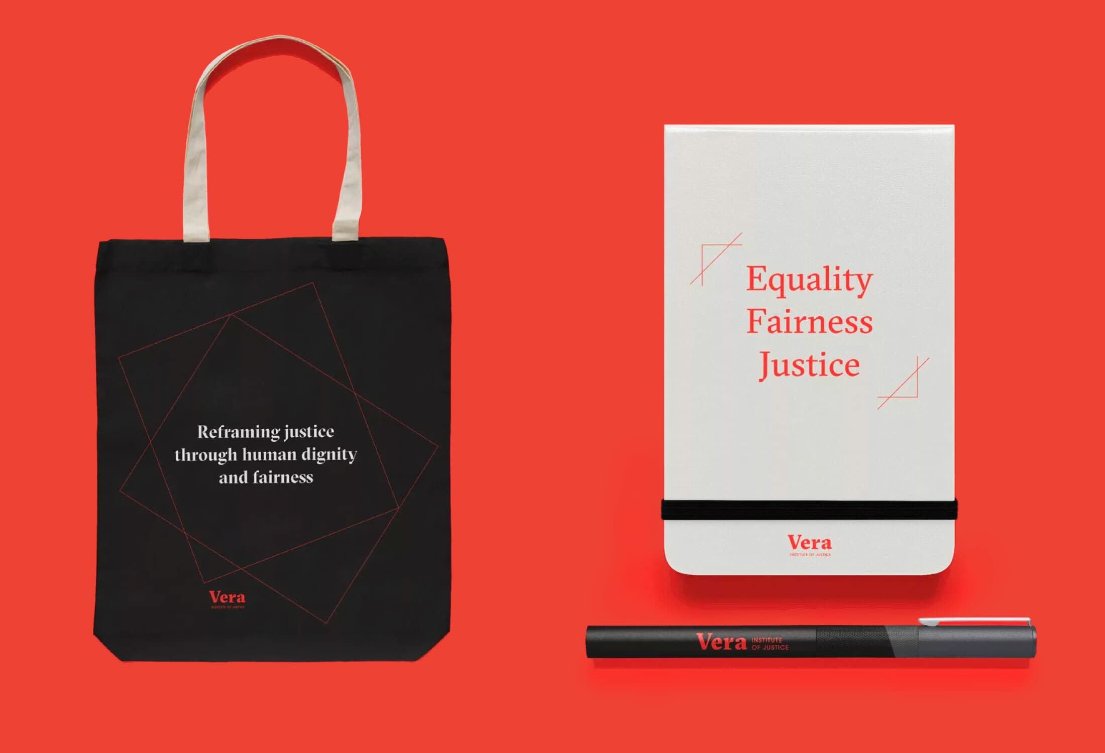
A brand that reframes justice
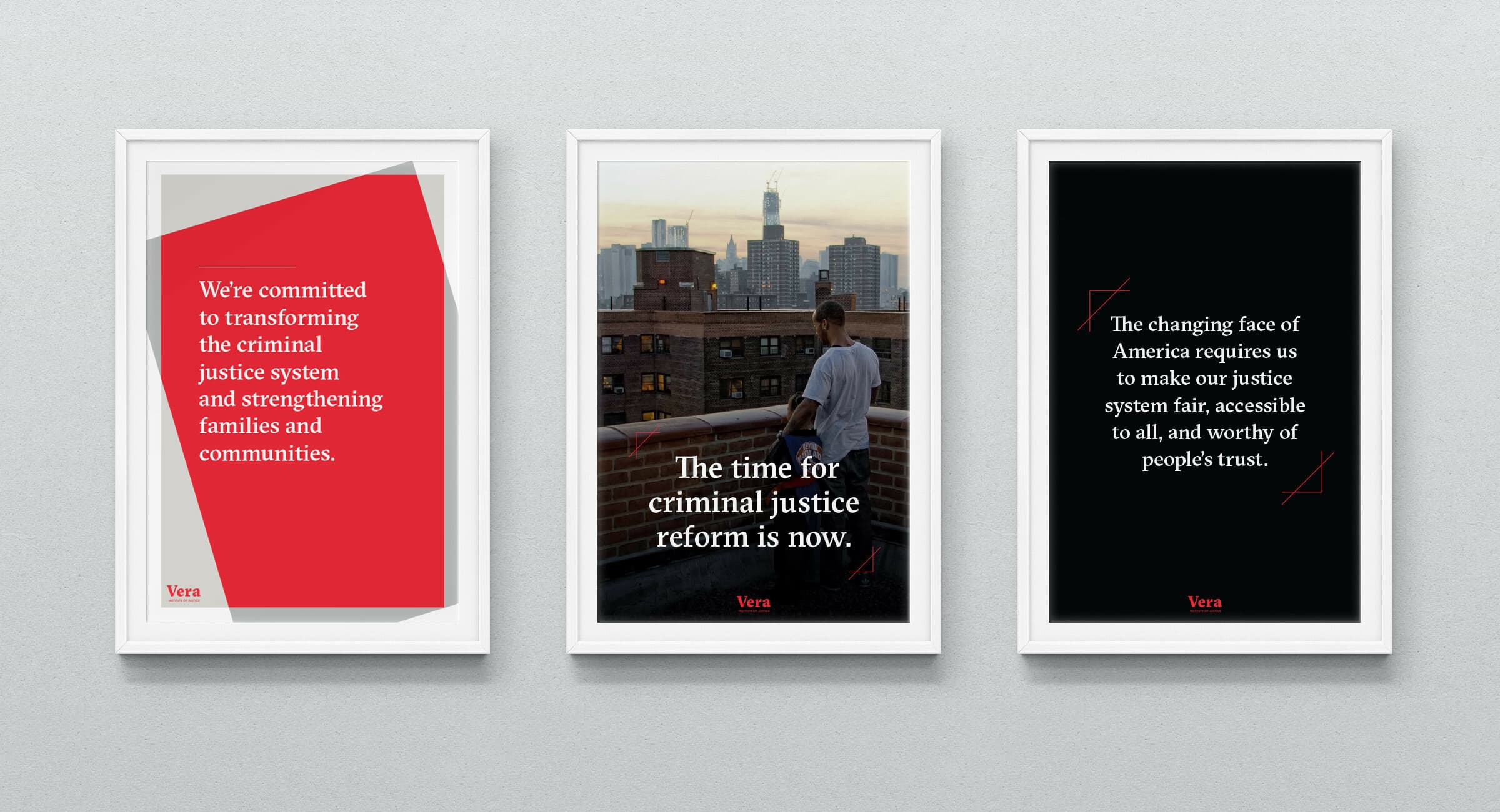
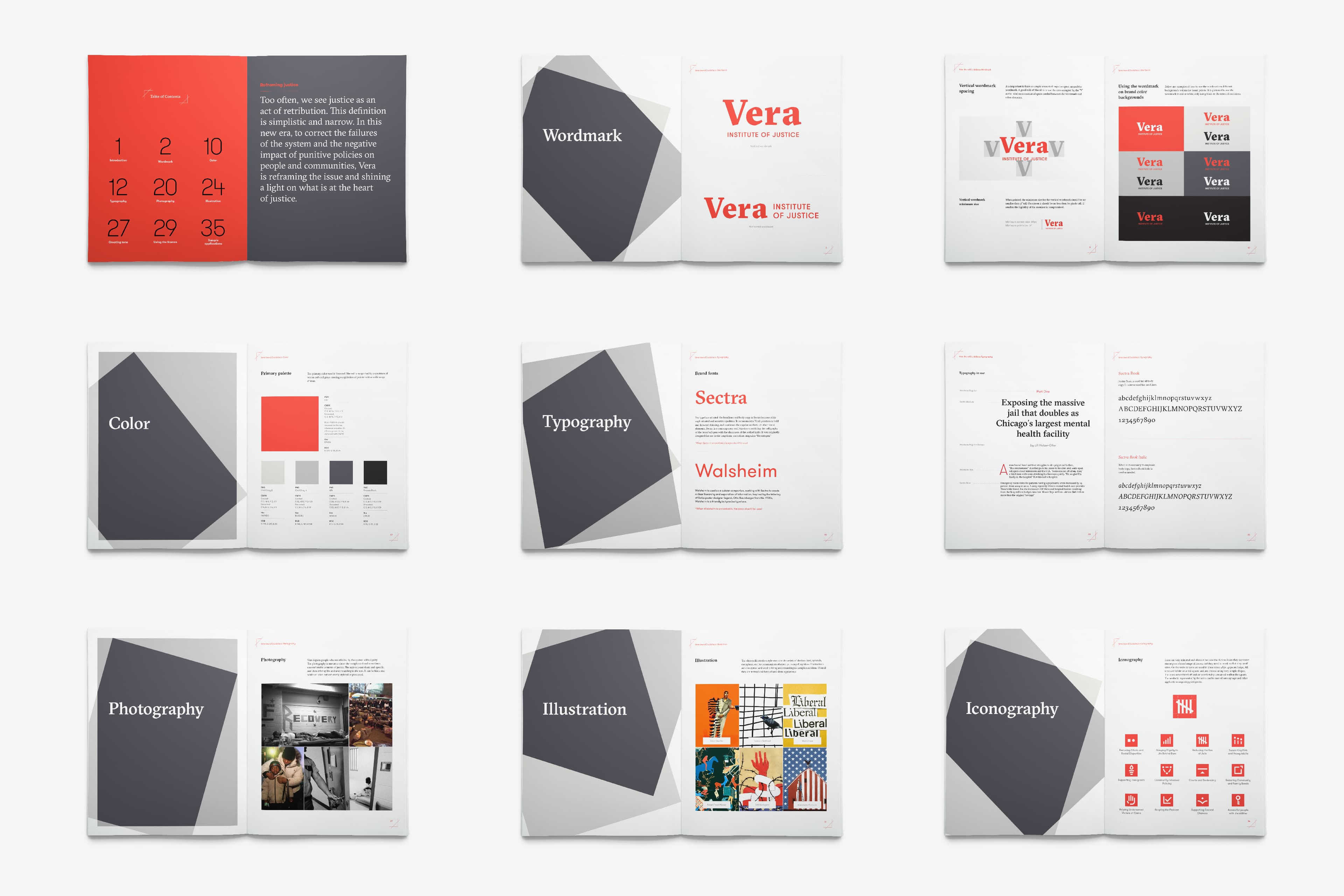
Based on the belief that true justice comes into focus through the lens of human dignity, Vera’s brand identity represents an organization that values individuals and the integrity of our society as a whole. The wordmark connotes the urgency and gravitas of an organization that deploys truth to push for change from within the system—spotlighting visionary and radical correctional leaders, judges, public defenders, and police chiefs.
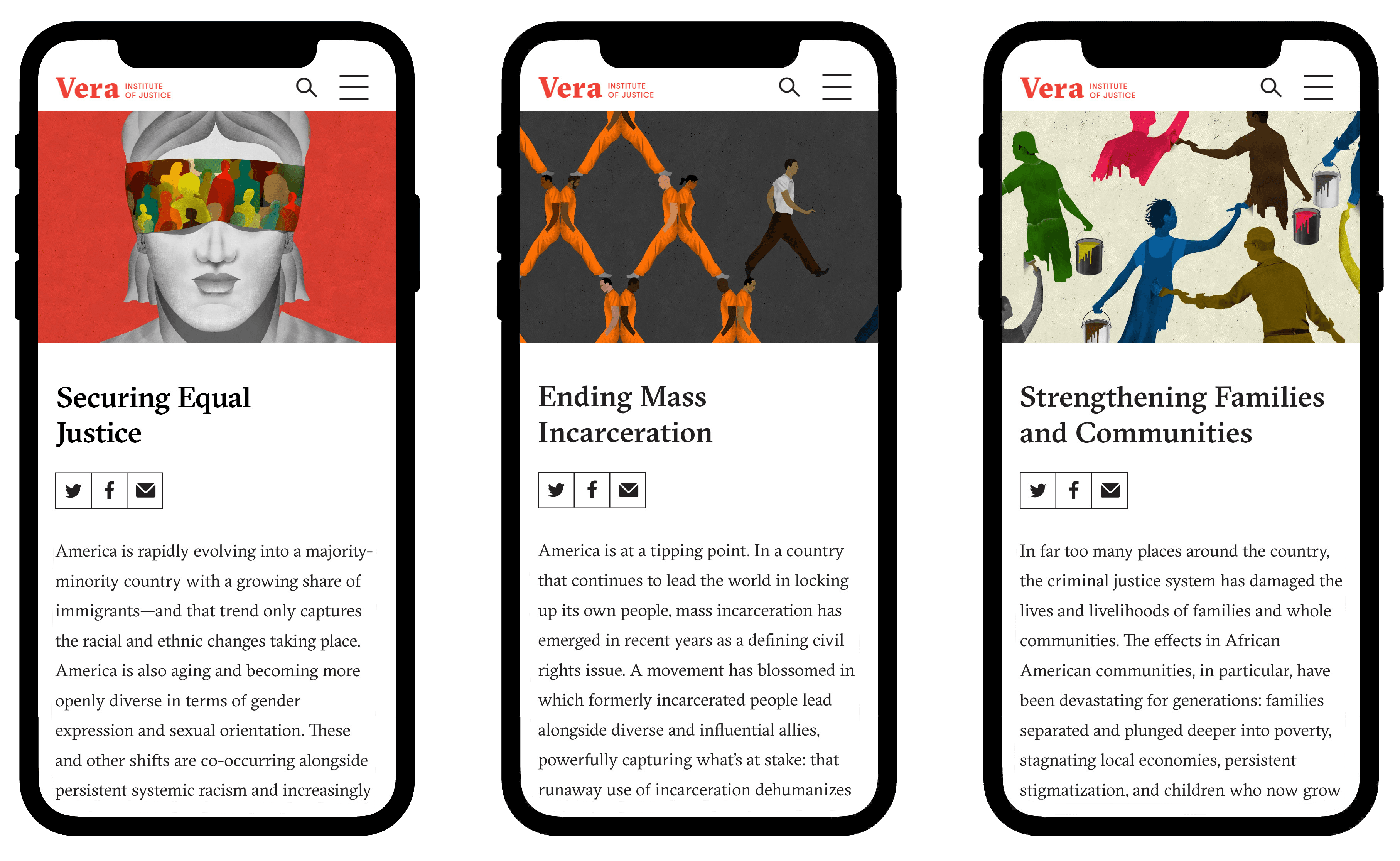
These three related but distinct components of their work helped define Vera's role in the justice ecosystem. By breaking these down into more specific "action areas" and "issues" we provided clear paths for exploration and understanding of a vast library of research and analysis produced by Vera over more than half a century.
Artist and illustrator Brian Stauffer created these illustrations to evoke Vera's three commitment areas.
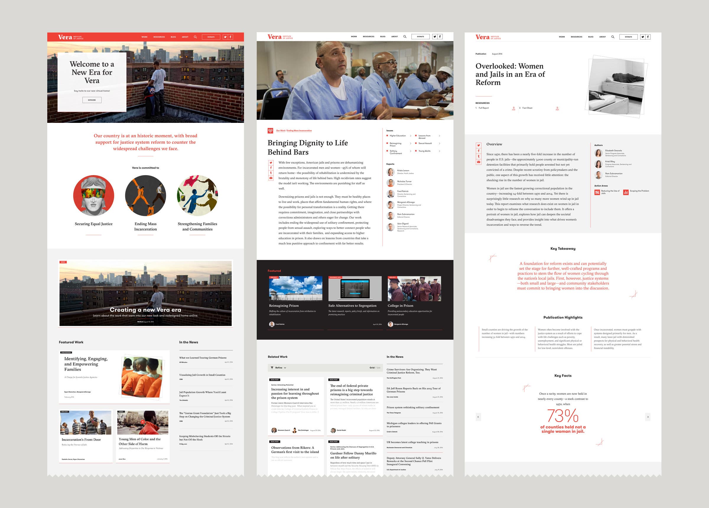
A flexible system for an organization in motion
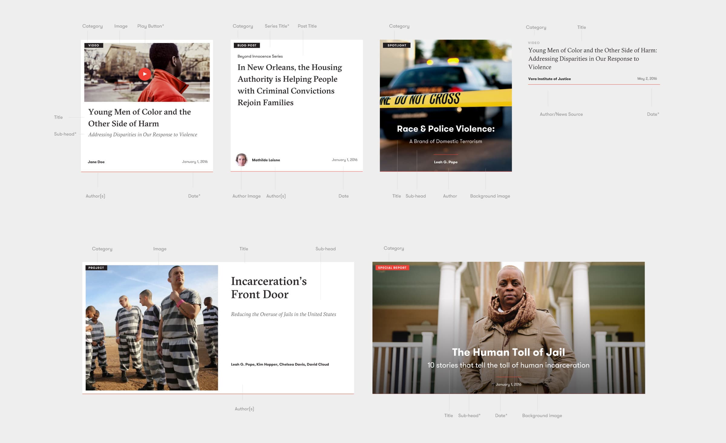
Vera is a content powerhouse. Their rapidly growing digital library spans over half a century of work and covers multiple dimensions of our labyrinthine criminal justice system. After conducting an in-depth audit, we used atomic design methodology to build a library of modules and a system of guidelines that underpin how content pieces are displayed, organized and related to each other on the new site.
The new system allows Vera to bundle their work into streams using an issue-based taxonomy so users can explore, sort, and filter content based on their particular interests.
We also helped Vera's current staff build a framework and toolset for an ever-growing and evolving stream of media-rich, digitally native storytelling projects that compel new audiences to learn about efforts to reform our inhumane justice system.
Betting big on visual storytelling
Vera's new brand and website, launched in the summer of 2016, marked a turning point in the organization's approach to content creation. With a new voice focused on advocating for change in the criminal justice system, Vera harnessed the power of its new digital tools and leaned into visual storytelling for the first time in its history. Over the last five years, Vera has published dozens of "Special Reports" in an assortment of different formats, all designed by Hyperakt. Readers spend 2x to 4x more time on Special Reports than Vera's site-wide average time on page.
Visual essays
Whether it's providing historical context for the present day ills of mass incarceration or highlighting first-hand accounts about how societal inequities play out in real lives in the present day, Vera has many compelling stories to share. Over the years we've designed and built an expansive system of features which can be used to weave powerful photography into stories, like Paid In Full, a photo essay about money injustice in New Orleans. Other essays feature videos and data visualizations to further the emotional resonance.
Custom title pages
For several of Vera's more ambitious storytelling pieces, like the Reimagining Prisons Webumentary, we have designed custom title covers. The attention to detail and high production value convey the importance of the content and give the story the sophistication of a top-notch digital magazine.
Multi-chapter essays
Vera publishes a lot of reports. In the olden days, these were printed documents or at best pdf downloads. We've given Vera the ability to publish visually-rich, digital-native reports like Driving Change, which summarizes the organization's current strategic objectives. Because these have a tendency to be quite lengthy, we built in a sticky index menu that sits in the navigation bar allowing readers to jump from chapter to chapter.
Story collections
Vera often produces content pieces that collect multiple stories centered around a common theme. For example, the State of Justice Reform reports provide a benchmark for issues such as voting rights for the justice-involved, police shootings, and bail reform. We've designed a suite of templates that allow Vera to publish collections of individual articles, all packaged with a unifying visual theme, navigation, and taxonomy.
Data visualization
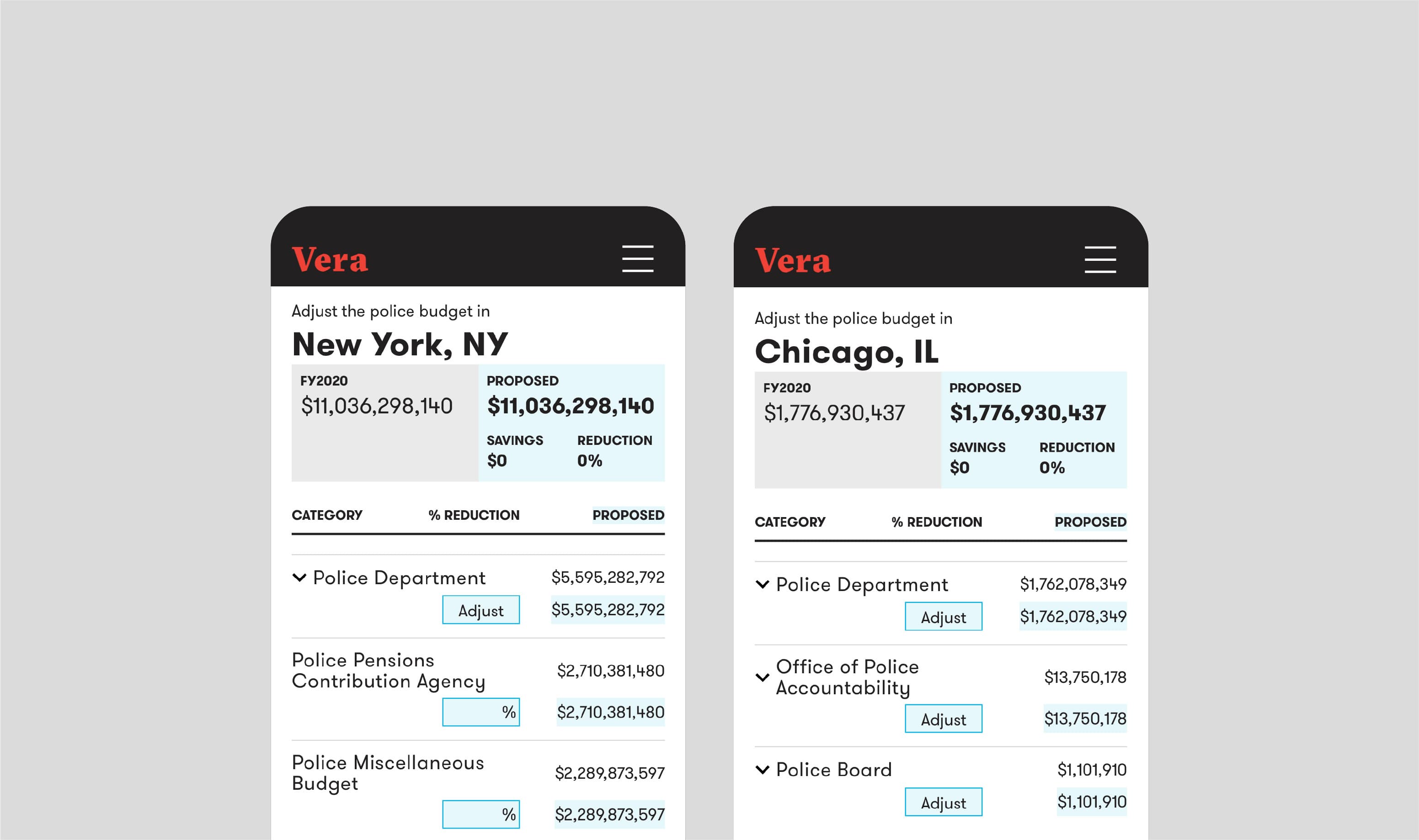
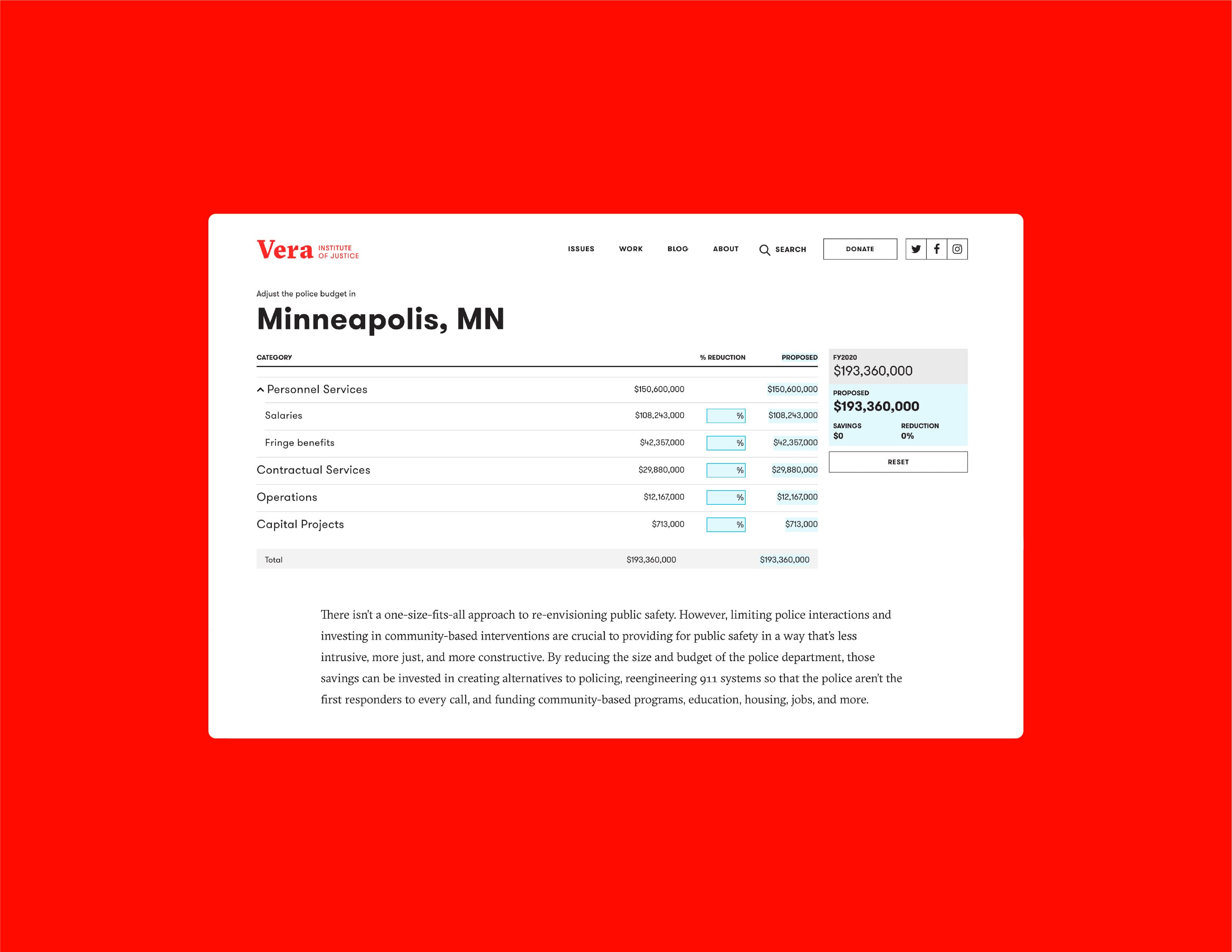
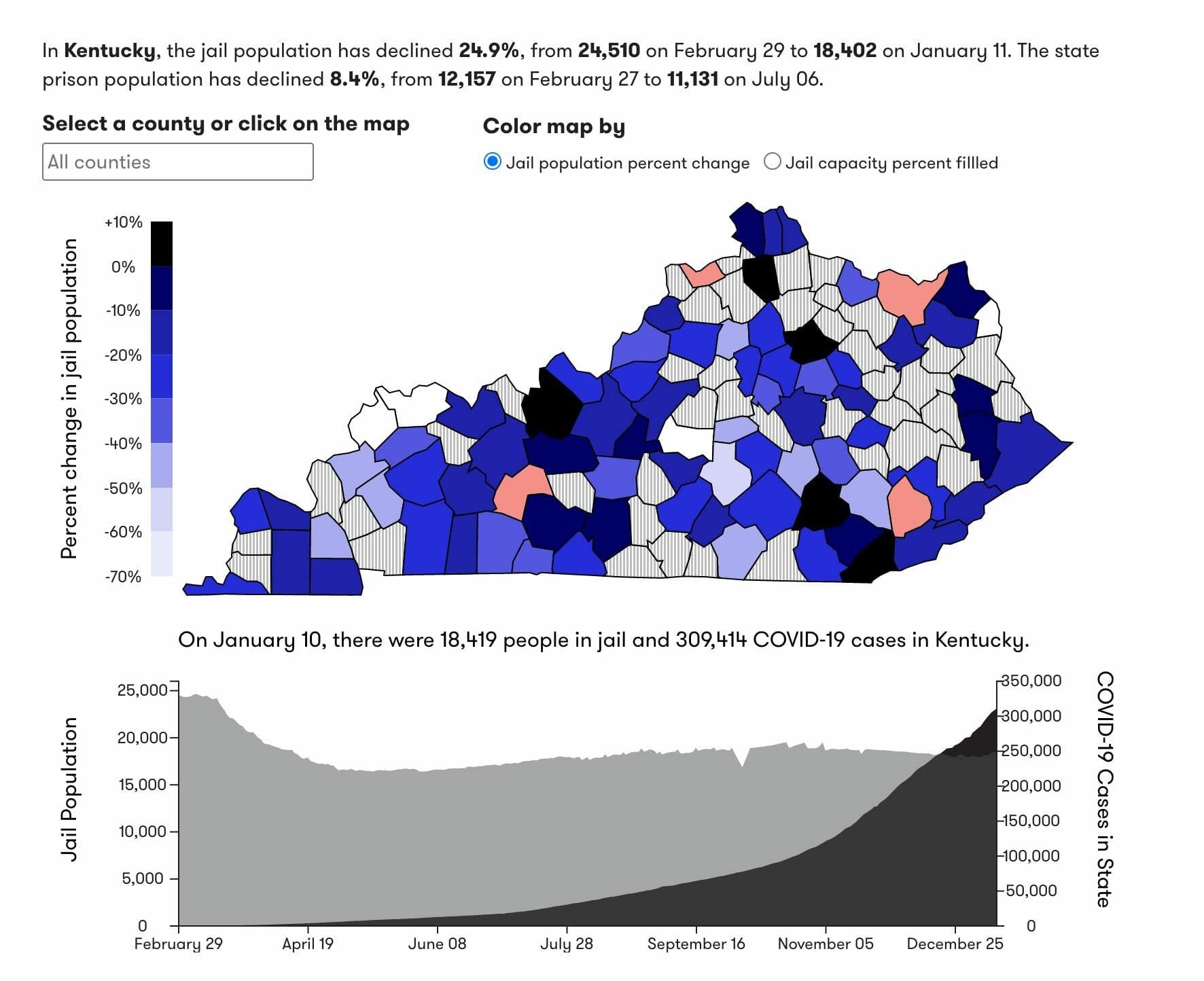
At its core, Vera is a research organization. Its collection and analysis of datasets within the criminal justice space are unparalleled. In order to make these datasets accessible and useful to the public, Vera counts on Hyperakt's expertise in Data Visualization to design intuitive interactions for their data.
Co-branded initiatives
As a large, system-wide actor, Vera forms strategic partnerships with specialized organizations working locally. Given the depth and distinctiveness of each partnership, each one merits specific branding—and with it, facilitation and alignment of two teams, brand identity design, content strategy, website design, and development.
 Motion For Justice
A resource hub that equips prosecutors—the legal system’s powerful gatekeepers and decision makers—to reduce racism-fueled harm to Black and brown communities.
 Restoring Promise
Working cooperatively to honor heritage and build trust in programs that restore dignity to young adults in the criminal legal system.
Collaboration, from beginning to end
At every step along the way, we worked side-by-side with Vera. Our collaboration involved countless stakeholder interviews and workshops. It was important that diverse Verans from all program areas and teams were able to come together to craft a shared story about their work and its relevance to the outside world. Together, we surfaced insights and ideas, leveraging our combined expertises to build an inspiring brand and digital experience everyone could be proud of.
- 122%increase in site visits
- 123%increase in unique visitors
- 105%increase in the institute's operating revenue two years after site launch
Impact
Vera’s brand and website, launched in summer 2016, was a turning point in the organization’s history. Formerly known as an organization with a government inside-lane, Vera has reimagined itself as an outward facing advocate and champion for justice. Within two years of the site’s launch, content publishing increased exponentially and visits to the site more than doubled.
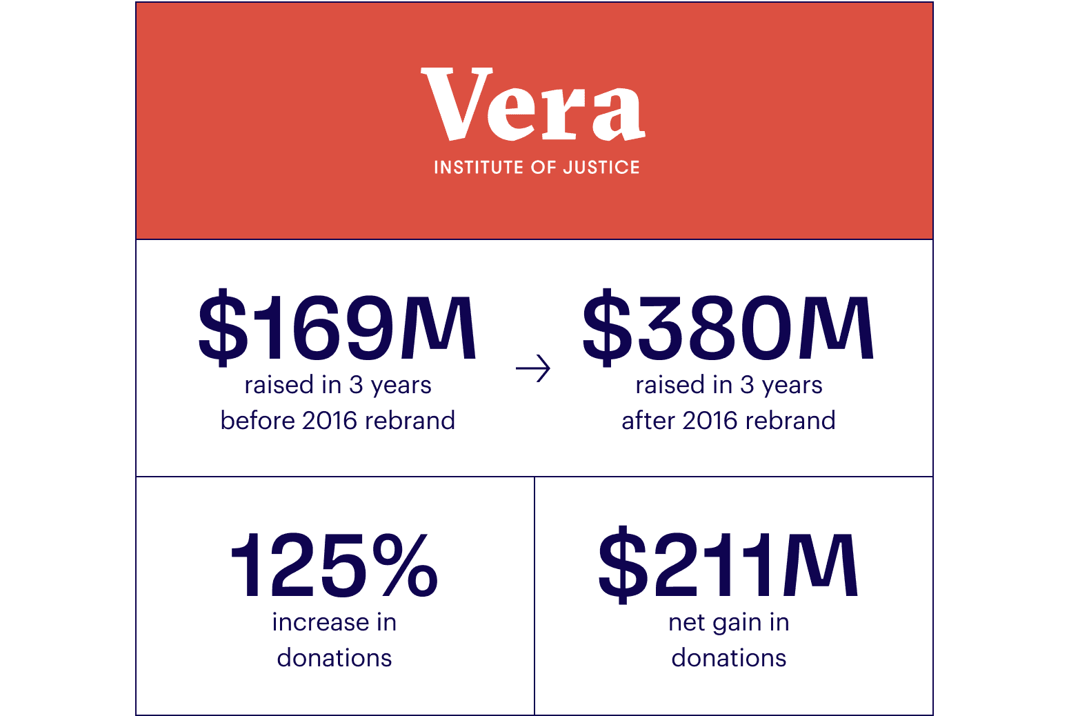
Vera’s new stature also led to immediate financial impact: a capital campaign with a $50MM five-year goal was surpassed with $75MM raised just two years after the new brand and site launched. In those two years, Vera’s operating revenue more than doubled and that growth continues to accelerate. The organization has grown their fundraising and staff more in the last four years than at any other time in its fifty-year history.
Project Credits
- Deroy Peraza
- Sruthi Sadhujan
- Eric Wang
- Nick Di Chiara
- Jason Lynch
- Jeanne Henry
- Andres Kishimoto
- Radhika Unnikrishnan
- Misa Rodriguez
- Dylan Viola
