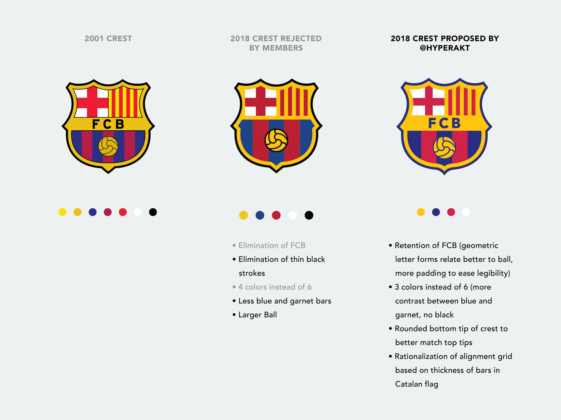
FC Barcelona, the football club I love like many people love their religions, is undertaking an update to their legendary crest. With over a century of history, about which I’ve previously waxed poetic, this is no simple task. The crest has been simplified considerably over the years. The current version was updated in 2001. Quite a bit has changed since 2001 and the crest is due for a bit of cleaning up again to improve its legibility on small digital devices.
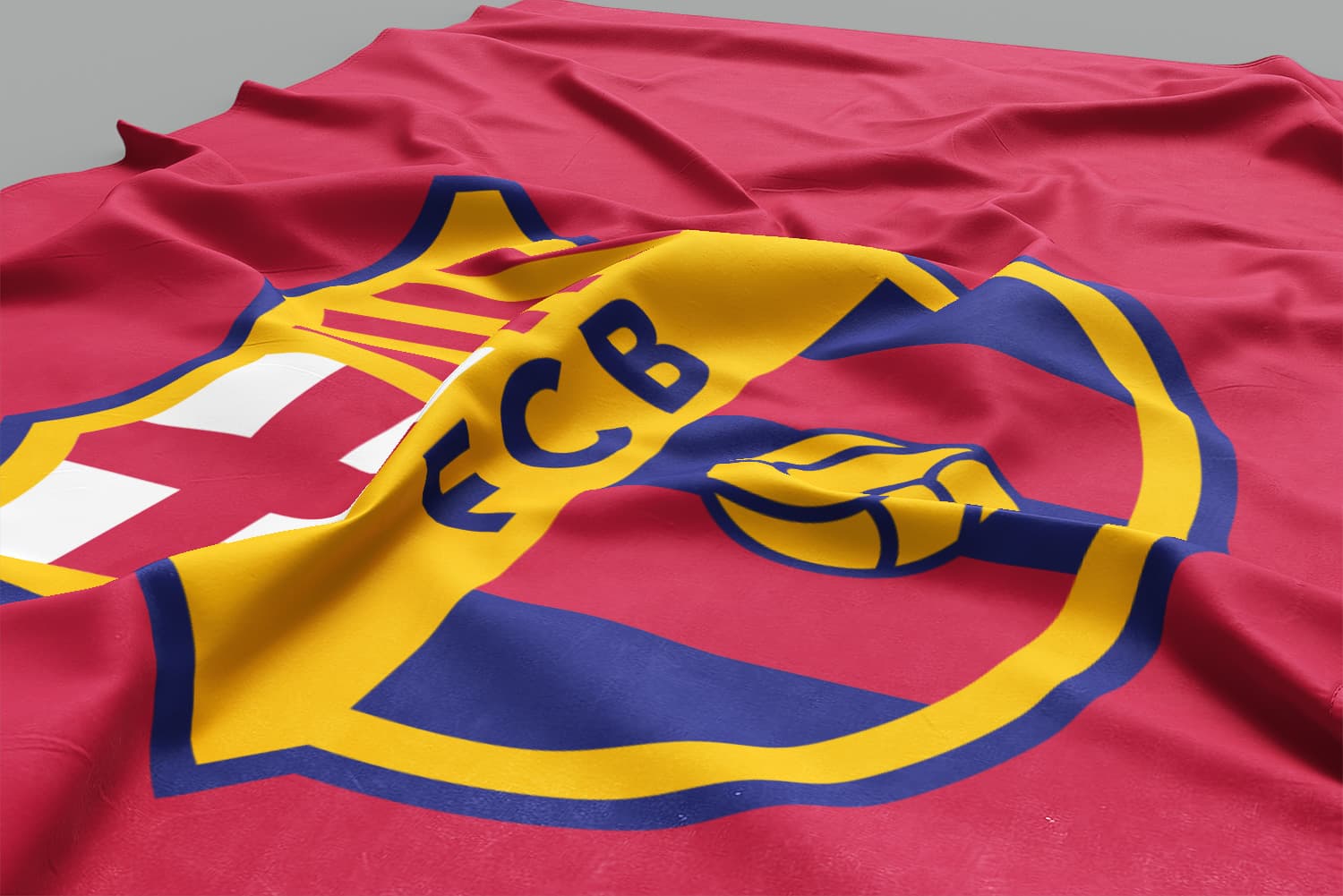
Barça turned to Barcelona-based Summa for the rebrand. They did a fine job as you can see here. It seems they went a bit too far, though. Members of the club voiced strong opposition to the change due to the removal of the club’s FCB initials from the crest.
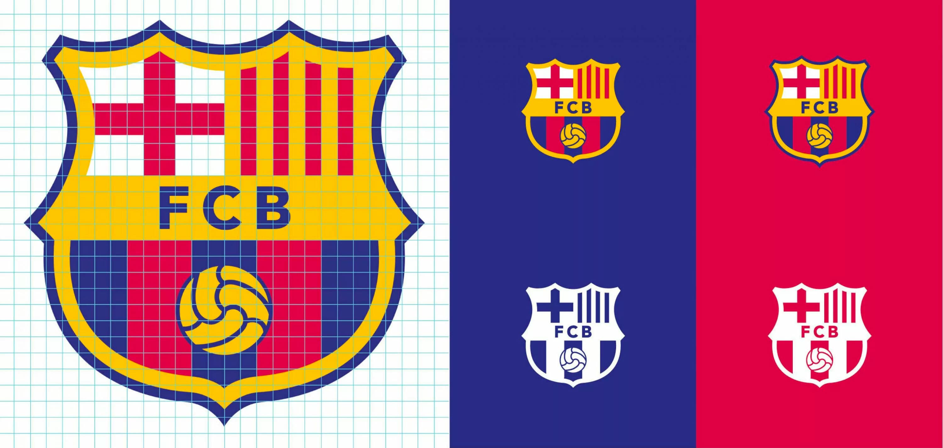
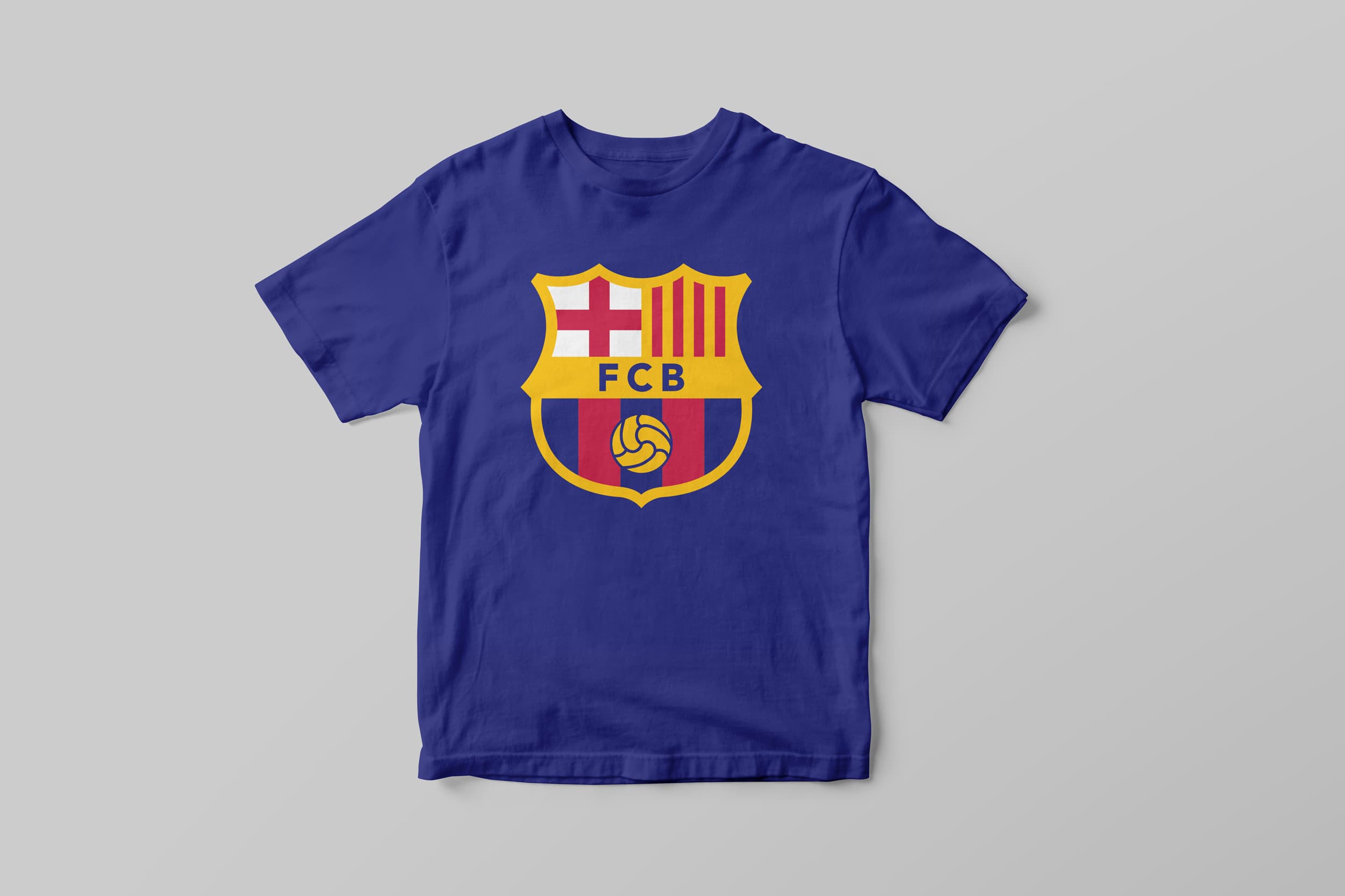
While the new crest introduced a lot of great simplifications, I too miss the FCB. Beyond that, the straight edge on the St. Jordi cross feels awkward. I’ve taken the liberty of suggesting some amendments.
The history of the FC Barcelona crest
Unlike American sports teams, soccer teams in Europe (and most everywhere else, for that matter) stay away from the whole mascot thing. In fact, seen from a hardcore soccer fan’s perspective, the idea of calling a team something like the Minnesota Timberwolves (NBA) or the Jacksonville Jaguars (NFL) sounds a little childish. Beyond that, having a logo with a cartoony looking 3D animal head is a big fútbol faux pas. Instead soccer clubs tend to have no mascot (they are either Football Club So-and-so or Bla-bla United, or something of the sort), and they mostly stick to good old-fashioned crests to represent them.
I have to admit, I’m a sucker for the crests. Unlike the uber-literal logos of most American sports teams, there are usually layers of meaning behind crests. For a team like Barça which has been around since 1899, those layers help to illustrate the rich history to the club.
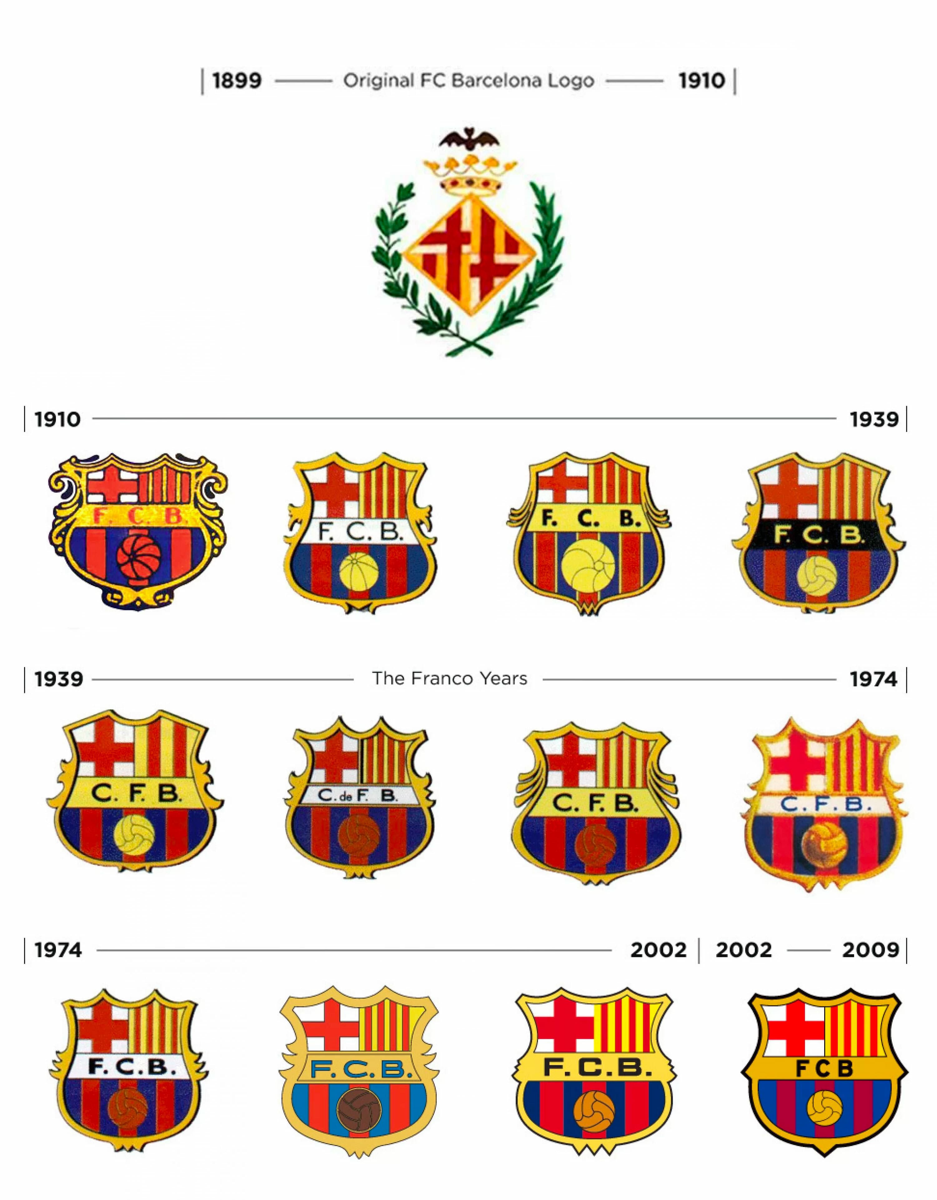
I’ve done a little digging around on the club’s website and around the interwebs and found the various incarnations of the logo you see here. As you can see, with the exception of the very earliest versions, which heavily feature Barcelona’s municipal crest, the basic elements of the logo have been in place since 1910. The logo, which was selected in a contest, was designed by Carles Comamala, who was actually a player for the club from 1903 to 1912. You can’t get more immersed in a brand than that. I can hardly imagine current players like Leo Messi or Zlatan Ibrahimovic wipping out the old color pencils and sketching out some logos.
The crest is divided into three parts. The upper left contains a red cross on a white field and symbolizes St. Jordi (St. George), the patron saint of Catalunya, which is the autonomous community (kind of like a state) that Barcelona is the capital of.
The upper right section of the crest contains the flag of Catalunya. Legend has it the four red bars represent king Charles the Bald’s four bloody fingers dragging on Wilfred I the Hairy’s (Count of Barcelona) golden shield after the king wounded the count in 897. Pretty colorful, huh? I’ll make a quick digression here for a quick history lesson. Catalunya has been called Catalunya since the 12th century and was one of the several kingdoms that were absorbed by the kingdom of Spain. It has its own language, Catalán (which is not a dialect of Spanish), culture, traditions and flag, all of which have often been repressed or outright prohibited by the Spanish government throughout the last several hundred years. Among other things, this is a big part of the reason for the intense rivalry Barça has with Real Madrid. During Franco’s long rule of Spain (1936-75), when speaking Catalan was made illegal, Barça games against Real (seen as representative of the central Spanish government) were among the few instances when people could express their rage. Thus the superclasico gained its political undertones.
Now, if you notice in the logo specimens, in 1939 the logo was changed to include only two red stripes in the flag. Why you ask? Well, Francisco Franco, Spain’s dictator in chief wasn’t so keen on expressions of Catalanism, so he made the club get rid of the official flag on the shield! He also made them change the FCB, which stands for Fútbol Club Barcelona (in Catalán) to CFB, or Club de Fútbol de Barcelona (in Spanish). How often do you hear of a sports team having to change its name for political reasons? The club was able to get its stripes back on its flag in 1949, when it celebrated its 50th anniversary, but it wasn’t able to revert to FCB until the Franco madness was over in 1974.
That leaves us with just the bottom section of the crest to dissect. The blaugrana (red and blue) stripes are FCB’s club colors and feature prominently on their uniforms. Joan Gamper, the founder of the club in 1899, brought the colors with him. It turns out that Mr. Gamper was a actually Swiss and played for FC Basel in his native country. He donned Barça’s uniform with his old club’s colors and that’s how it stayed. In fact, a quick Google search reveals some striking similarities.
After several slight tweaks throughout the year, the current version of the logo, created in 2002 by Claret Serrahima, boils the crest down to is simplest and cleanest iteration, making it an easier identity to reproduce across mediums, including all that sweet Nike gear.
There you have it. A not so brief history in Barça branding. Thanks to fcbarcelona.com, brandsoftheworld.com, futbollocoatacando, and of course, wikipedia.org, for informing this article. It goes without saying (but I’ll say it anyway) that all the Barça logos are registered trademarks of FC Barcelona.com. Visca Barça!
