A New Campaign Brand That Stands Tall
The Harris/Walz brand comes together quickly, and so does the Democratic Party.
By Deroy Peraza, Partner at Hyperakt
A few weeks ago, when Joe Biden stepped out of the 2024 presidential race, the newly minted Harris for President team spun up an updated brand to reflect the change in mere hours. As I wrote then, the updated brand sent a clear signal—this is a smooth transition, we’re ready to go. I also wrote that this was surely only the beginning, and that we would soon see an updated brand that better reflected our new presidential candidate.
It took less than two weeks to make that happen. Sounds crazy, but two weeks to create a brand is par for the course in campaign land.
What changed?
As I wrote a few weeks ago, change needs to happen at the right pace and for the right reasons. The brief was to balance continuity with a change in tone to reflect more of Harris’s personality—timed to coincide with the announcement of her new running mate. The latter is the easy part. The VP choice wasn’t decided until the 11th hour before the brand was made public, so the designers had to design for all possibilities on the table. Surely, somewhere in their servers lay several more logos with different potential VP candidates we will likely never see.
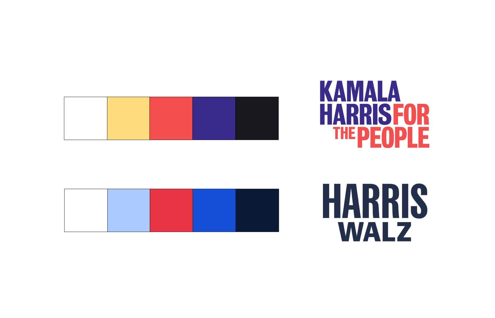
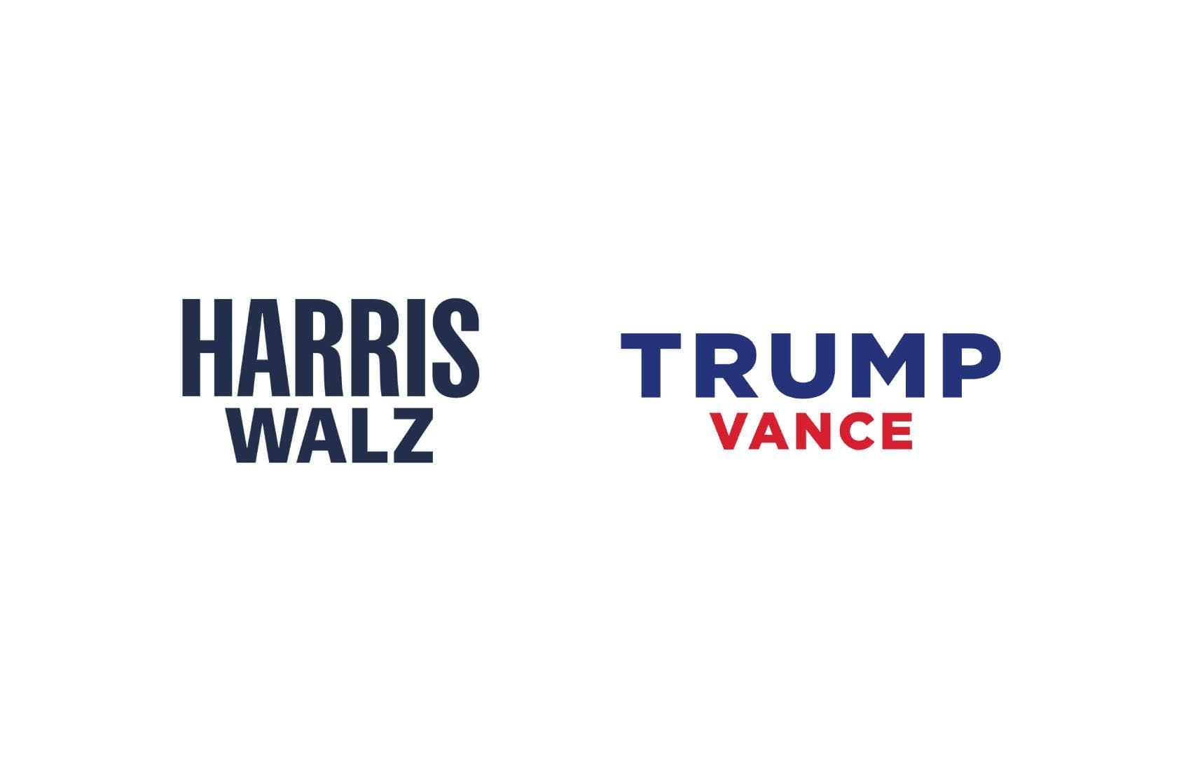
In my opinion, the designers took the path of confidence and clarity here. This is an in-your-face, matter-of-fact brand that is all about clear messaging. It looks like they returned to some of the references that inspired the 2020 campaign branding by our friends at Wide Eye, leaning on the aesthetics of typography-heavy boxing posters to convey that Kamala Harris, and her running-mate Tim Walz, are “no-nonsense fighters who aren’t afraid to speak truth” as that case study states.
The logo says goodbye to Hoefler & Co’s Decimal and Mercury in favor of Lift Type’s Sans Plomb 98 (renamed Fearless Bold by the campaign) for HARRIS, with Tal Leming’s Balto Bold for WALZ.
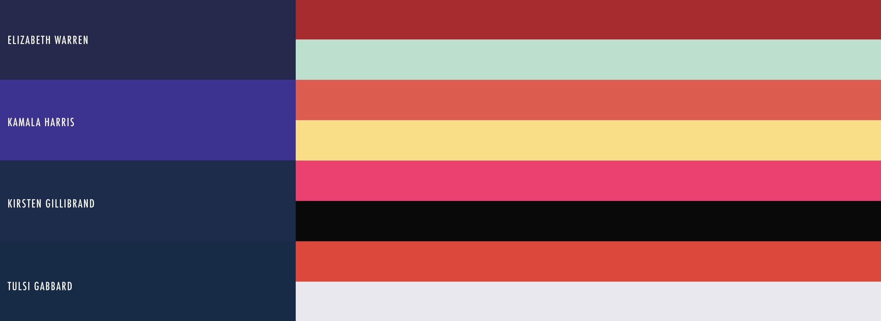
The Biden/Harris 2024 brand colors were freshened up as well. The new palette says goodbye to President Biden’s vanilla ice cream color in favor of a stark white. The light blue was given more heft. The two reds were consolidated into one bright red. A dark navy blue was added to inject some bold contrast. The only color directly carried over was the bright blue, which looks great on the dark navy.
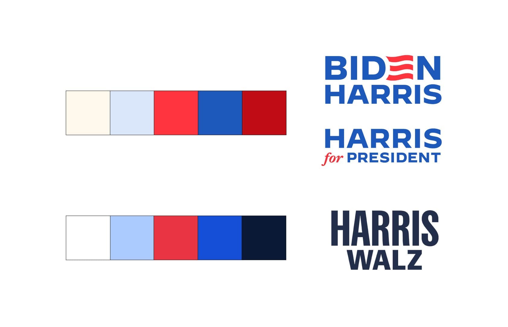
In short, Kamala Harris 2.0 feels like a marriage of the Harris 2020 branding and the Biden/Harris 2024 branding, which makes a whole lot of sense to me.
To the haters
Surely, some people will look at this brand and say, “Meh, it’s just a font. It’s boring and minimalist and doesn’t excite me. It feels rushed.”
Consider this: Yes, it was rushed. It was made in two weeks. There’s no universe where the designers were going to get around that necessary timeline. How would you use those two precious weeks? What would you focus your energy on?
If I were in their shoes, I would use that limited time to tackle practical considerations first. What are the essential jobs this logo and this brand need to do? My answers to that key question would be:
- It needs to be clearly readable from a mile away at campaign rallies. That means simple, bold, and high contrast.
- It needs to be confident, urgent, and declarative. That means straightforward, not fussy.
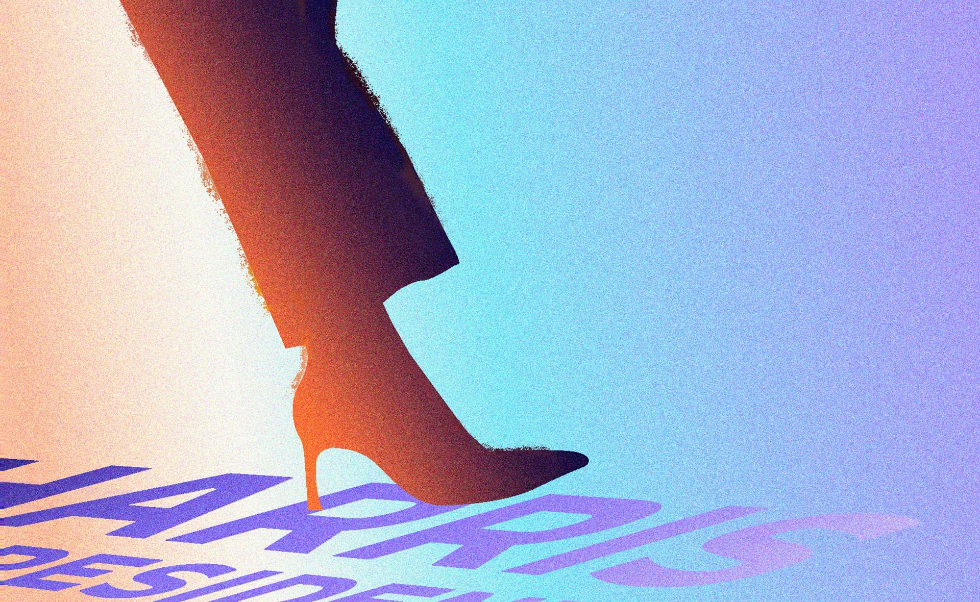
- It needs to convey strength, standing up to and towering over the competition, who happens to be a narcissistic alpha-male with very thin skin. That means tall, bold, and condensed.
- It needs to feel solid, dependable, and convey the gravitas of experienced leaders.
- It needs to be flexible and easy to use so the creative team an quickly incorporate and capitalize on new messages that resonate. In Walz’s first campaign speech alone on August 7 in Philadelphia, he had several made-for-bumper-sticker one liners, including “Mind Your Own Damn Business” “Don’t Underestimate Teachers” “We’ll Sleep When We’re Dead” and “Let’s Bring Back the Joy” that are going to look great set in Sans Plomb and Balto.
In my humble opinion, this brand checks off all of those essentials in spades. This is a solid, tough brand. It’s a work-horse designed to set a tone and carry a message day in and day out. It’s confident. It’s direct. It’s honest. It’s built to win.
But the brand is just a channel—it’s not an end in itself. Any brand is only as good as the organization and people it represents. This is all about Kamala Harris and Tim Walz continuing to build momentum and getting as many people to row with them as possible over the next few months. So let’s not waste our time throwing shade. We’ve got bigger fish to fry. Let’s get to work in whatever ways we can to elect Harris and Walz.