By Deroy Peraza, Partner at Hyperakt
As we turn another wild corner in the 2024 election cycle—one in which we suddenly have a new Democratic candidate with little more than 100 days left to get out the vote, I want to shout out some unsung heroes: Harris for President creative team, there’s much work ahead, but so far, you’re doing great! 🙌
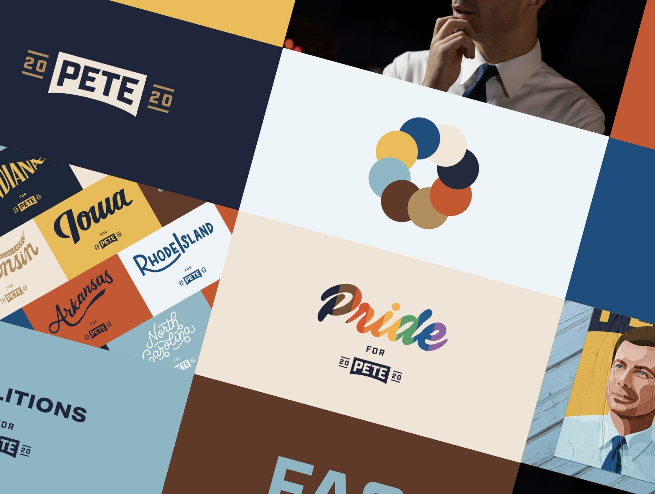
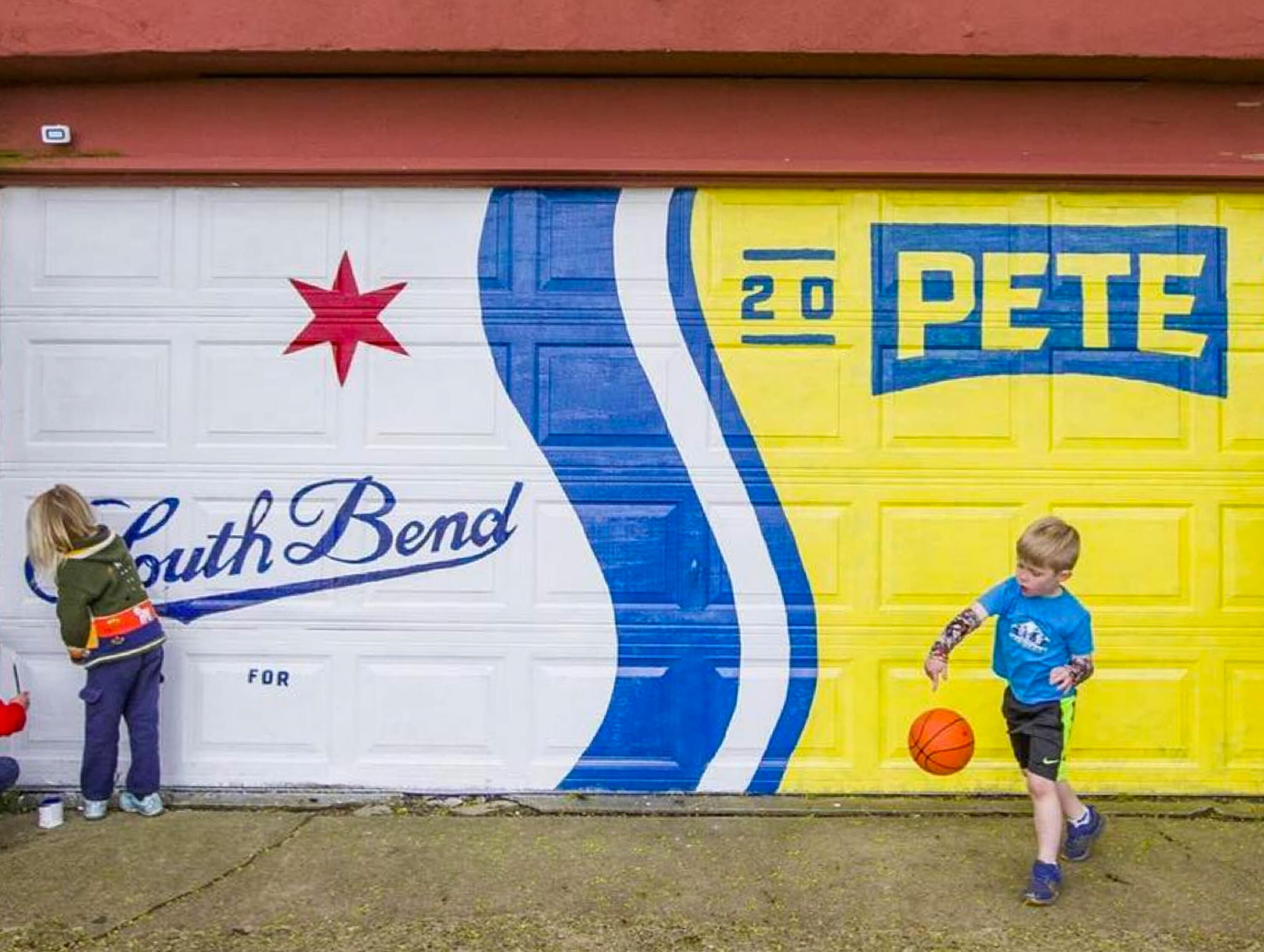
Designing for political campaigns is one of the toughest design assignments there is. It’s stressful, high stakes, ephemeral, and not particularly lucrative work for which people upend their lives. Over the years, I’ve had many conversations with folks who have led creative work for various presidential campaigns and we have had the honor of working on Pete Buttigieg’s 2020 campaign (among others). Political campaign design is an adrenaline rush roller coaster ride—deeply gratifying at times, exhausting and stomach turning at others. In campaign land, work-life balance and family time is not high on the priority list. There is a job to be done. Creative work has to be produced quickly, often with minimal information to rely on, in situations of extreme pressure, and with very little grace if you get it wrong (because, on election day, it’s win or lose for your candidate).
What the Biden (now Harris) creative team did this last Sunday is an extraordinary—and unprecedented—case in point. Biden announced he was dropping out of the race four months from Election Day in the middle of the afternoon on Sunday, July 21st—with prior speculation, but no prior warning to his team. Twelve hours later, the campaign was rebranded to Harris for President. Maybe this was anticipated, and they had it ready to go, but the speed and scope of the rebrand was impressive.
The campaign brand, originally developed by Creative Director Robyn Kanner and her team, was lovingly crafted and flexible enough to allow for a quick pivot to the Harris for President brand while retaining coherence and high production value. The design system continues to be anchored by a vibrant blue and red—perhaps not surprising for a presidential campaign brand—and a vintage cream color that felt right for Biden. After all, the man really loves ice cream.
The brand employs two beautifully crafted fonts: Decimal (inspired by type on wristwatches) and Mercury (designed for high performance readability in editorial contexts), both by Hoefler & Co. Both fonts are combined in the new logo in a familiar style that tries to say both classic and modern at the same time. It’s a look straight out of the good ole Obama days.
Looking at the Harris for President brand more critically, one might argue that it feels like a continuation of the Obama-Biden tradition at a moment when we’re all looking for a fresh start.

Obama/Biden 2012
Biden/Harris 2020
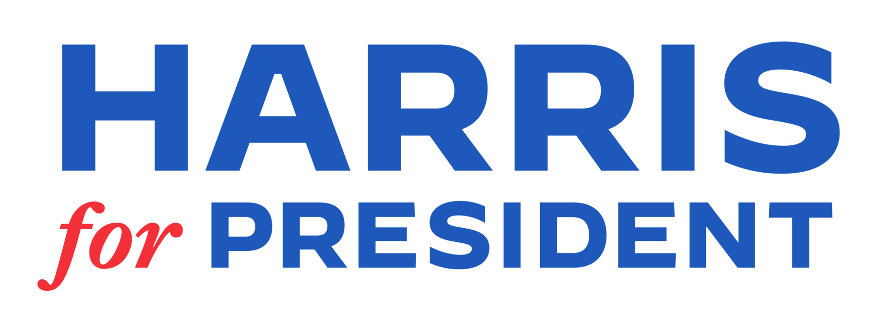
Harris 2024
Design alone doesn’t win campaigns, but it does provide some good clues into a campaign’s strategies. The decision to carry over the hallmarks of the Biden campaign’s identity system tells us a few things: Democrats are betting on emphasizing continuity here—an upgrade to a younger, more vigorous candidate, but one who carries forward similar ideology and a sense of stability. The calculus is that at this moment, it’s important to convey that a quick but orderly transition is in process, and the logo effectively does that. It’s the practical solution that leverages a very solid brand foundation.
Trying to immediately blow the brand up and start over with a hard pivot would have been a massive distraction, a huge risk, and a logistical nightmare. As with many things, change needs to happen, but it needs to happen at the right pace in order for it to stick and be effective. I’d say it’s a pretty safe bet that much will happen in 4 months ahead as events play out—both in the political drama unfolding before us and in the brand story of a unique candidate with a lot to repackage for the American public and a big chance to make history. This brand will need to evolve organically now.
Surely, what we’re seeing today is a new beginning for the campaign and for its brand. Over the coming months, the design team, and the creative partners they work with, will surely find ways to introduce more of Kamala Harris’s personality in there, not to mention update the brand to include a running mate. Not doing so would be a missed opportunity to highlight what she brings to the race and to the party at this critical stage, and to signal that the torch has indeed been passed to a younger, more diverse generation of leadership within the Democratic Party.
One very concrete design challenge, for example, is that the Biden/Harris design system leaned heavily on handwritten elements that convey “roll up your sleeves and get the job done” authenticity. That’s great. The only problem is that it’s Joe Biden’s handwriting, which wouldn’t make sense to continue using. The updated brand is using hand drawn lines and arrows, but incorporating Kamala Harris’s handwriting might be too on the nose.
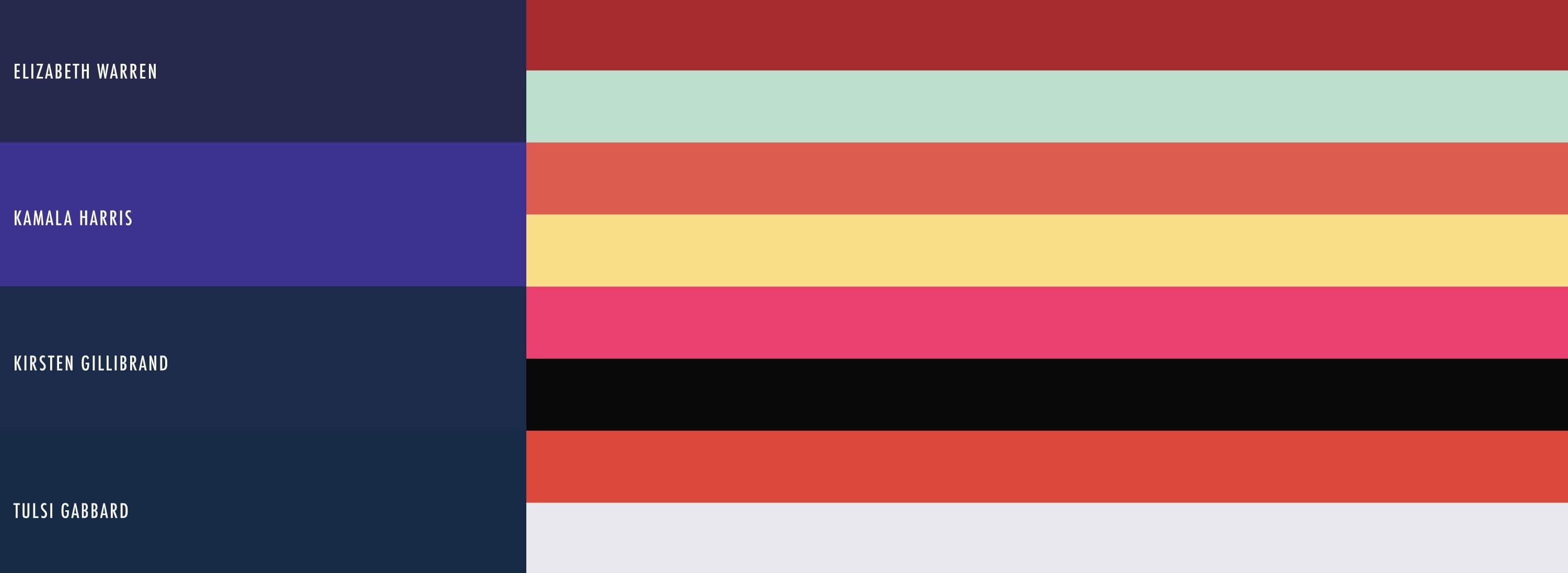
A new visual language will need to take shape in the days ahead to breathe life into the campaign website, Instagram posts, and TV ads. Broadening the color palette to achieve a less vanilla vibe might be a good place to start. Perhaps we’ll see the return of the buttery yellow color—an homage to the campaign branding of previous Black presidential candidates Shirley Chisholm and Jesse Jackson—used prominently in Harris’s 2020 campaign branding created by the team at Wideeye. Or we might see the incorporation of a new font designed by a Black type designer—Vice President Harris has been known to give great importance to the identities of the artists featured in the art collection at her residence. Over the next several months, we’re also likely to see a flood of new Kamala Harris memes spring up, which the campaign team will need to figure out how to leverage to boost their appeal to younger audiences—something that should feel a bit more natural than it did with an octogenarian candidate. Whatever the changes to come, I’d be surprised if they aren’t significant in a month or two.
At the end of the day, a brand is a reflection of a promise and a personality. As the current VP, Kamala Harris provides continuity of promise, but with a decidedly different personality than President Biden. Expect her brand to come to reflect that.
If you're thinking about how to evolve your organization's brand organically through a moment of transition, let's chat.