Work

SparkYouth NYC

Expanding opportunities for New York's youth with the vibrant energy of connection and uplift.
A blue background with the text "spark youth NYC" in white and yellow. The "k" in "spark" is stylized with a lightning bolt. A small yellow lightning bolt symbol is in the bottom left corner.

The challenge

On the cusp of its 25th anniversary, the organization’s brand wasn't speaking to its dynamic, innovative work in youth development. Previously known as Catalog For Giving, the name reflected its founding function as a rolodex of youth charities. But the organization had growth in the depth and breadth of its purpose, including development training and peer networking. The new name and visual language needed to elevate the energy and potential of New York's youth, while also speaking to donors' increasing interest in maximizing the impact of their financial support.
The image shows a logo for "Spark Youth NYC." On the left, the primary mark consists of "spark youth" in bold, blue letters with "NYC" in yellow. On the right, there is a yellow lightning bolt icon.

Finding the spark

Through a series of collaborative creative sessions, we explored the heart behind the work accomplished thus far and dug into the goals that will carry the organization into the future. Our team renamed Catalog For Giving as Spark Youth NYC, conveying the catalyzing energy they provide to youth organizations. We designed a complementary visual brand that marries a bright color palette and iconography that illustrates the exponential impact of the SparkYouth model and a new website that puts the organizations SparkYouth supports front and center.

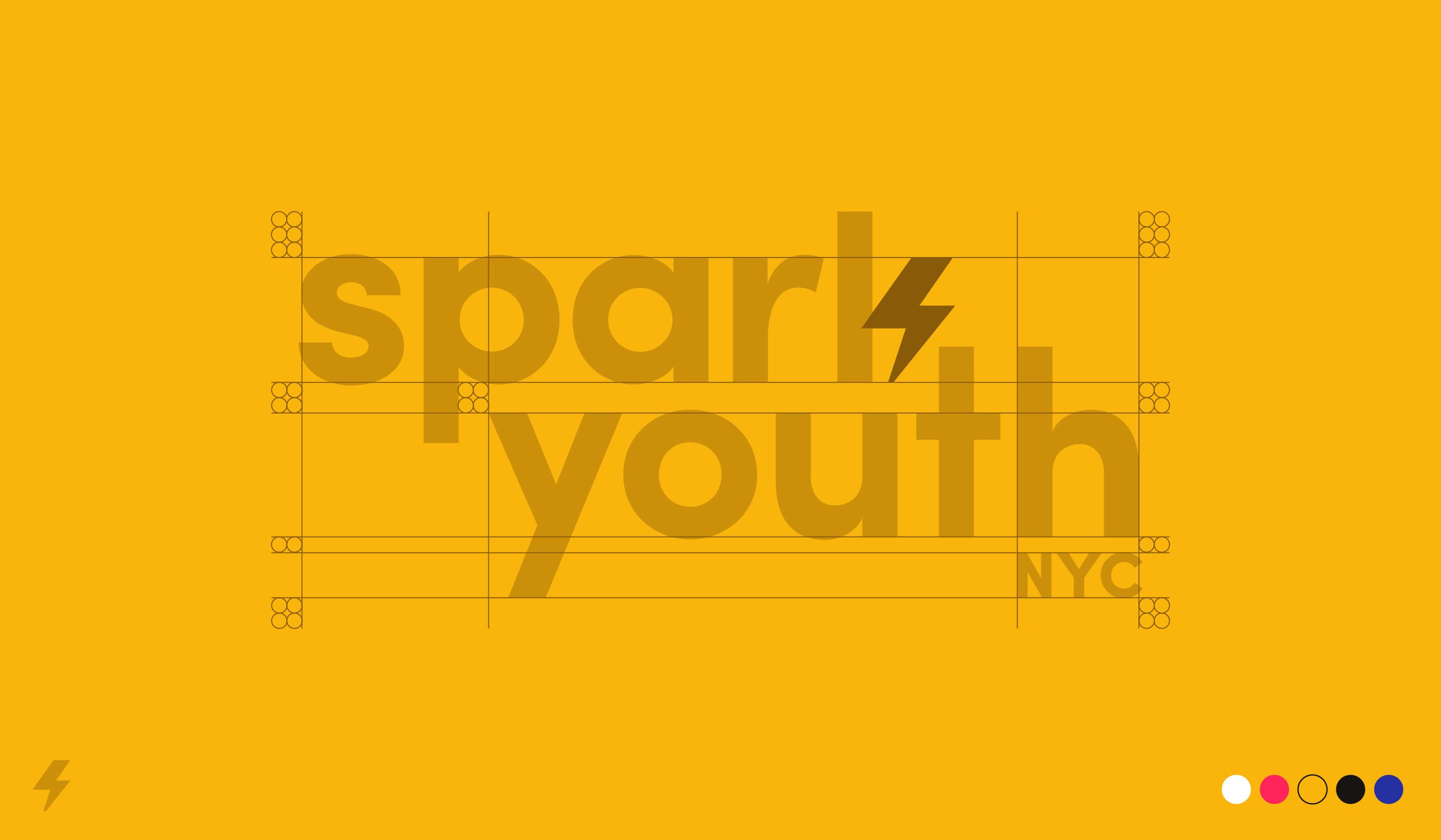
A bold, yellow graphic featuring the text "spark youth NYC" with a stylized lightning bolt replacing the 'a' in "spark". Grid lines and alignment markers are overlayed on the text, and a small logo with a lightning bolt is in the bottom left corner. Color dots are in the bottom right.
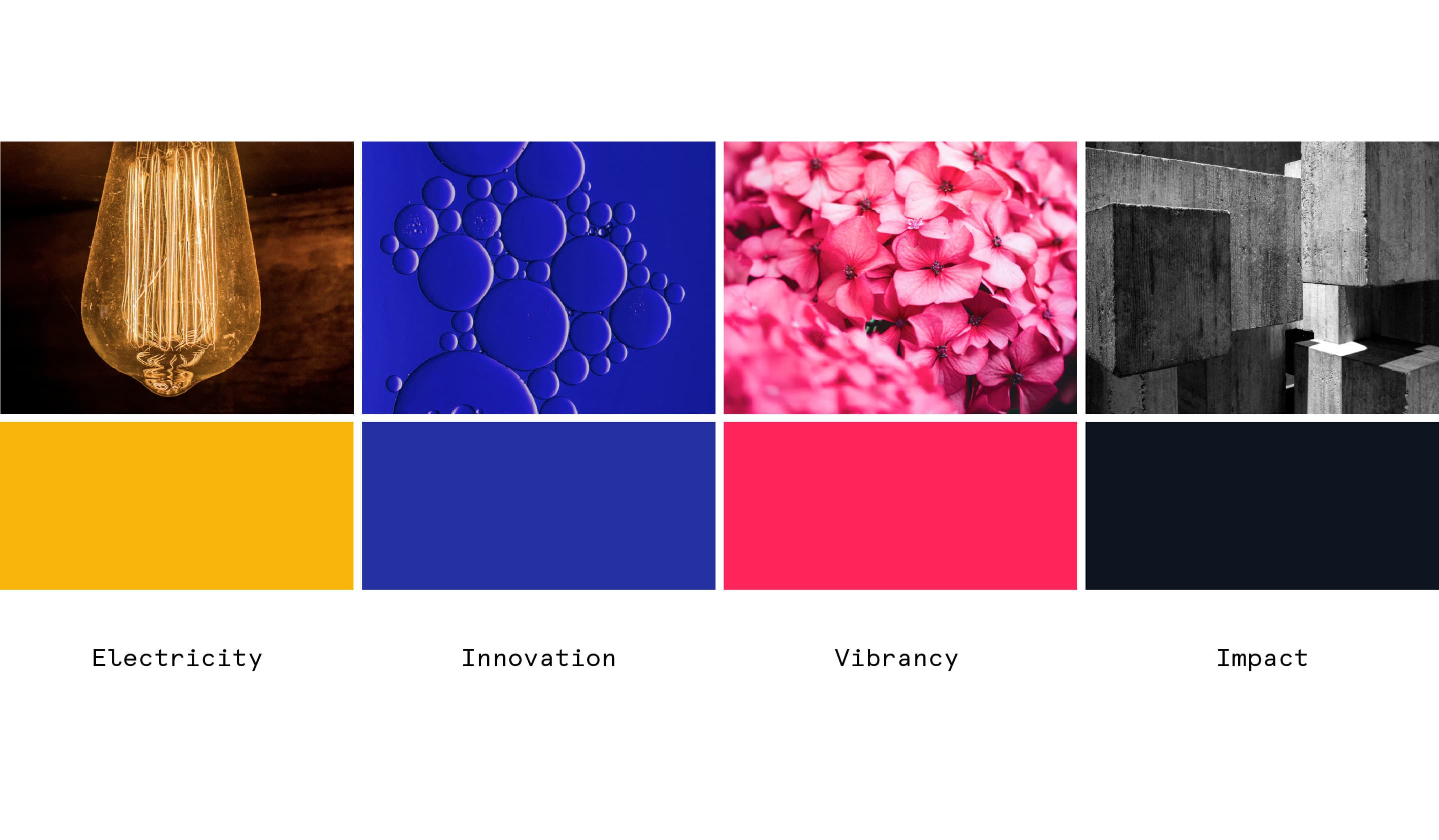
A collage of four images and four color blocks with labels. Top row: a lightbulb ("Electricity"), bubbles in blue liquid ("Innovation"), pink flowers ("Vibrancy"), and concrete blocks ("Impact"). Bottom row: orange, blue, pink, and black color blocks correspond to each term.
Six vertical rectangles are arranged side by side. From left to right, their colors are blue, yellow, red, white, black, and black. Each rectangle has a white lightning bolt in its bottom left corner, except the last black rectangle which has a yellow bolt.
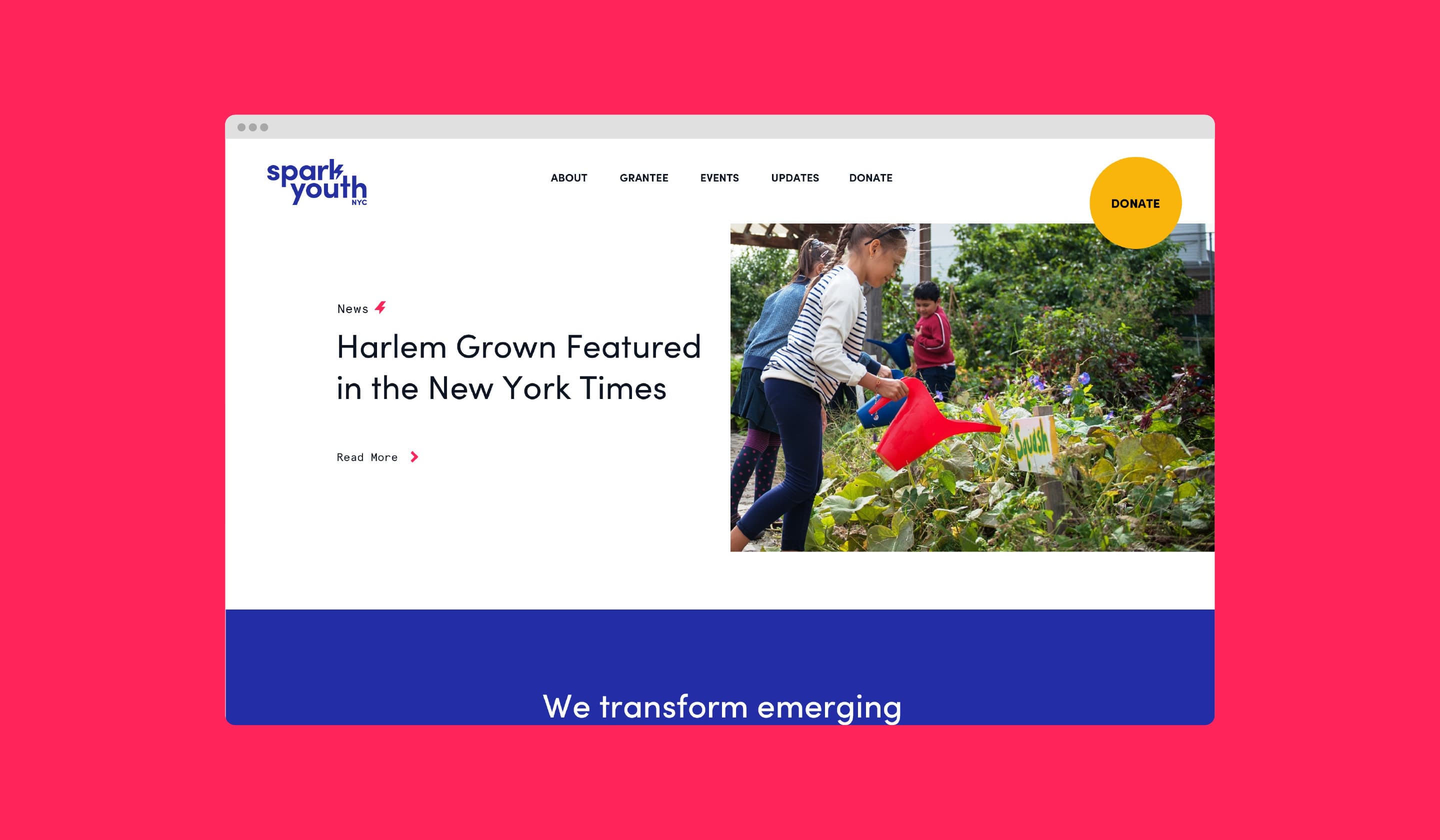
Screenshot of a website with a bright pink background. The website features a header for "Spark Youth" with navigation links - About, Grantee, Events, Updates, and Donate. A main article is titled "Harlem Grown Featured in the New York Times," next to a photo of a child watering plants.
Two cards on a dark background. The left is the Spark Youth NYC logo card with blue and red text. The right is a business card for Kellie Cunningham, Director of Operations & Development. It includes the organization's address, email, phone number, and website.
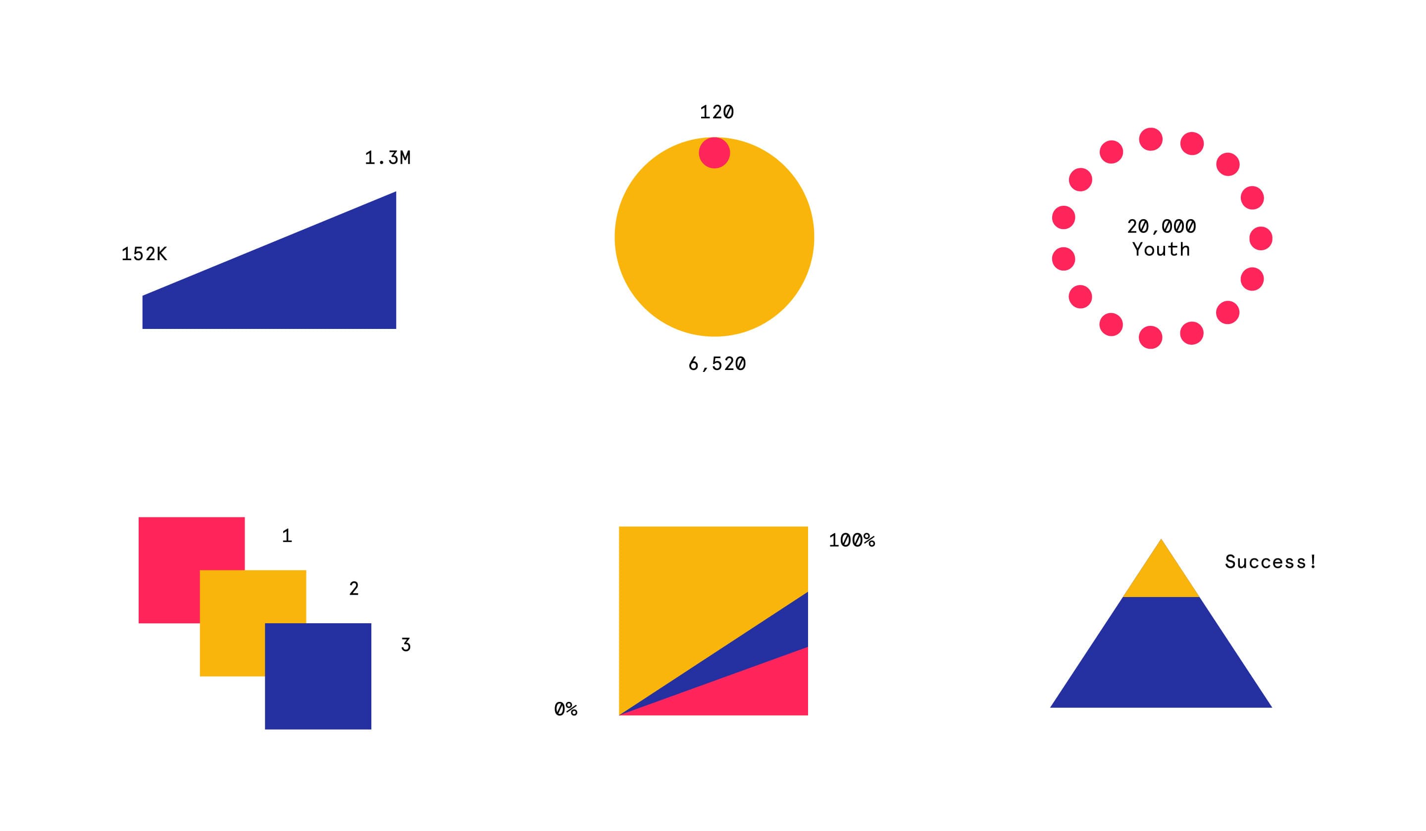
A grid of 6 charts: a blue bar chart labeled 152K to 1.3M, a yellow circle with 120 on top and 6,520 below, a red dotted circle labeled "20,000 Youth," 3 overlapping squares labeled 1, 2, and 3, a square split into yellow (0%) and blue/red (100%), and a triangle with "Success!" on top.
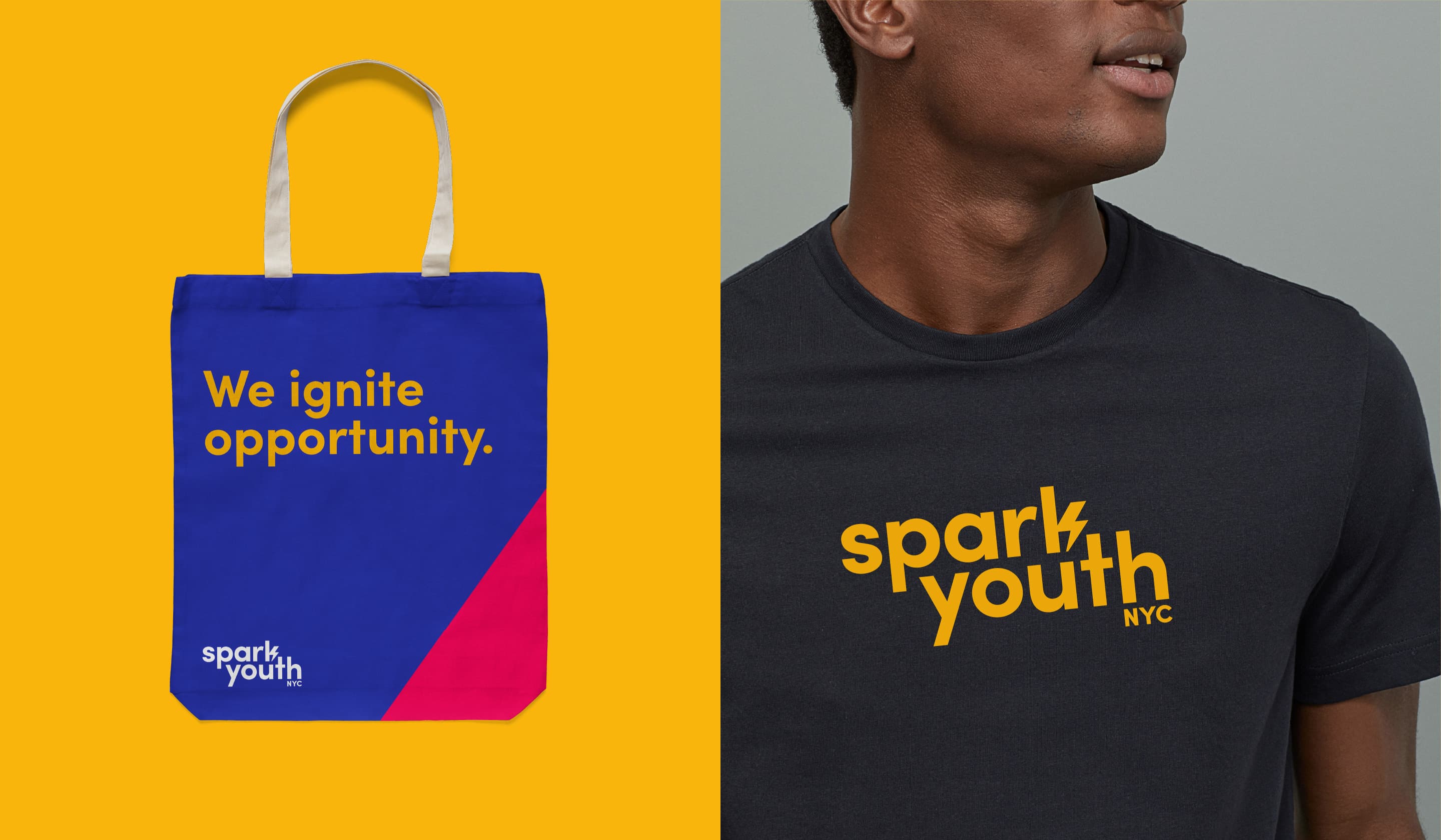
A tote bag and t-shirt are displayed side by side. The tote bag is blue and red with white handles, featuring the text "We ignite opportunity." The t-shirt is navy blue with the text "spark youth NYC" in bold yellow letters.
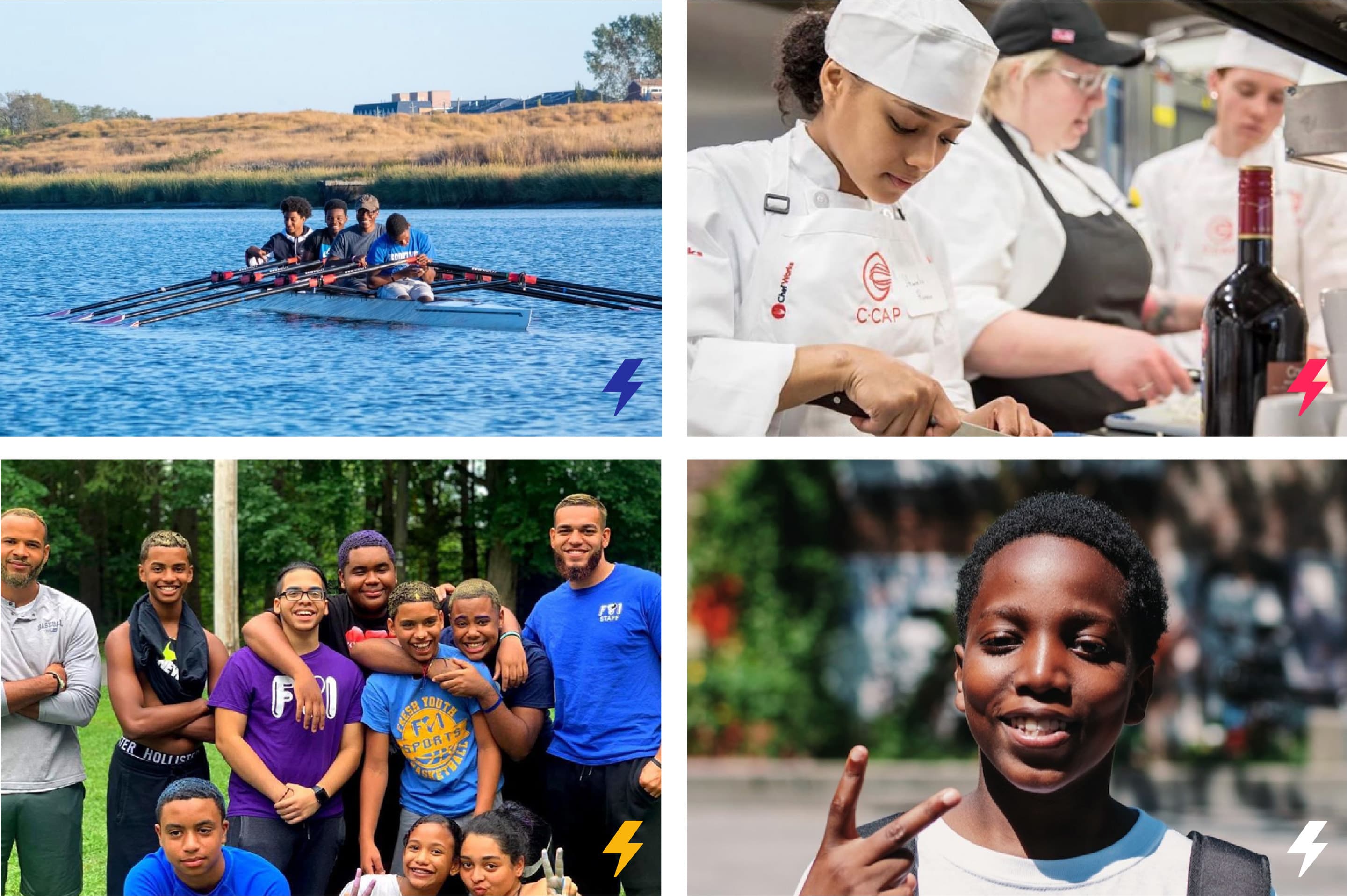
A collage of four images: Top-left shows a rowing team on water, top-right features chefs cooking in a kitchen, bottom-left shows a group of smiling people outdoors, and bottom-right is a close-up of a child making a peace sign.
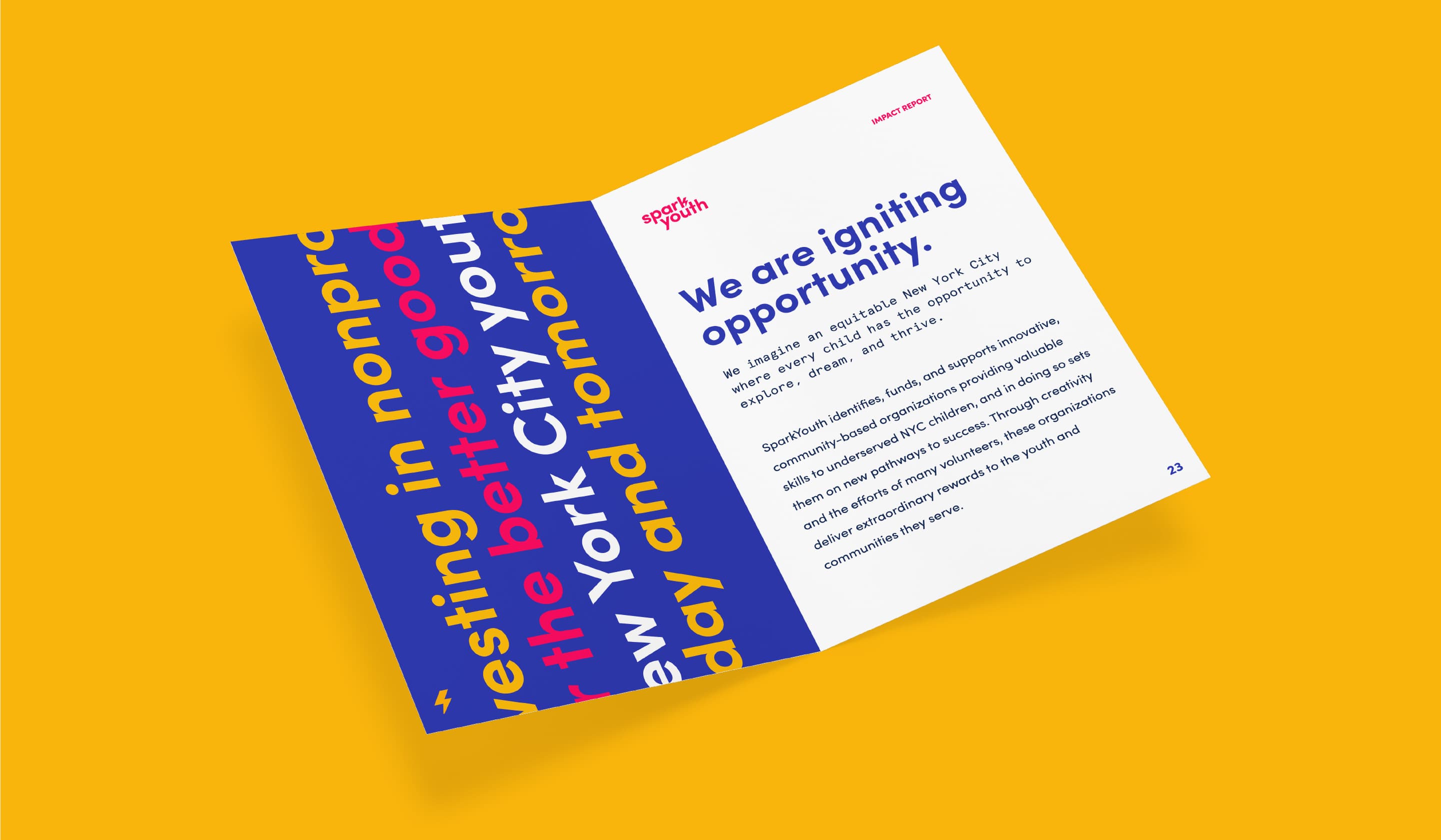
An open booklet against a yellow background. The left page features colorful, vertically aligned text, while the right page has the title "We are igniting opportunity" followed by a paragraph of smaller text and the number 22 at the bottom right corner.
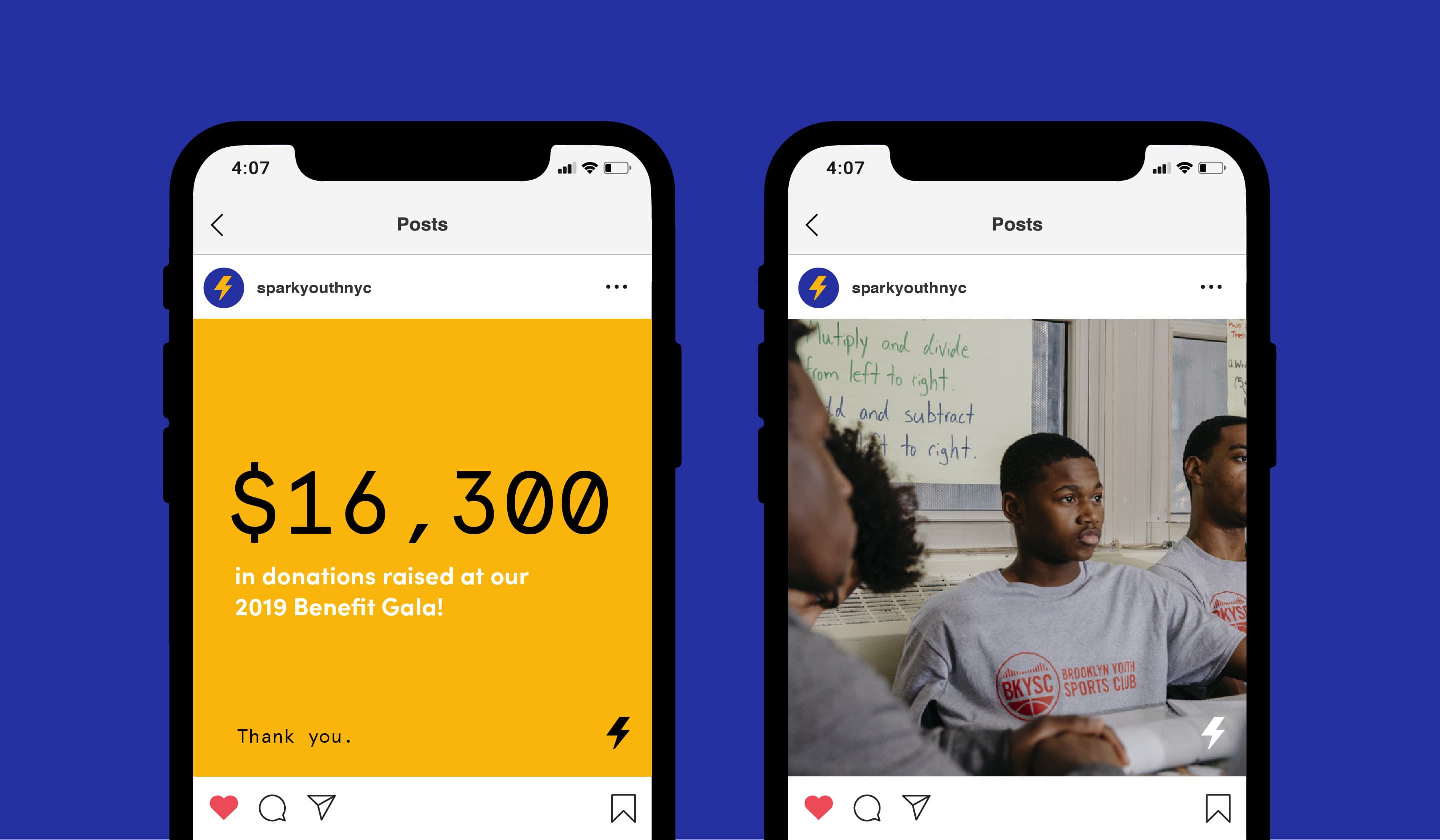
Two smartphones display posts from an Instagram account. The left post announces $16,300 raised at a 2019 Benefit Gala on a yellow background. The right post shows a group of young people in gray shirts seated at a table. The background is blue.

Project Credits

Ready to unlock the potential of your nonprofit's brand?
Reach Out