Work

Factr

Creating a platform for information that matters.

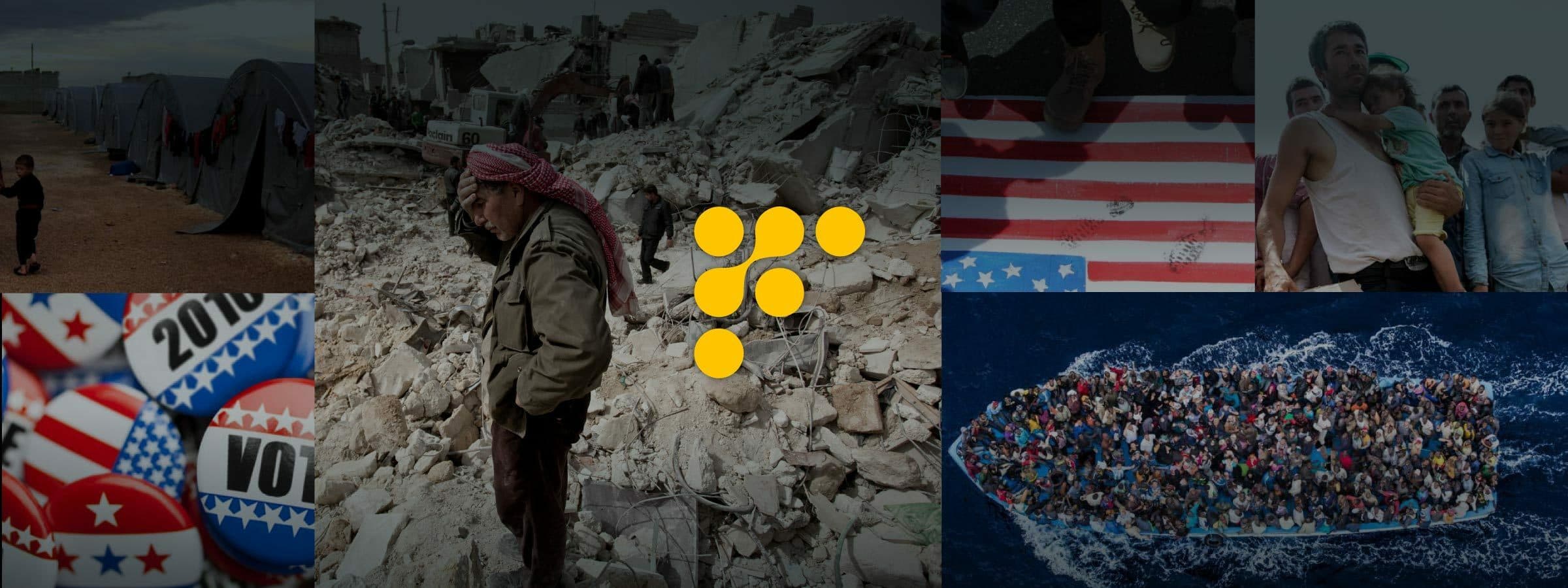
A collage of images: a refugee camp with tents, a person standing in rubble after a disaster, a close-up of election buttons, people carrying a child, and an overcrowded boat at sea. In the center, there is a logo with yellow dots forming a stylized "F" shape.

Background

How do you filter through all of the information clutter on the internet? How do you get the content that’s most relevant to you and your interests? Factr is a customizable news and information aggregator that compiles all relevant content into one place, from any source, in real time. It delivers and filters the information that matters to you based on your interests. With Factr, you can create your own curated collections of content that allow you to develop opinions and insights to share with the Factr world. In addition, the Factr community allows you to follow curated collections by experts in any field.
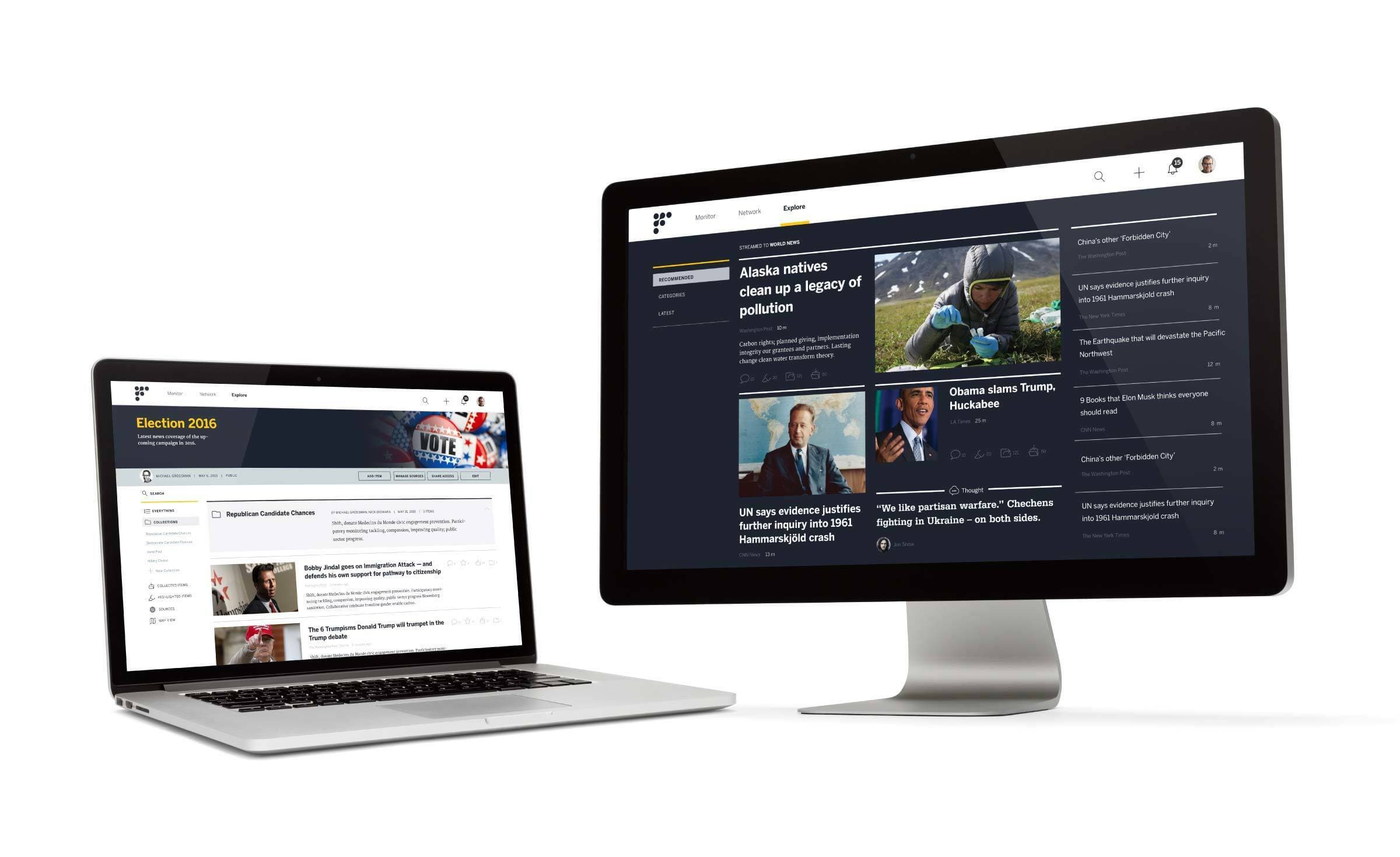
A laptop and a desktop monitor displaying different web pages. The laptop shows a website about an election in 2016, while the desktop monitor shows various news articles on a dark-themed website, including topics like pollution and individual profiles. Both devices have sleek designs.

The challenge

We teamed up with Factr to create a comprehensive, simplified, and robust new site for their platform. There were multiple challenges to this project. We had to figure out how users could control and dissect vast amounts of information in an intuitive and easy way. Secondly, we had to create a site that was both a news aggregator and social network, with content curation capabilities. We also had to understand how each of the different types of content (articles, written posts, and collections) visually exist as both aggregated and curated pieces. Lastly, the site had to feel heavy with content, but still digestible.
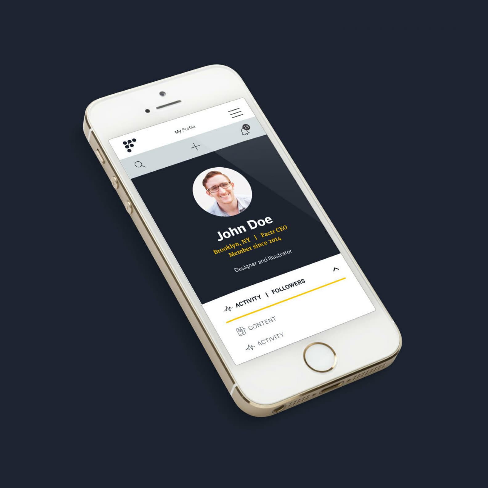
A smartphone displays a user profile interface on the screen. The profile shows a photo of a person labeled "John Doe," with titles "Designer and Illustrator" and "Recruiter/VP, Talent CEO" beneath it. Tabs labeled "CONTENT" and "ACTIVITY" are also visible.
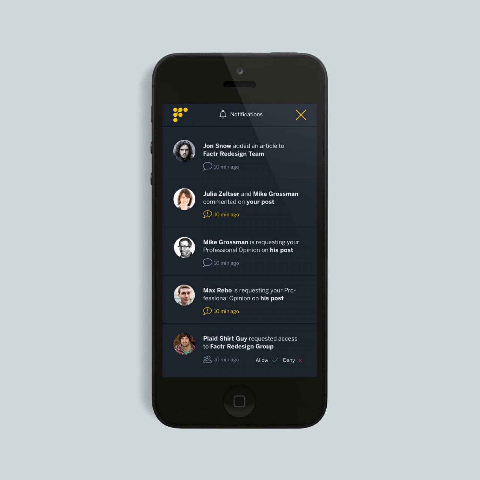
A smartphone displaying a notification screen. Notifications include added articles, comments, and requests for professional opinions or access. The screen background is dark, with profile pictures and names of users alongside their respective messages and time stamps.

The opportunity

We began by researching these types of sites separately and then developing a solution that integrated the most important features. We created a visual and logical system for each piece of content that was maintained throughout the platform. From there, we started prototyping different visual interfaces, figuring out the content hierarchy. We ended up with a solution that was rich with content that was digestible with clear hierarchy and direction.
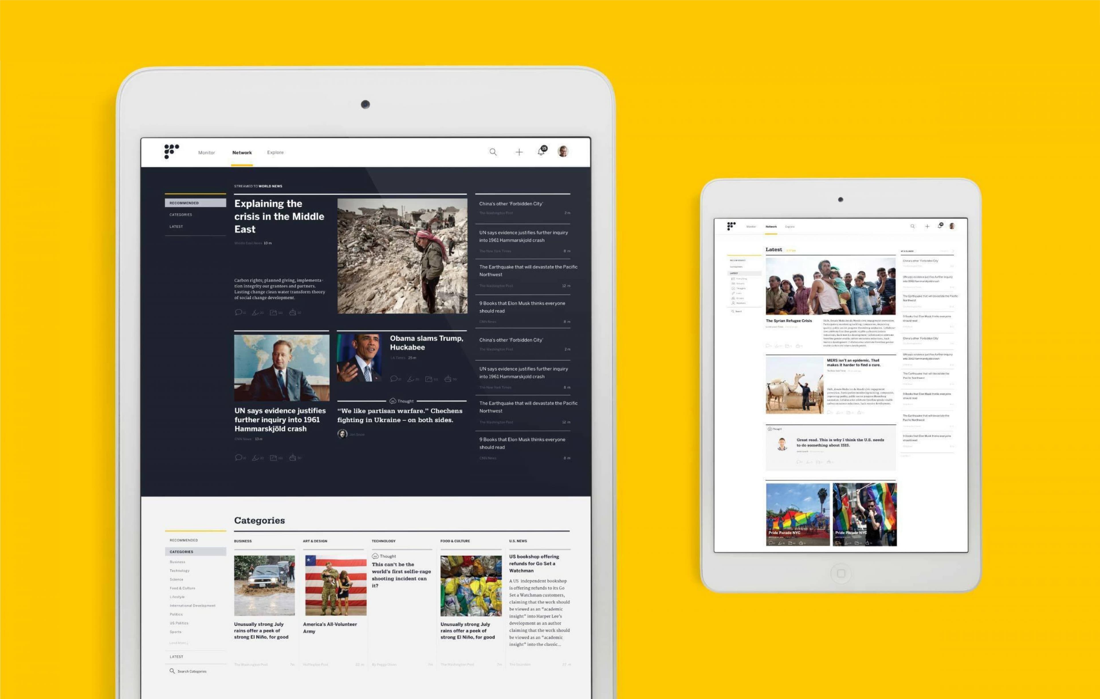
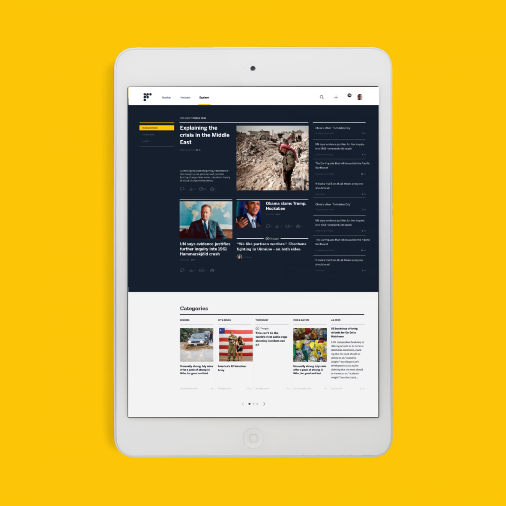
Two tablet screens display news websites against a yellow background. The larger tablet shows a dark-themed news site with various headlines and images. The smaller tablet displays a lighter-themed news site with articles and images arranged differently.
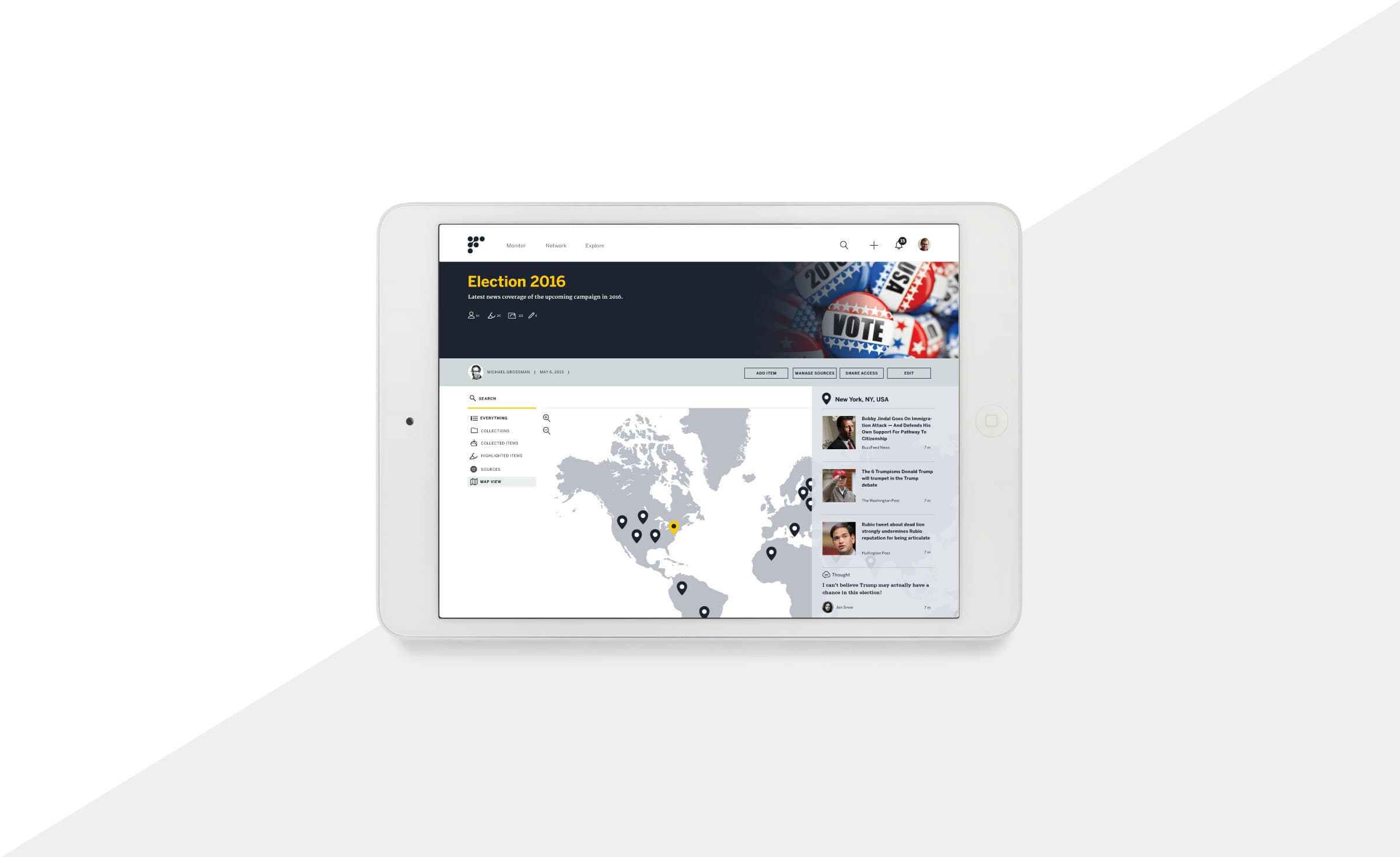
A white tablet displaying a website titled "Election 2016" with a navigation map of the United States and Canada. The interface features menu options on the left and news updates on the right. The top right corner shows a patriotic image with "VOTE" badges.
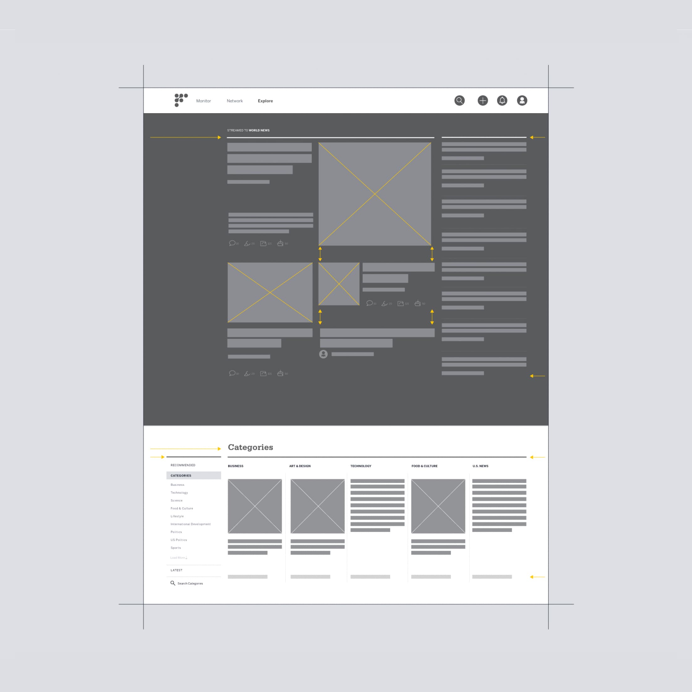
Wireframe of a website layout with a header containing navigation buttons. Below, the main section features multiple content blocks with placeholder text and image areas. At the bottom, there's a section titled "Categories" displaying several boxes for category items.
A white tablet displaying a news website against a bright yellow background. The website features articles on various topics such as the Middle East crisis, political news, and more. The layout includes images, article titles, and previews arranged in a clean and organized format.
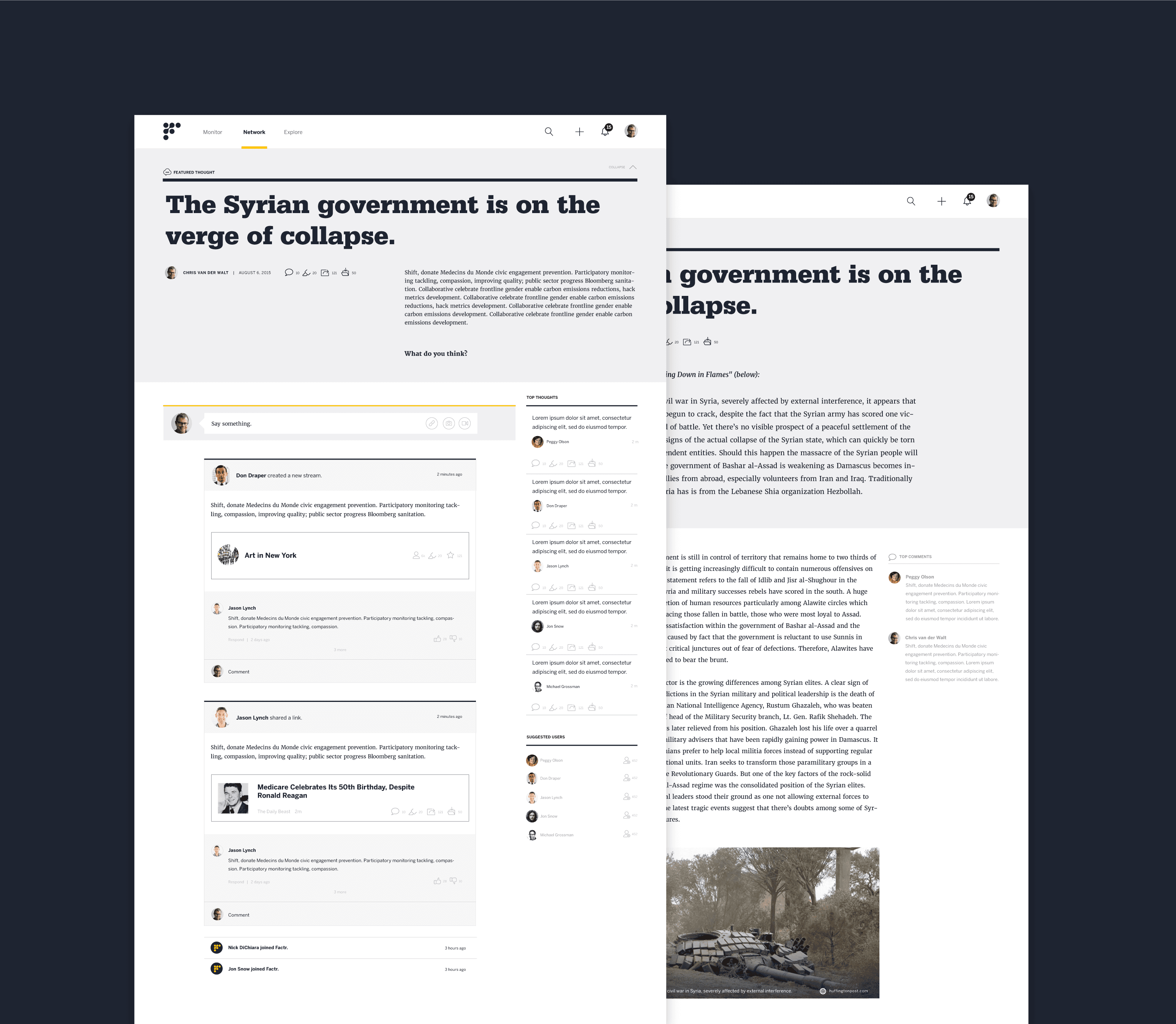
Two overlapping web pages display a news article titled "The Syrian government is on the verge of collapse." The pages show the article text, a comment section, and an image of a military tank in a conflict zone. The background is a dark, contrasting color.

Project Credits

Client
Year of Completion
Capabilities
Project Team
Ready to unlock the potential of your nonprofit's brand?
Reach Out