Work

DonorsChoose

After 20 years of bringing joy to classrooms all over the country, DonorsChoose was ready to reintroduce itself to the world with a fresh face and new visual story.
Text "DONORS CHOOSE" in bold, white uppercase letters against a solid purple background.

Background

When DonorsChoose launched in 2001, the technology was the centerpiece of their work: an easy-to-use, direct-to-teacher platform that made learning possible for millions of students across the country. With one click, donors could send money whizzing through the internet and into a classroom full of children anywhere in the country.

The challenge

Over two decades, a lot had changed. The company had grown substantially, proving the value of its concept and triggering a whole set of competitors and copycats. Classrooms also evolved, placing greater emphasis on technology, flexible learning, and integrated curricula. It was time to level up. And it wasn’t uncommon for first-timers to ask, “Donors choose...what?” In order to compensate for a challenging name, the brand leaned on an ad hoc visual language of outdated symbols like apples and books.
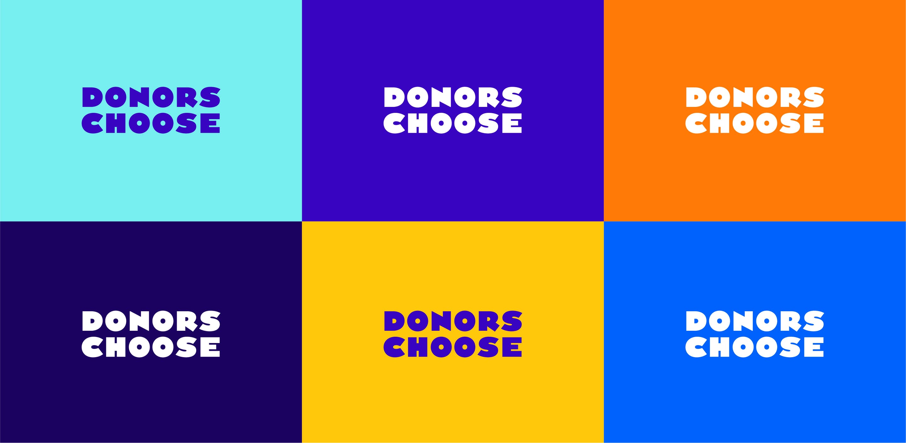
A 3x2 grid features the words "Donors Choose" in bold white letters. Each segment has a different colored background: light blue, purple, orange, dark blue, yellow, and bright blue.
It was a hands down, clear decision for us to work with Hyperakt. They had respect for us, respect for our brand, and a real desire to get to know us.
Chris Pearsall
Vice President, Brand & Communications, DonorsChoose

The opportunity

How could we use branding to position DonorsChoose as a leading charity, in crowdfunding and beyond? How could we build relationships with new donors and strengthen connections with existing donors through a heart-forward visual brand? How could we create a brand that was easy for teachers to adapt to their unique identities and needs?

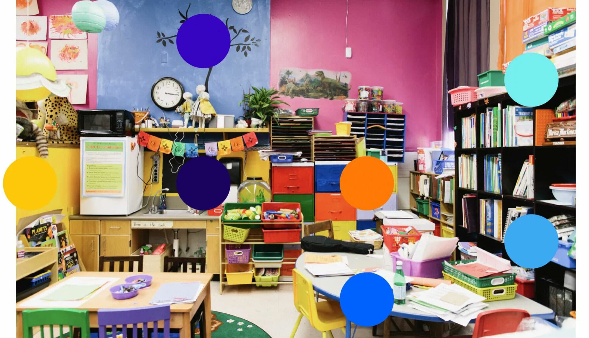
Colorful classroom decorated with vibrant artwork, various storage bins, shelves filled with books, and educational materials. Tables and chairs are arranged for student activities. Bright walls with posters and a potted plant add to the lively environment.

A kaleidoscope of color

Classrooms are playgrounds of color, where bright hues mix and mingle, building energy in their spontaneous, ever-changing combinations. The main brand color, Buxton blue, is a rich tone that anchors the broader palette of aqua, yellow, and orange. We also prioritized accessibility, selecting bold, high contrast colors that are clearly legible in all brand applications in print and online.

A colorful illustration comprised of geometric shapes and various objects related to education. Items include a book, a pencil, scissors, a ruler, a calculator, a school bus, and a microscope. The colors primarily used are blue, orange, and yellow.
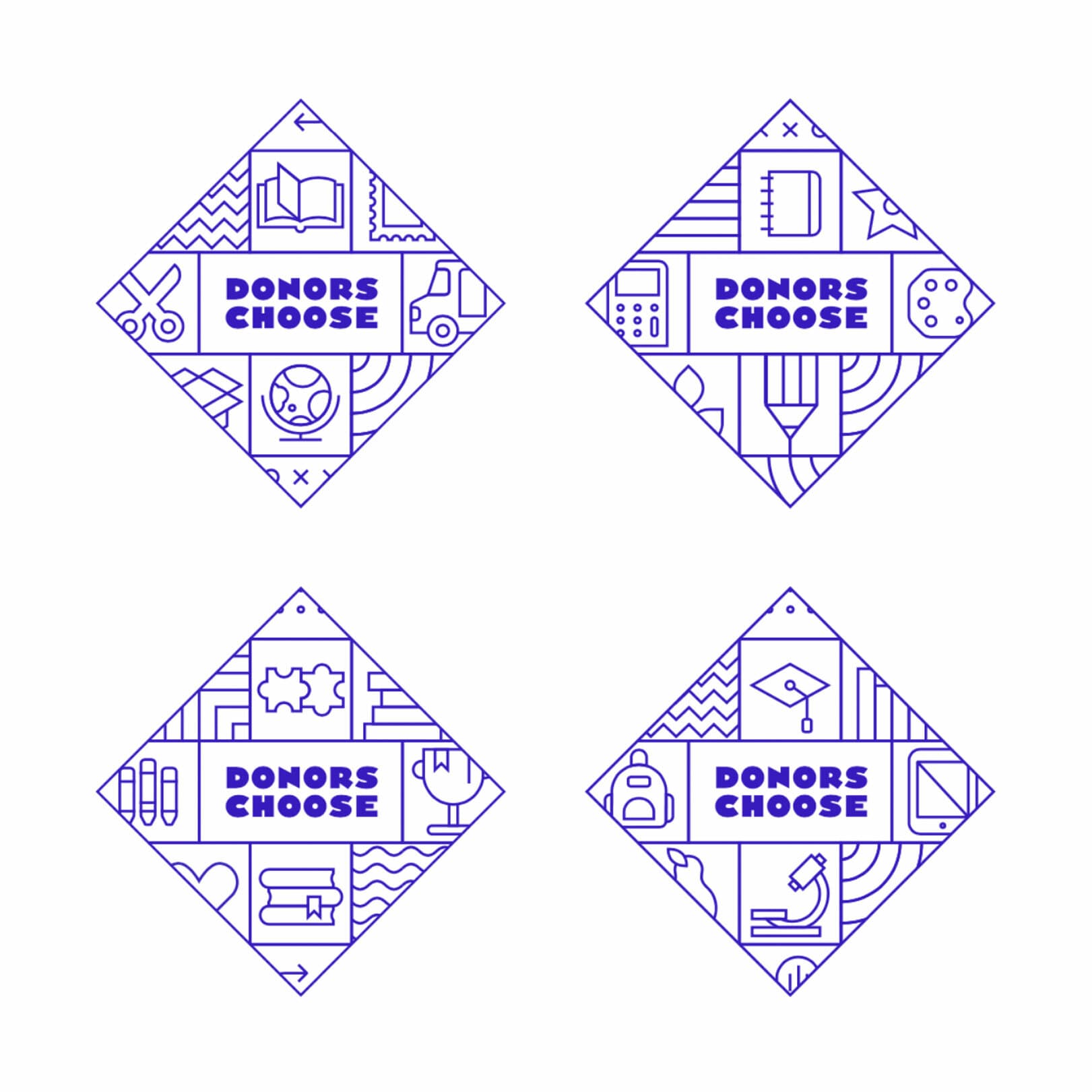
Four square icons with a blue outline, each featuring the text "Donors Choose" in the center. Surrounding the text are various educational symbols, including books, calculators, backpacks, microscopes, graduation caps, and art supplies.

A brand of boundless possibility

No teacher or classroom should ever feel limited by geography or money. The new brand is all about DonorsChoose making teachers’ dreams come true and empowering them to spark their students’ curiosity, awe, and wonder.

The brand is made of infinite building blocks, showing that when teachers and DonorsChoose join together, students can learn, grow, create, and explore a world with boundless possibilities.

The platform quite literally helps fill the shelves of classrooms around the country. Anything is possible. Donors can give to who they want. Teachers can ask for what they want. The new brand evokes a sense of classroom abundance and limitless imagination.
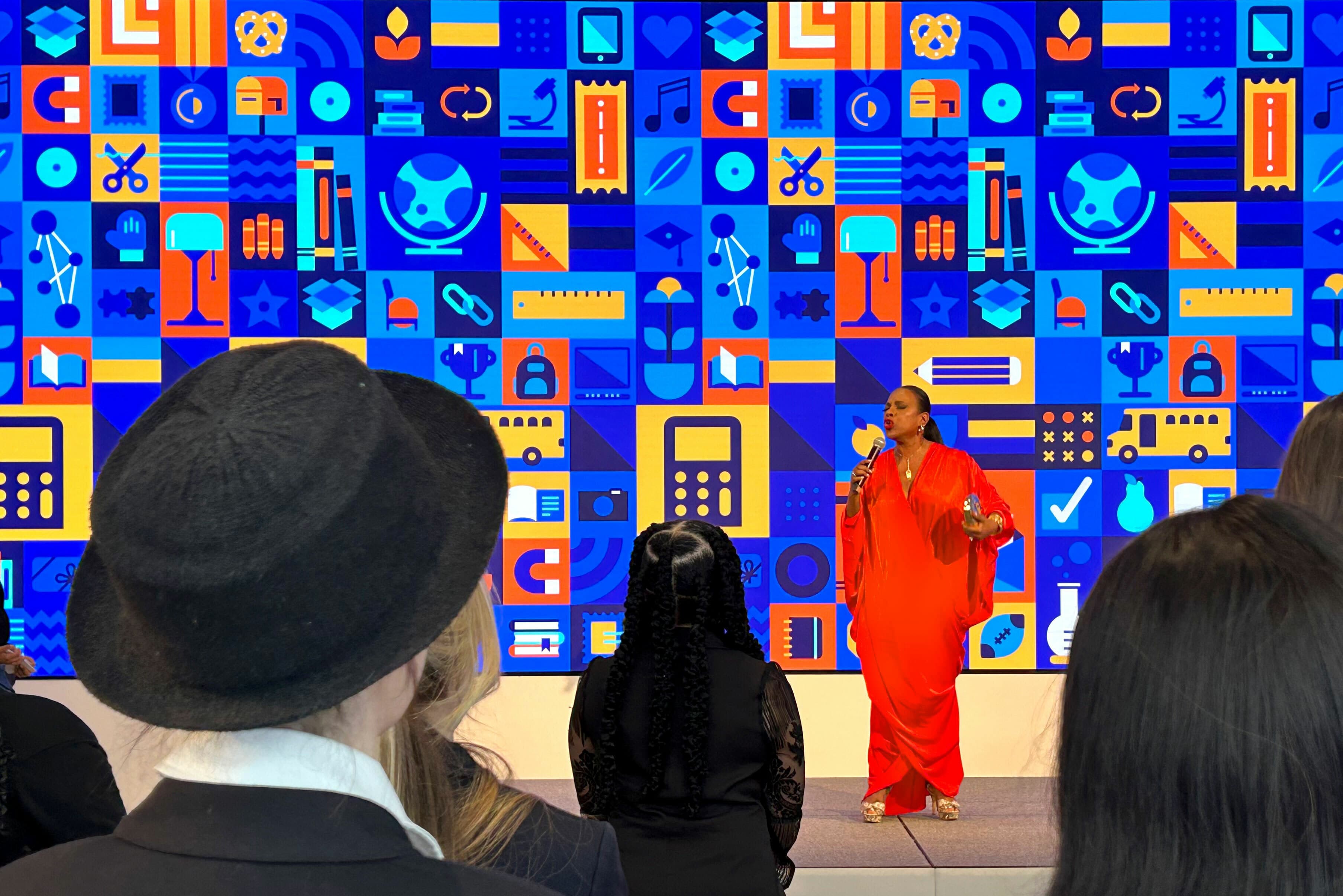
A person in a vibrant red outfit speaks into a microphone on stage in front of a colorful, geometric backdrop. The audience listens attentively, with some members wearing hats and dark clothing. The backdrop features various icons in blue, orange, and yellow hues.
Illustration of a person with short black hair and glasses, wearing a green shirt, blue pants, and gray shoes. They are sitting on an orange exercise ball and holding a small yellow object with a blue leaf above their head. The background is white.
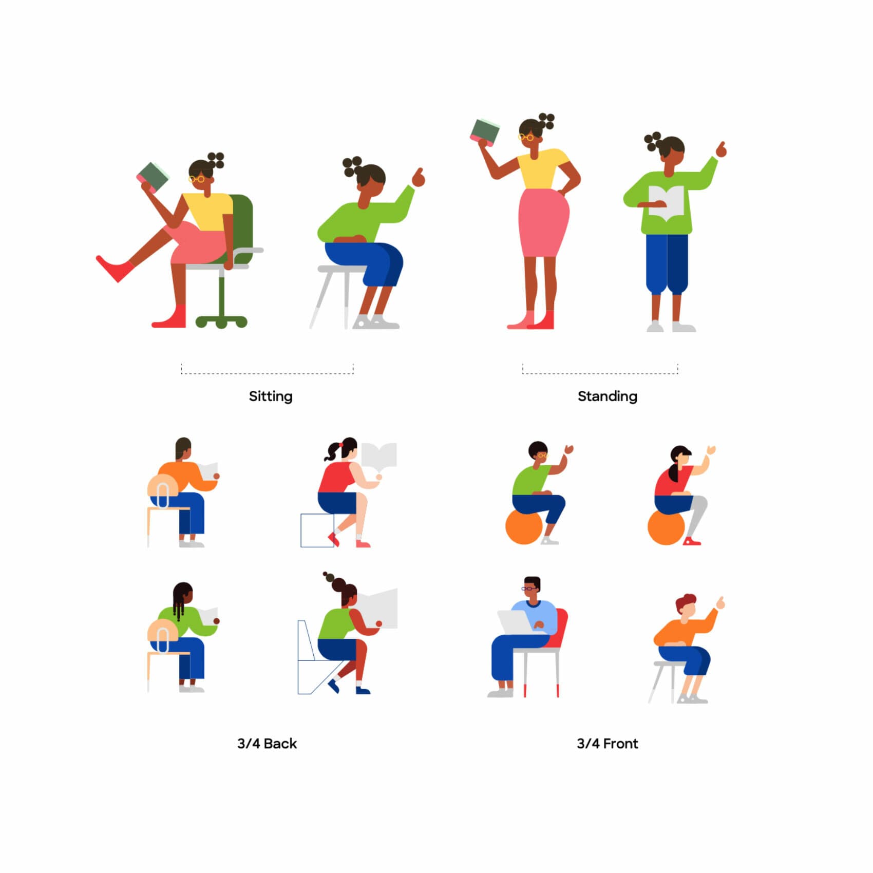
Illustration of diverse people in different positions: sitting, standing, 3/4 back, and 3/4 front. Activities include reading, working on a laptop, sitting on a chair or exercise ball, and raising hands. The vibrant colors and varied postures convey dynamic and active scenarios.
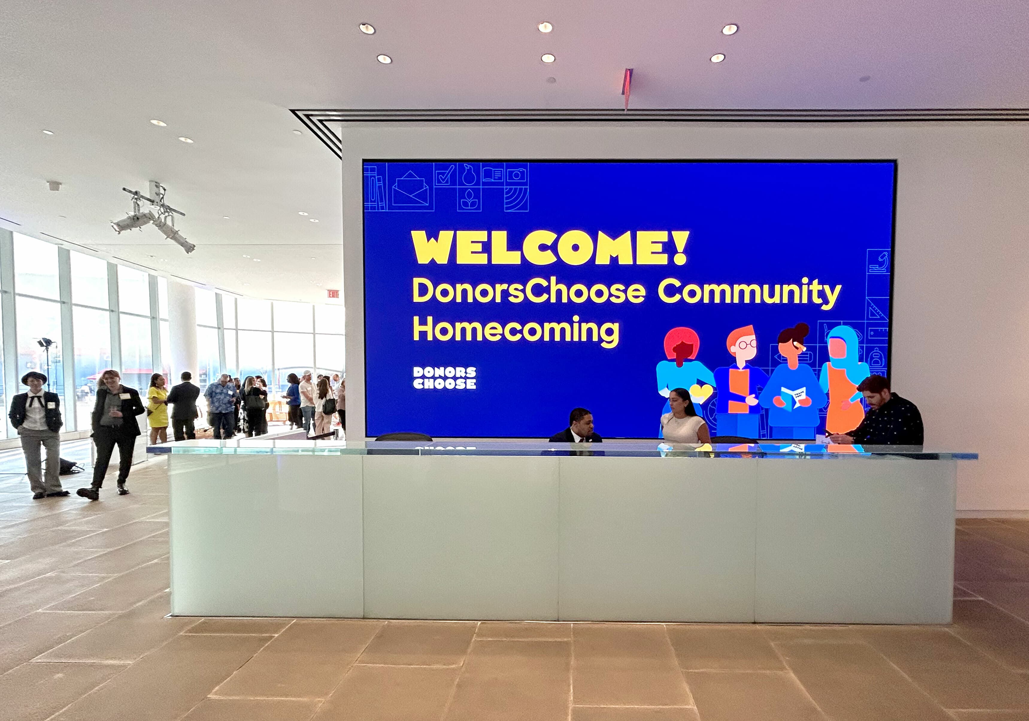
A brightly lit lobby features a large digital screen displaying "WELCOME! DonorsChoose Community Homecoming" with colorful illustrations of diverse individuals. In the foreground, a glass reception desk is staffed by three people. Several attendees stand in the background.
A colorful illustration features three sections: a girl in glasses interacting with various educational icons, a central diamond with bar charts and school-related symbols, and a boy using a laptop surrounded by similar educational imagery.

A custom font and a solid foundation

Even after dropping the original .org, the brand name posed some challenges. With 12 characters and 2 words, we had to ensure the logo didn’t become too wide. And we needed legibility and presence at very small sizes because this is first and foremost a digital brand. To solve for all of these challenges, we worked with Frere-Jones Type to develop a custom typeface for the primary wordmark. From there, the team developed a full-body display face that conveys a sense of playfulness yet holds its ground, striking the right tone between playful and reputable— it’s a brand for both students and teachers.

A toolkit for teachers

Make it “teacher-friendly” was our north star throughout the rebrand. Teachers are ambassadors who push their campaigns to their friends and families and advocate for their classrooms with unparalleled energy and vision. We needed to create a brand that teachers could make their own and infuse with their unique identities and personal stories. The Design Playground, an innovative outgrowth of the rebrand, gives teachers the power to create personal, beautifully branded social media assets, with custom messaging, colors & illustrations, to help them amplify their classroom campaigns.
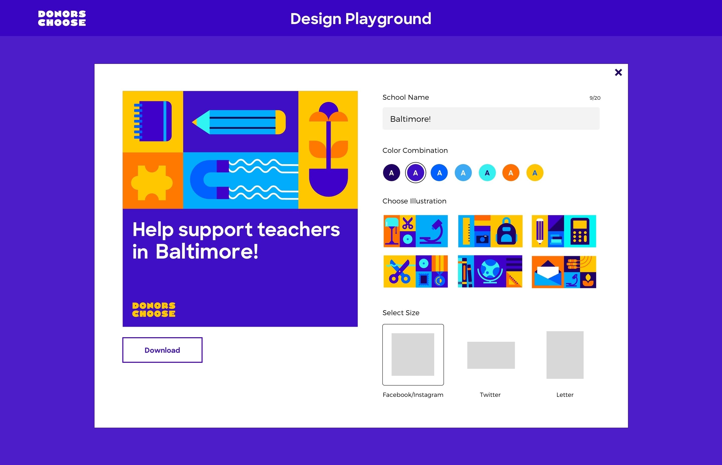
A design playground interface for DonorsChoose is displayed. It has options to input a school name, set color combinations, choose illustrations featuring educational themes, and select size outputs for social media or letter formats. A "Download" button is visible.
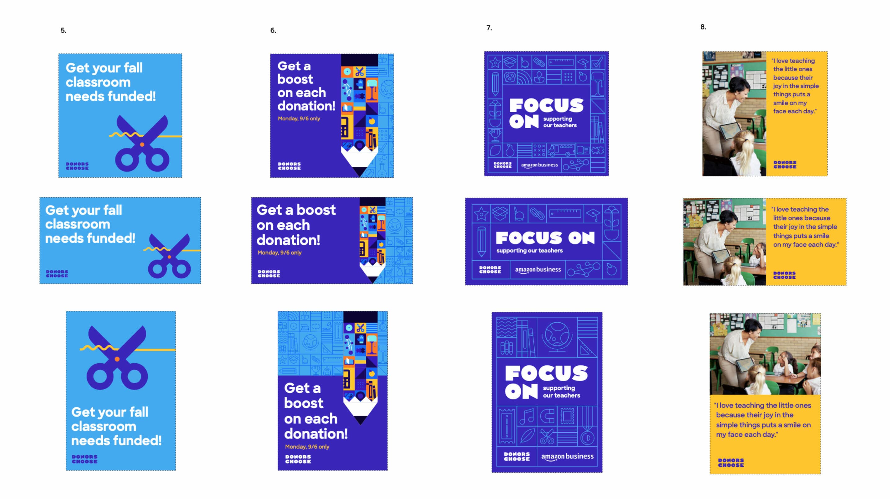
A grid of nine images showcasing educational and fundraising-themed graphics. The first eight images contain text about classroom funding, donation boosts, and business support with colorful designs. The ninth image shows two people discussing, alongside a quote about teaching's value.
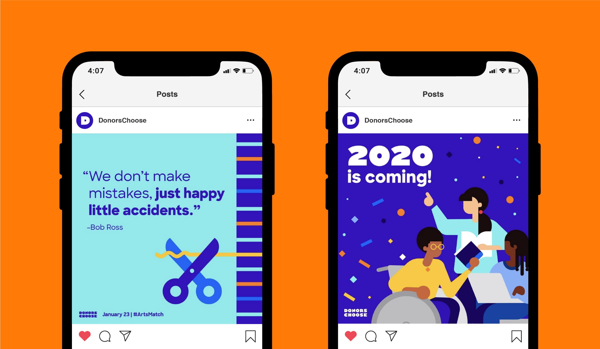
Two smartphone screens display Instagram posts. The left post features a Bob Ross quote and an image of scissors. The right post has a "2020 is coming!" announcement, showing illustrated people celebrating with confetti. Both posts are from DonorsChoose.
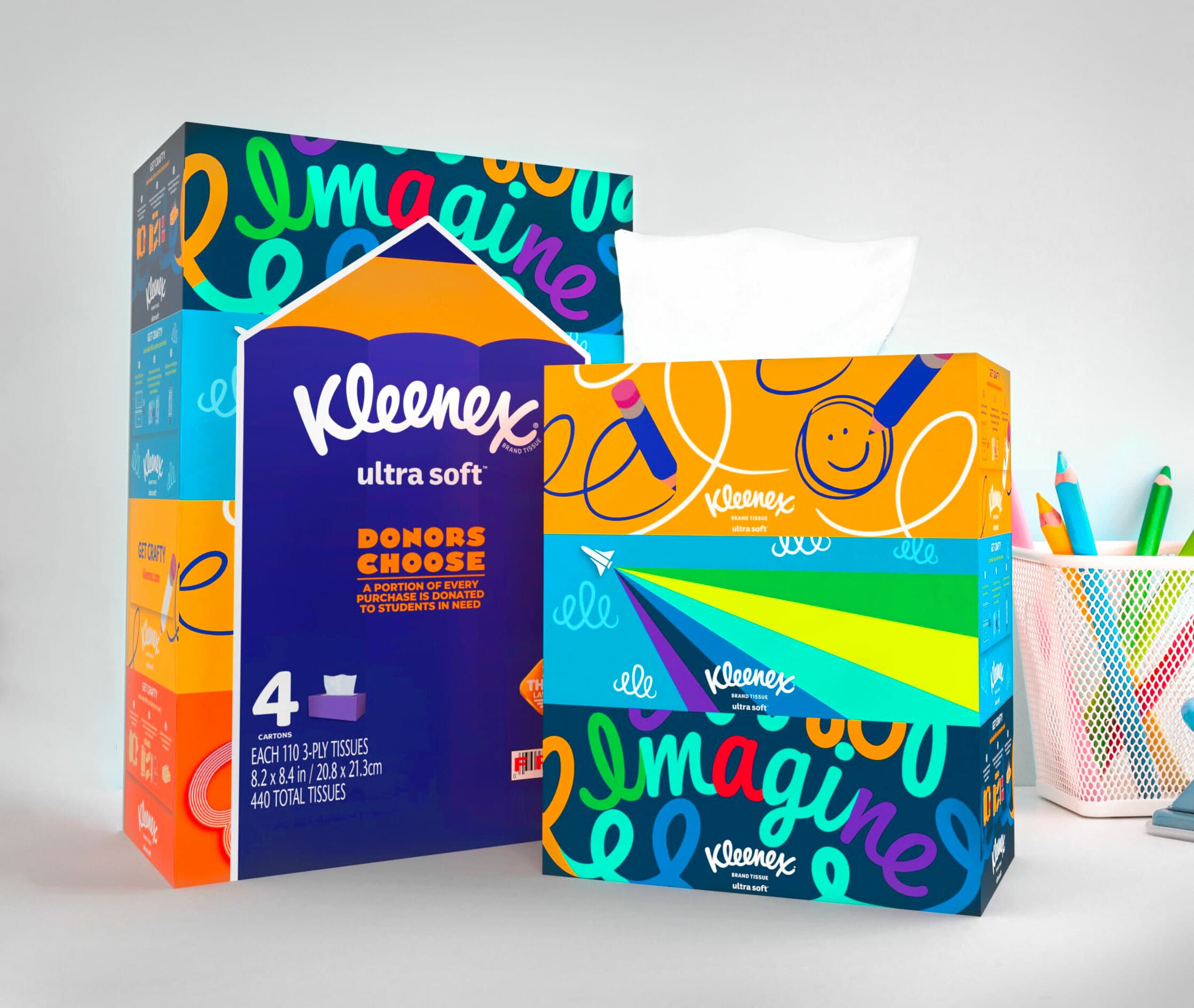
The brand refresh has saved us countless hours in design work, and our corporate partners clamor to integrate our brand assets into their campaigns. In fact, our brand assets were customized to appear on everything from Kleenex boxes to race cars to athletes' shoes.
Chris Pearsall
Vice President, Brand & Communications, DonorsChoose
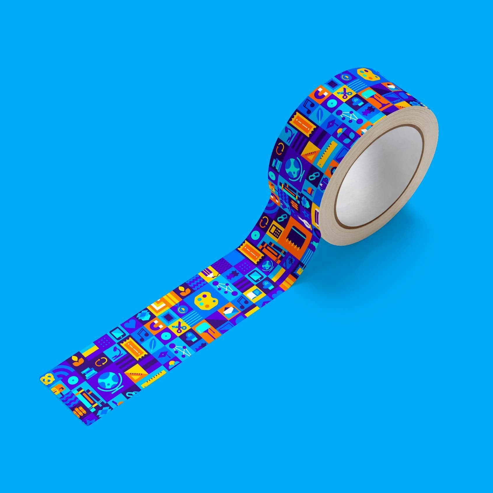
A roll of decorative tape against a vibrant blue background. The tape is unrolled and features colorful, geometric patterns with various symbols, shapes, and icons in shades of blue, yellow, orange, and red.
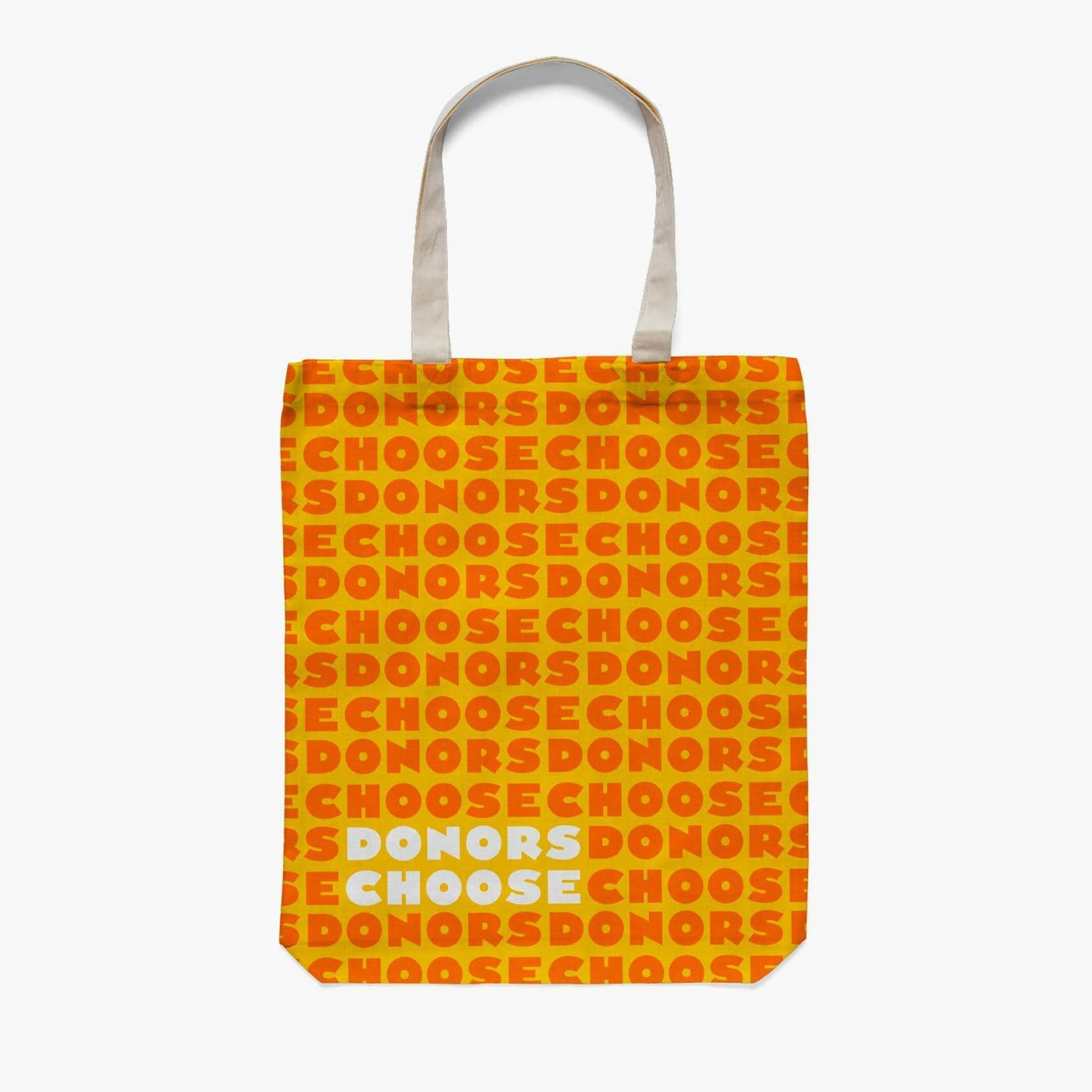
A tote bag with the text "DONORS CHOOSE" repeated in a pattern. The words "DONORS" are in red and "CHOOSE" in yellow, on an orange background. The bag has white handles, with the words "DONORS CHOOSE" in white and light blue at the bottom center.

Creative collaboration

While the Hyperakt team took the lead on crafting every detail of this brand, our work was all the better because of the rich, thought-provoking ideas generated by the DonorsChoose team. From the outset of the project, we designed a series of creative workshops that enabled the team to step away from their day-to-day roles, see their brand and organization in a new light, and experiment with what it could look like in the future.

A white metal mug with a black rim is set against a yellow background. The mug features a purple diamond-shaped graphic with various icons and the words "Donors Choose" in the center.
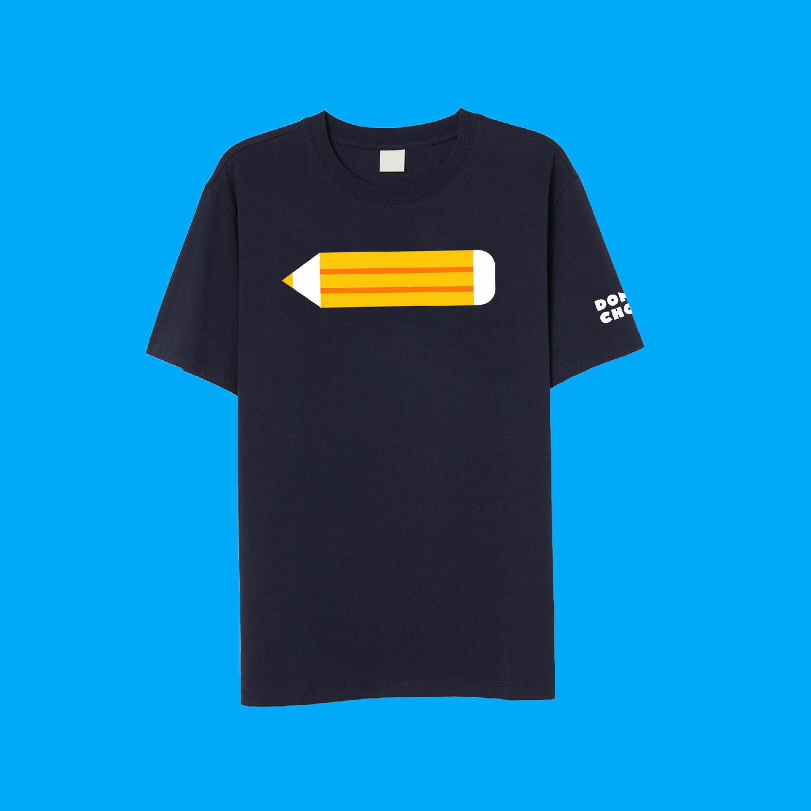
A navy blue T-shirt featuring a graphic of a yellow pencil with red and white accents across the chest. The phrase "Don't Check" is printed in white on the left sleeve. The shirt is displayed against a bright blue background.
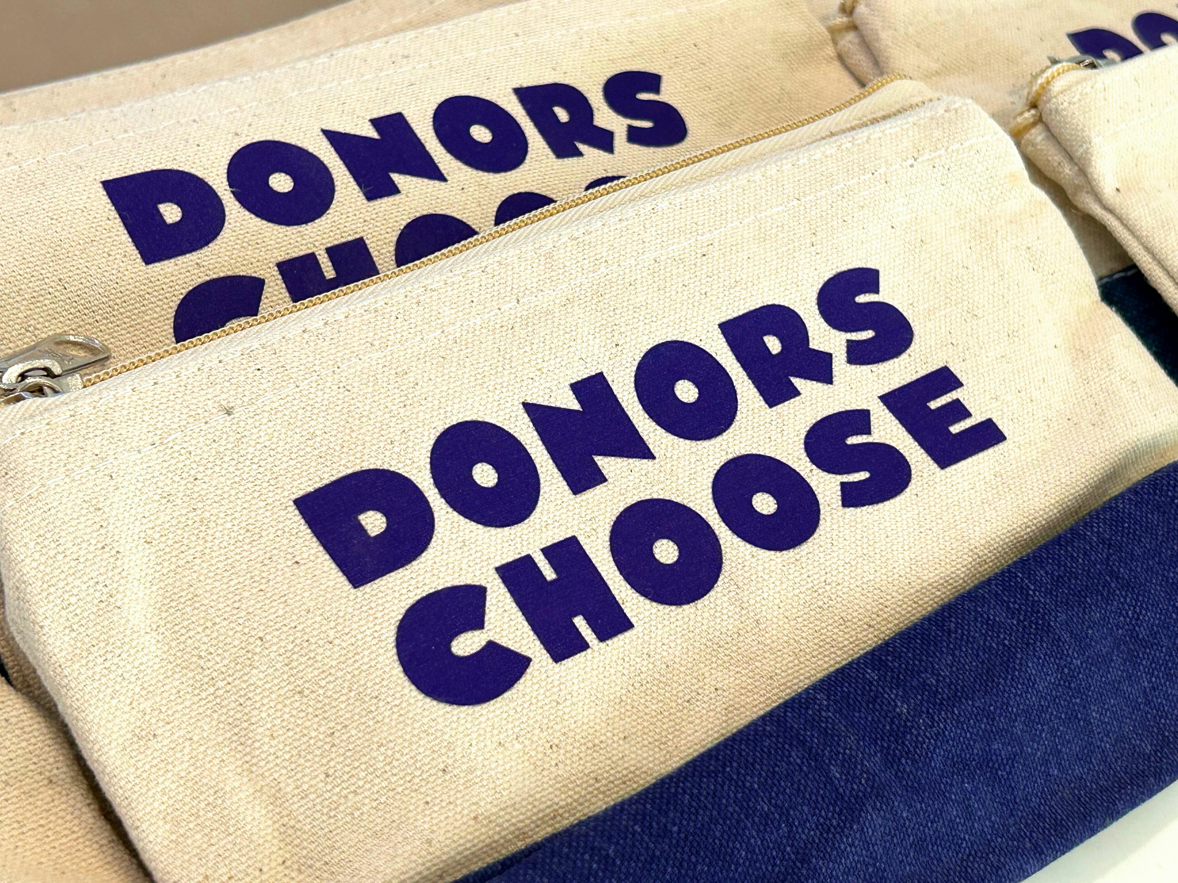
Several beige zippered pouches with the words "DONORS CHOOSE" printed in bold, purple letters are neatly arranged side by side.
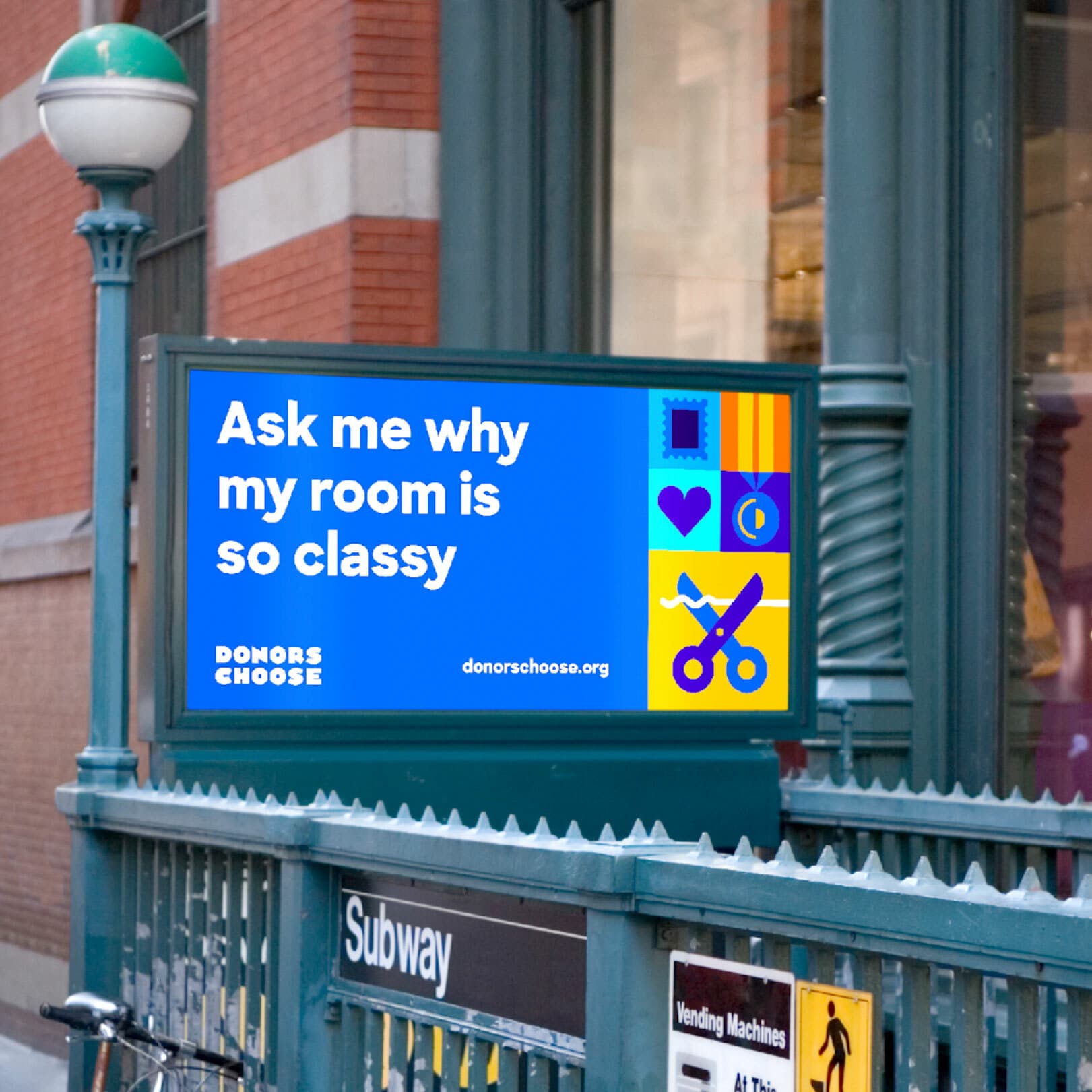
A lit billboard at a subway entrance showcases a DonorsChoose advertisement. It reads, “Ask me why my room is so classy” and features colorful icons, including a heart, book, and scissors, against a blue background. The DonorsChoose website address is also displayed.
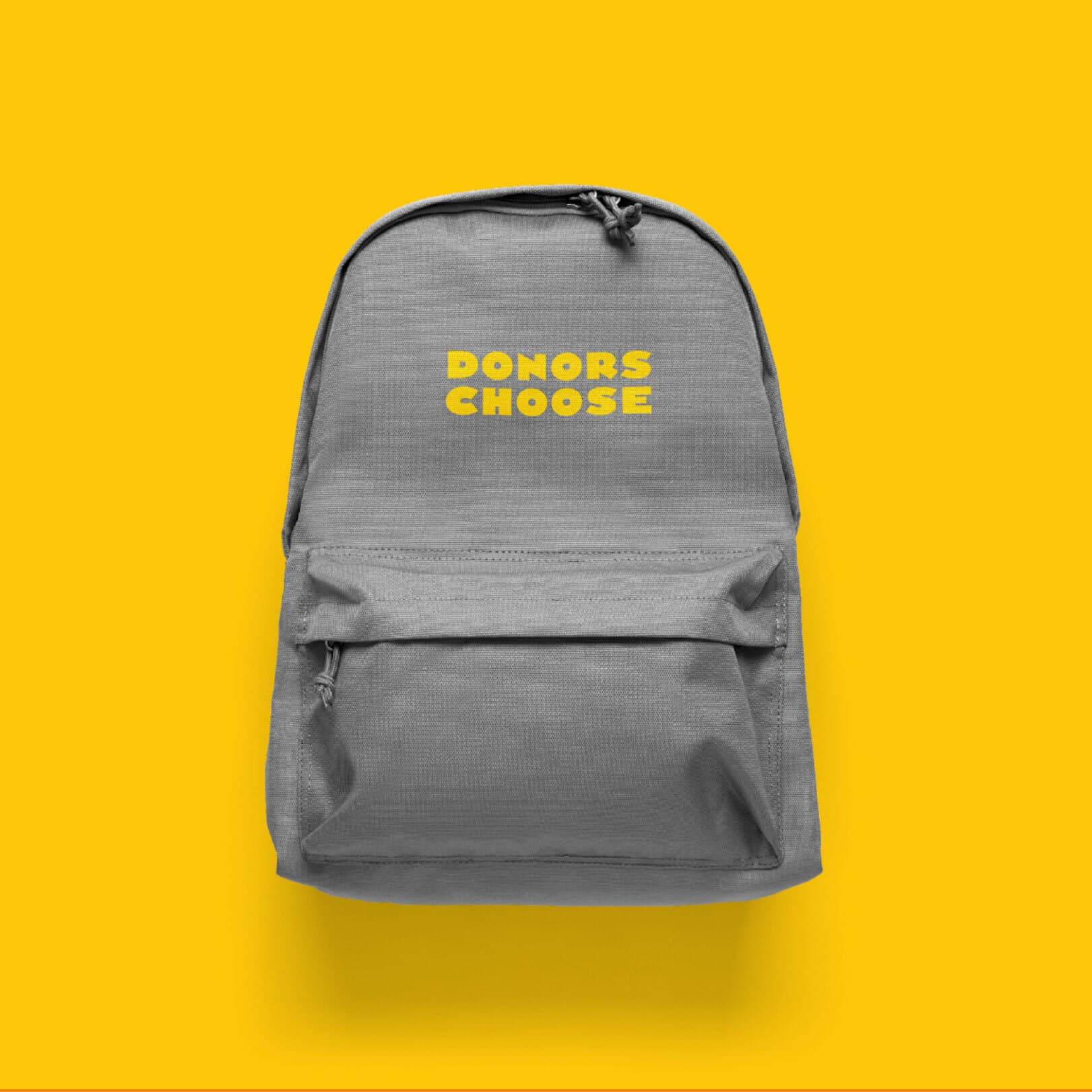
A gray backpack with the words "DONORS CHOOSE" printed in yellow on the front pocket sits against a bright yellow background. The backpack has a front zipper pocket and a drawstring at the top.
Internally, we've had strong adoption of the brand as well, and folks are more likely to create brand-consistent materials, given our extensive template library.
Chris Pearsall
Vice President, Brand & Communications, DonorsChoose
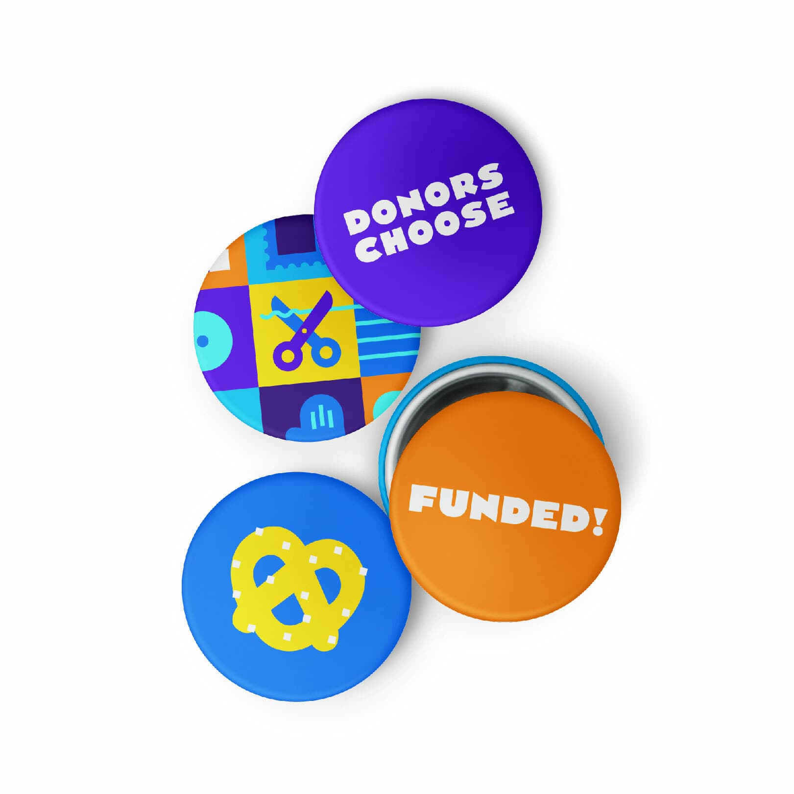
Four colorful circular buttons are arranged on a white background. They read "DONORS CHOOSE," "FUNDED!," one has a yellow pretzel, and one features a collage of playful icons including scissors and a musical note.
A blue map of the United States against a dark background, with illustrated diverse faces, icons of a book, globe, and communication lines connecting different locations. The image represents nationwide connectivity and the exchange of information and ideas.
Having a stronger, refreshed brand has helped us boost our impact, more clearly communicate our mission and vision, and streamline design work, while creating a vivid and memorable impression for our teachers, donors, partners, and supporters.
Chris Pearsall
Vice President, Brand & Communications, DonorsChoose

A brand built for partnerships

DonorsChoose is naturally positioned to partner with brands of all kinds. They needed a logo that other brands would be proud to apply to their products and feature at events.


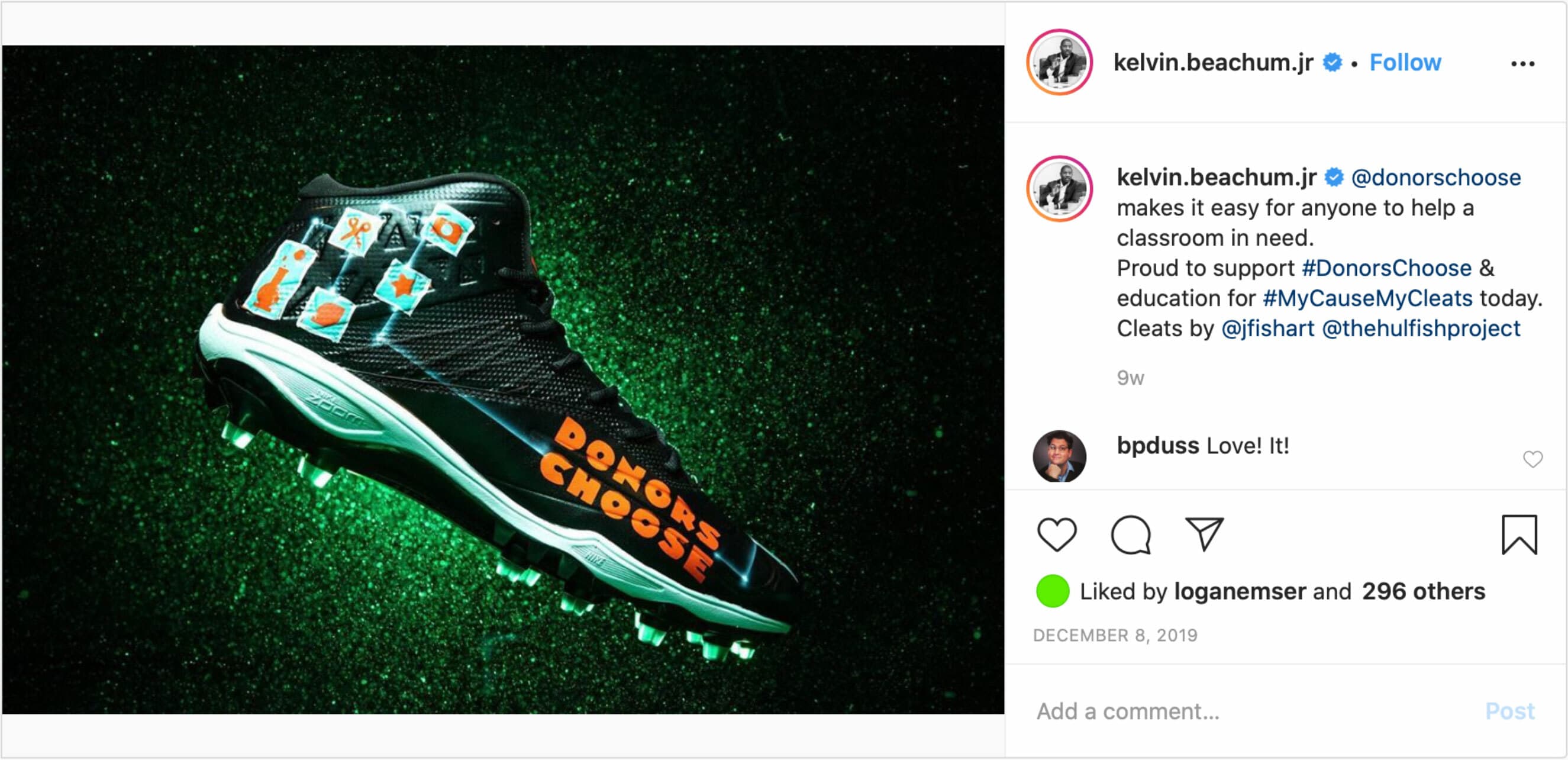
A black football cleat with green soles is displayed against a green glittery background. The cleat is decorated with colorful icons including books and pencils, and the words "DONORS CHOOSE" are written in orange on its side. Instagram post by kelvin.beachum.jr.
A live event stage with a large "Riot Games x Donors Choose" screen in the background. Several people are seated and engaged in conversation on stage. The audience sits facing the stage, and there are camera operators capturing the event.
Two people standing in front of a blackboard wall with white chalk drawings and the words "Donors Choose" in the center. The person on the left is wearing a white shirt and gray pants, and the person on the right is wearing a blue shirt and jeans. They are both smiling.
A box and a packaging of Kleenex ultra soft tissues are shown. The packaging features colorful, playful artwork with the word "Imagine." Beside the tissues is a cup holding assorted pens and pencils on a white surface.
  • 24%
    of visitors downloaded assets from the Design Playground
  • 2 mins.
    average time on site for the Design Playground
Just after we launched the new brand, COVID-19 hit and we had to reimagine our marketing approach. A national public service announcement (PSA) campaign that we'd been planning had to be scrapped because we couldn't film in classrooms; however, because we had such a comprehensive brand library, our PSA producers were able to pivot and produce an animated PSA using our new brand assets. The PSA production costs were lower because we had such a strong new brand, and the reach was fantastic: our PSA was one of the top in the country, and over 18 months generated over $100 million in free ad placements.
Chris Pearsall
Vice President, Brand & Communications, DonorsChoose

Behind the Scenes

Project Credits

Ready to unlock the potential of your nonprofit's brand?
Reach Out