What Does One Year After a Rebrand Look Like?
How branding repositioned The New York Community Trust.
When an organization reaches its centennial year, it’s an ideal time to reflect on its legacy. For The New York Community Trust, it became a moment to look forward. Their rebrand wasn’t just a new coat of paint—it was a decisive pivot. As the Chronicle of Philanthropy put it, it’s the jumpstart to a yearslong effort to make the foundation feel more relatable and connected to everyday New Yorkers. The rebrand—anchored in a fresh visual identity—signals that the foundation is part of the communities it serves across eight counties.
President Amy Freitag summed up the aspiration: If the foundation can earn the trust of both Trump-voting firefighters of Staten Island and liberal doyennes on the Upper East Side, it can unite New Yorkers in their fierce pride in the city to get behind efforts for the common good.
That kind of shift doesn’t come from aesthetics alone. It takes intention and depth—starting with strategy, then extending through every facet of the brand: naming, brand architecture, verbal identity, visual expression, and daily behavior.
This transformation reflects how the organization sees itself and how it wants to be seen. And it’s a process that requires courage, collaboration, and clarity.
Building clarity and connection
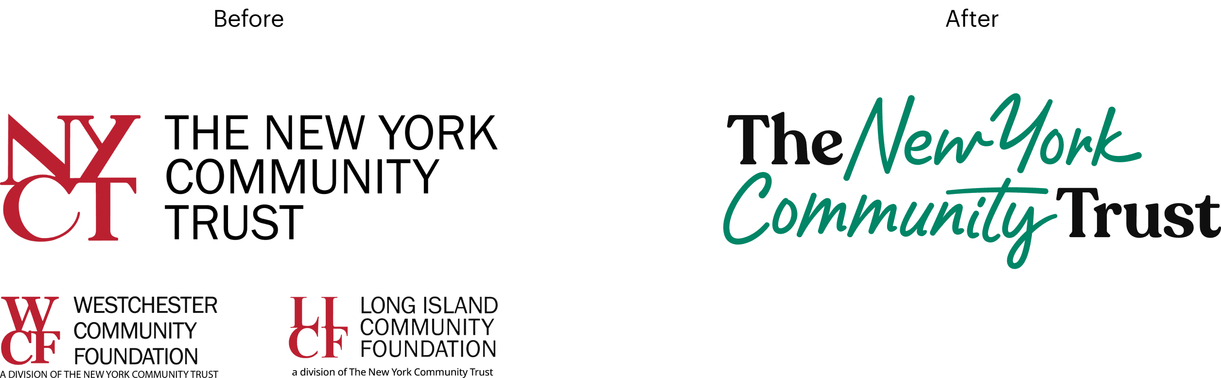
The Trust’s brand had been relatively unchanged for decades—a red logo and an acronym that many mistook for a bank. For a region as vibrant and diverse as New York, it no longer fit. “Not enough people knew what we were, who we were, or how we could help them,” said Amy Wolf, Senior Director of Marketing. The brand needed to reflect the scale of the problems it tackles, the breadth of people it serves, and the joy at the heart of giving.
From the start, our rebranding process was rooted in collaboration. Through workshops, vision boards, and exercises that invited staff and board members to imagine what kind of person the Trust would be, the new brand began to take shape. That kind of participatory approach creates not only better outcomes but also deeper internal alignment—crucial when change itself is the work.
The new strategy positioned the Trust as a democratizer of philanthropy, a place where everyday New Yorkers—not just the elite—can contribute to causes they care about. It shifted the perception from institutional and opaque to welcoming, human, and clear. Or as Wolf put it, “We wanted to bring out the joy in philanthropy. We wanted to feel approachable.”
A brand that speaks from the heart
That shift became especially tangible in the Trust’s new tagline: For New York. Forever. It’s a phrase that’s simple, powerful, and full of intention. From it flows a whole family of messages that express both values and permanence. “‘Forever’ is a big word,” Wolf admitted. “But if we’re not for forever, I don’t know who is.”
Brands that act like people connect like people. “A nonprofit colleague told me she read our subway poster that states The Trust’s values i.e. For Justice. Forever. For the Arts. Forever…. like a meditation on her commute,” Wolf said. “That kind of emotional connection always wins.”
This voice is part of a broader verbal identity that speaks directly, confidently, and inclusively. The emotional connections it creates are essential in a space where trust is everything.
From visual identity to brand behavior
The new visual identity complements the tone perfectly: joyful colors, dynamic shapes, and authentic photography convey energy and warmth. “The color palette is very welcoming, very colorful, bright, joyful,” said Wolf. “We want to connect with people’s hearts.” And that joy isn't superficial—it’s an invitation to take action.
The Trust extended that invitation in tangible ways. At its Centennial events across the five boroughs and beyond, attendees held placards with personalized messages—For Accessibility. Forever. For Climate. Forever. For the Arts. Forever. For Democracy Forever. It was a simple but powerful gesture that turned values into photo-worthy statements. In doing so, the brand became something people could literally stand behind.


Making it easy to share
The rebrand also simplified how staff and partners talk about the organization. Previously, the Trust had separate names for its regional arms—Long Island and Westchester—which created confusion. The unified brand made it easier for people to understand. “It was a heavy lift for someone to say, ‘I’m on the advisory board of the Long Island Community Foundation, which is a division of the New York Community Trust,’” said Wolf. “Now it’s simple. Simplifying who we are helped potential donors understand us more quickly.” That clarity is paying off empowering ambassadors—advisors, donors, and board members—to advocate for the organization with pride and confidence.
Internal rollout was a key part of success. The Trust used tools like Canva to make branded materials accessible to non-designers, empowering staff to create aligned content. That kind of ownership turns a brand into culture—where every touchpoint, from a train ad to a donor call, reinforces the same values.
Immediate impact
The Trust’s new award-winning brand has been well received among design and branding experts. PRINT Magazine highlighted the symbolic significance of the continuous line in the logo, stating, "This throughline is a visual cue of the brand’s continuity, resilience, and impact." They noted that "organically adapting to its environment symbolizes The Trust’s enduring commitment to the region and its people."
Armin Vit, writing for Brand New, praised the new design for being "far more lively and energetic with a very nice hand-written script as its main feature." Vit also commended that the new brand ”gives the organization a human touch and a feel-good vibe.”
Branding as a long-term investment
Branding is often misunderstood in the nonprofit world. A rebrand is always about more than design. It’s about defining who you are now and who you need to become. For the New York Community Trust, it was an opportunity to grow, to reach more people, and to welcome a more diverse community of givers. “We need a big tent,” said Wolf. “And to build that, you need a strong brand.” In her view, the rebrand didn’t just refresh The Trust—it repositioned it to thrive in the next century.
The Trust’s new brand does more than look different. It feels different. It’s a brand that reflects New York itself—bold, vibrant, generous, and enduring. A brand that invites everyone to be part of something bigger. A brand that says clearly, confidently: For New York. Forever.
____
Ready to start imagining where your brand will take you a year after your rebrand? Reach out so we can chat about how we can make it a reality.